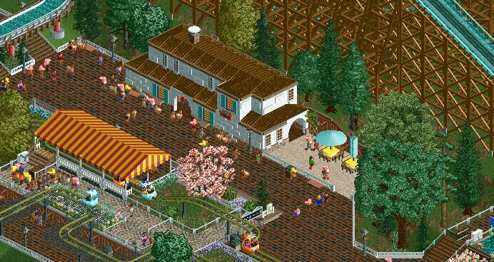
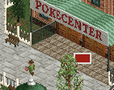
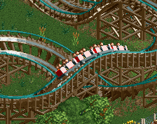
Screenshot / From new design project
-
 20-January 20
-
(Comprehensive) Design in the works
-
2 of 2
- Views 1,306
- Fans 0
- Comments 10
Community Forum Software by IP.Board
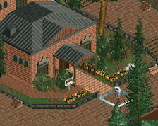

hmm, some nice stuff, however it's extremely short on the scale which makes it all look squished
I think if the buildings were all maybe 2 or 3 units taller it would help a lot.
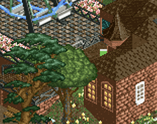
I really love this. Looks very realistic. Fantastic job
@Scoop - Actually, for aesthetic and realistic purposes, I think the height is about right, as compared to a peep. It is supposed to be an older building, and I think it is realistic that it looks a bit low. However, I can see the need for adding height from a more practical, RCT height-unit grid perspective, in order to properly fit even a small window on a low building for example. I'll see if I can add some height to it. I can tell you that you would probably have the same scale issue with most of this park though
@Mynock - Thanks
I would predict that I wouldn't be the only one. I think even one unit would help.
other than the scale, I think you could round off/ vary the rectangular bits of this slightly more gracefully. for example- near the stairs going under the flume, the queue for the helicopter ride, and the path one unit below that- all similar rectangles. putting some winding planters, sections of tables with umbrellas, small stalls or awnings, etc can help with that, on top of just varying your path formula to be more organic. otherwise a neat atmosphere.
quick edit: you're right that the scale of windows/ doors is about right for a peep. what is hidden though is that most ceilings don't sit exactly above the door- there's a good foot or two or four, especially so in older buildings. partly to put all the infrastructure stuff you need for the second floor (lighting, plumbing, etc) and partly because it gives the interior a nicer space. Thats why the scale feels off- your first floor roof sits incredibly low and then the second floor just starts on top of it immediately. thats why we're all having the same reaction to the scale, I think- it doesn't have to do with accurately matching peep size.
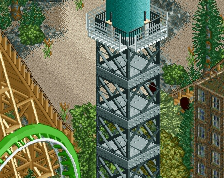
I personally would think the helicopter ride would be better if it were all at the same height above the path. Personal preference on that one though!
With 1 unit added to top, resulting in 4 units on bottom floor and 4 on top, with 1 unit in between (rooves)
With 1 unit added to both top and bottom floor, so that bottom floor is 5 units high before the roof, and top floor 4 units before the roof. Some additional details added above windows since it looked a bit bare.
I think I will go with the latter. What do you guys think?