Screenshot / Sidewinder
-
 06-February 20
- Views 1,646
- Fans 0
- Comments 7
-
 Description
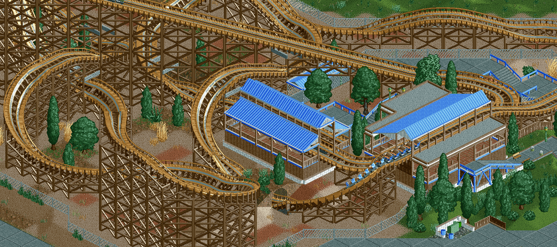
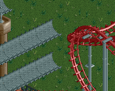
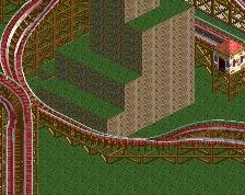
Screenshot of the GCI in my WIP park. Sidewinder will ultimately be the focal point as guests enter the park since it's on the opposite side of a service drive from where the main plaza buildings will be when completed.
I tried to have fun with a short layout and a lot of crossings while including a station fly-by and keeping the ride somewhat close to itself. I was inspired a bit by Kentucky Rumbler's crossovers and I think I got a pretty solid layout/footprint for the ride. -
 Full-Size
-
 No fans of this screenshot
-
 Tags
Tags
This is really cool. Simple yet realistic looking station. The tunnel the coaster goes through is a nice touch.
I'd consider adding some flowerbeds or some sort of theming to the queue as you progress!
I like this, good vibe here. I think some small things could make this more interesting. Definitely vary the Foliage colours as Faas said that will go a long way. Maybe some queue covers would help. That tall large banked turn at the bottom of the screen could use some supports. And lastly is just my personal opinion but I'm not a fan of the coaster colours. Dark brown or light brown but not both.
Cool screen, it has a good vibe. I'll echo Faas about the foliage.
Not bad work, the station flyby is done nicely. Agree on the foliage.
I like what I see, but i want to see how it fits into the path and park. How do guests see it?