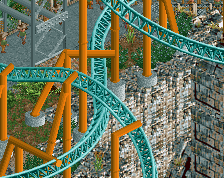
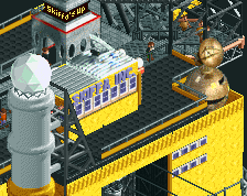
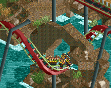
Looks great up until the trackitecture - to me it doesn't fit with the rest of the structure/style. I think you'd do better with objects even if that means abandoning the curves.
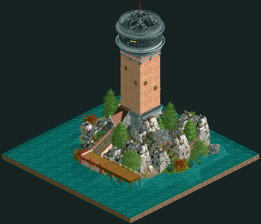
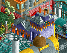
Bold object choice! The Mayan objects work decently as cliffs but those clay walls don't do it for me, and they also clash rather harshly with the tudor roof piece over the entrance. Kudos for exploring the possibilities of these less appreciated expansion objects, though!
The second version is much better, the tin roofs (always my favorite WW scenery set) really have that weathered marine vibe to them, and they look good with the texture of the Roman fence just below the roofline. I'd use that texture for all of the lighthouse.
 24-February 20
![screen_5841_Tiny Church [13x13]](https://www.nedesigns.com/uploads/screens/5841/5841_thumb.png)
![screen_6140_Bathhouse [10x10]](https://www.nedesigns.com/uploads/screens/6140/6140_thumb.png)
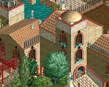
always a lighthouse, always a man.
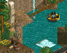
really great stuff though- i love the use of those aztec ruins more sparingly.
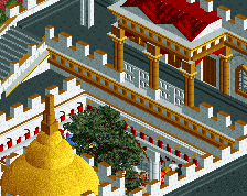
also, what you've done with the glass dome works great, very sneaky
Incredible work dude. The wall colors/textures look very nice in this setting. I also love the trick you did for the circle windows - great touch.
great use of different objects not usually used
Looks great up until the trackitecture - to me it doesn't fit with the rest of the structure/style. I think you'd do better with objects even if that means abandoning the curves.
Skiffa Offline
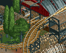
damn that second one is nice too.
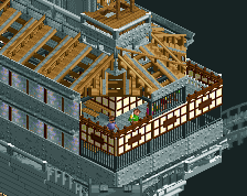
I agree with Alex; second one gets around that a little better.
Edit: The trackitecture does look quite nice, it just fits a more modern tower better in my opinion.
Yeah, the second one is nicer imo. A lot less grey too which is better.
Bold object choice! The Mayan objects work decently as cliffs but those clay walls don't do it for me, and they also clash rather harshly with the tudor roof piece over the entrance. Kudos for exploring the possibilities of these less appreciated expansion objects, though!
The second version is much better, the tin roofs (always my favorite WW scenery set) really have that weathered marine vibe to them, and they look good with the texture of the Roman fence just below the roofline. I'd use that texture for all of the lighthouse.