Screenshot / All the objects but no idea! Nostalgic Return III
-
 27-June 20
- Views 1,534
- Fans 0
- Comments 6
-
Description
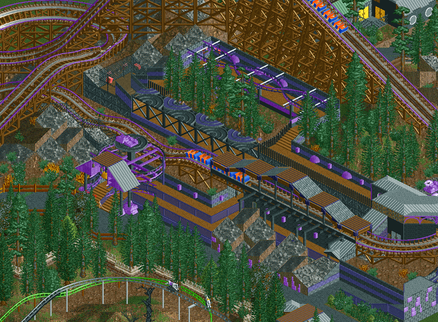
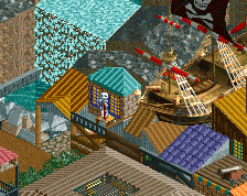
Just having a lot of fun with exploring all RCT2 has to offer again, wanted to share another screen from my current build, tempted to just start a park thread so as not to oversaturate the screenshot section!
This is a Wooden coaster in the park, not fully settled on the theme but it seems it'll either be some sort of Alien landing on earth (hence the purple stuff) or based around a quarry and some valuable gems (hence the purple stuff). -
Full-Size
-
No fans of this screenshot
-
Tags
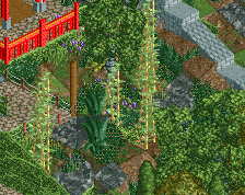
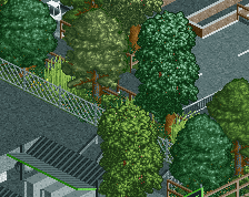
I think you have some cool ideas in there, but its kinda hard to read. I like the steeplechase track art roof thing going on. I don't like how the line of trees completely blocks the path
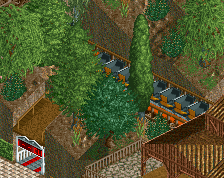
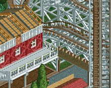
Overall the colours in this are problematic- my eyes are jumping round the image too much - possibly too much darker colour and a bit messy/chaotic- too much competing for attention/focus. Not sure what to suggest but someone here will know where you can restore balance. Love the canopy over the track, the choice of purple for the track edges and really love the train- if you can keep that upside of the darker colours the train really pops and the bright colours work in a way I wouldn't have expected. Hence finding a way to make the darker other colours work might be good for this with the train being the key feature - maybe some sort of alien snake like entity hence the colours are a bit of a warning ? Maybe the dna like trackitecture could echo these colours for a thematic and visual link.
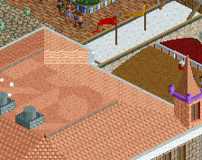
I dig this... color scheme actually looks cool and I like the use of the car ride as an awning, that's a good idea.
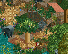
The landscaping needs work though. The trees seem randomly placed, as does that perfectly rectangular mass of jagged rocks. I'd work on making it more orderly and organic.
I like this. The structures are pretty cool and so are the colours IMO. But I echo Jaguar about the landscaping. I'd also say the foliage could use some work. Perhaps some more underbrush and variation would help.
Thanks all, interesting to see how some of you dig the colours and others not so much, personally I think it's looking good in the context of the whole park but will consider some minor colour changes.
It is true, very little thought went into tree placing other than the thought of blocking out the coaster from the queue to build tension but I'll try and be a bit smarter and think a bit more about placement thanks
The bold colours may not always be perfect but I think once you further develop and refine your style, the colours will be an asset. Keep them. I'd worry about random textures more. Everything awning or roof related in this screen is a mess.
Lots of ideas. Keep them if this park is a sandbox. When you want to make a park the best version of itself, kill your darlings and only keep the best ideas.