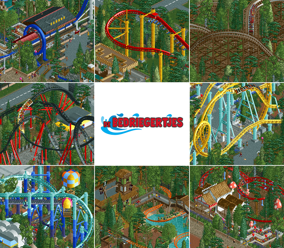
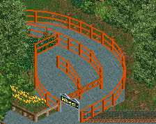
Screenshot / De Bedriegertjes - All Roller Coasters
-
 01-August 20
-
De Bedriegertjes
-
41 of 41
- Views 1,915
- Fans 0
- Comments 9
Community Forum Software by IP.Board
Cannon looks awesome.
lol can't tell if the community rating is some sort of joke I'm not privy too?
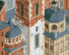
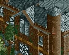
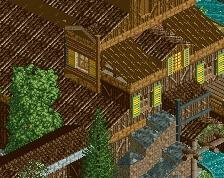
I don't think there's too much in the screens that stands out completely relative to other areas but the park feels fleshed out and seems to mix classic RCT with a lot of the newer playmaking styles.
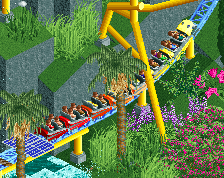
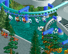
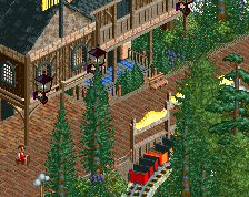
My fav screen is definitely the flying (laydown?) coaster bottom left. The supports are fun to look at and the hot air balloons are clearly contributing to the theme along with the station.
What a great start to August on NE!
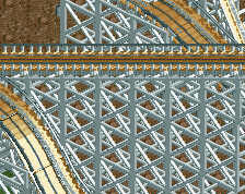
Most excited to check out the flyer in this. The layered colours on the supports are brilliant. The vekoma looks very flowy as well.
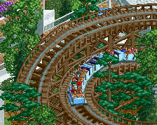
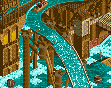
Nice roller coaster, I liked the supports, it must have been a lot of work
Thanks guys! Dark Horse, you need to look at your screen's brightness settings. What you call white is clearly sky blue for me. The idea behind the flyer's colours is that the coaster visually fades into the sky, or at least the gradient symbolically represents that transition. And yes I'm aware that the dark-light gradient is inverted from the real sky gradient which gets darker the higher you go.
Fair enough.