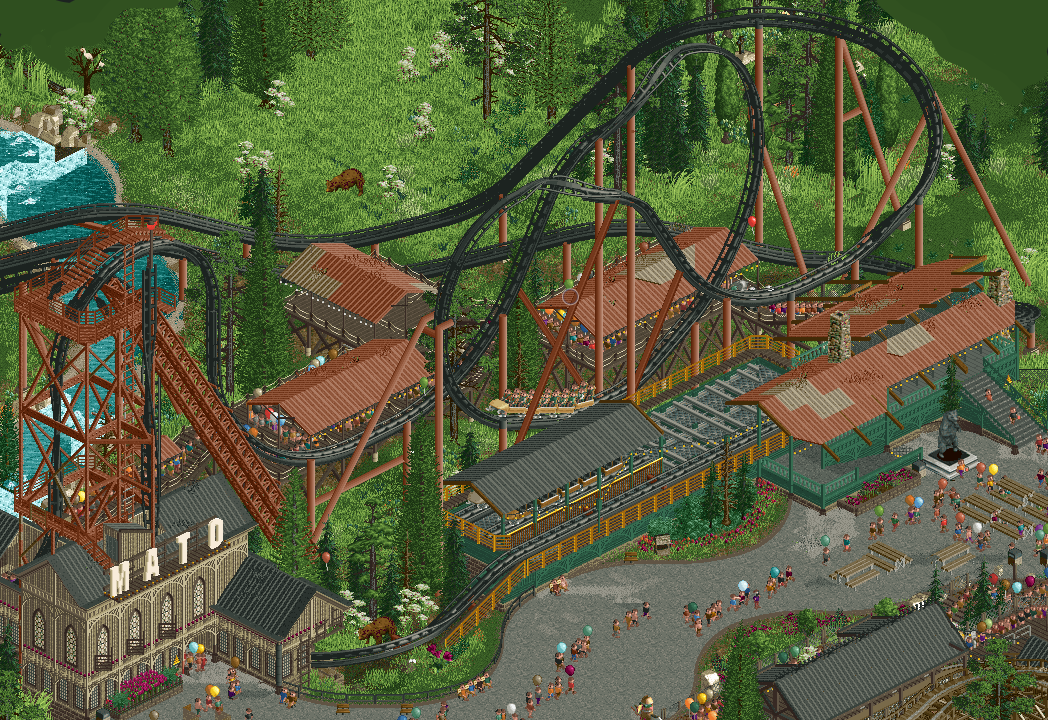
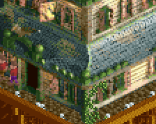
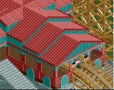
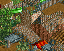
The foliage the coaster are very nice, but to me the combination of metal roofs with wooden lattice in the archy is a little weird for me. Just doesn't really make sense for a building to have expensive details but cheap out on the roof.
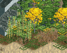
I agree with JK about the flower colors - change them to something that pops a bit more and goes along as an accent. Maybe some blues or yellows. Could even sprinkle a few throughout the field as wildflowers. Little pops of color like that would really elevate this even more.
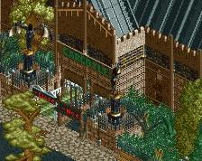
Also the bears might benefit from being rotated slightly different from eachother so that they aren't facing the same direction.
Grass up top (left) could use a bit of breathing room, and the flowers up there might appear more "wild" if they were in larger clusters, but that aside, this is some of my favorite North American landscaping yet.
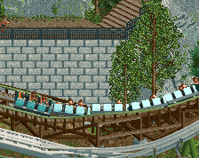
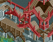
Any reason why you didn’t use the large zero G rolls here? Stunning work regardless, but those new track pieces would smooth out that main element really nicely.
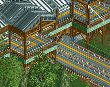
I think the steep Zero-G rolls are shorter. I kinda like that it's stretched a bit! I think with the grandiose entrance, structure, I feel the tiniest bit let down by the actual station. Not that the station is bad by any means, I just think it could be a bit bolder. Obviously, this is a tiny gripe. I am in love with the colors in this screen, and the overall breathability. <3
 17-March 23
elonmuskrat Offline
So fucking lovely dude! I've always loved this vibe from you.
Yep this stuff is you in your prime.
Three nitpicks from me;
The bear in the natural grass is so much more effective as the one nearest the ride.
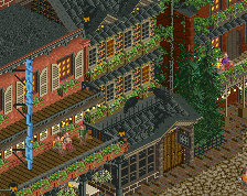
I think there could be a stronger choice for the church windows on the MATO station and some more detailing on it.
The colour of the flowers at the front are a similar shade to the roof colours used throughout.
Small changes for me. I voted 85% but with a few more touches it would be a 90% from me.
The foliage the coaster are very nice, but to me the combination of metal roofs with wooden lattice in the archy is a little weird for me. Just doesn't really make sense for a building to have expensive details but cheap out on the roof.
Peak AJ vibes.
This is you at your best (so far). Love it dude.
I agree with JK about the flower colors - change them to something that pops a bit more and goes along as an accent. Maybe some blues or yellows. Could even sprinkle a few throughout the field as wildflowers. Little pops of color like that would really elevate this even more.
Also the bears might benefit from being rotated slightly different from eachother so that they aren't facing the same direction.
Top notch work man. Easy 85%+ for me.
Grass up top (left) could use a bit of breathing room, and the flowers up there might appear more "wild" if they were in larger clusters, but that aside, this is some of my favorite North American landscaping yet.
I think the steep Zero-G rolls are shorter. I kinda like that it's stretched a bit! I think with the grandiose entrance, structure, I feel the tiniest bit let down by the actual station. Not that the station is bad by any means, I just think it could be a bit bolder. Obviously, this is a tiny gripe. I am in love with the colors in this screen, and the overall breathability. <3