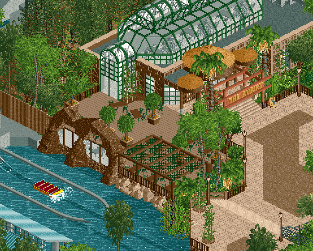
Screenshot / The Aviary
-
 13-June 23
- Views 1,400
- Fans 1
- Comments 21
Community Forum Software by IP.Board
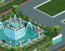
Nice, good first screen. Maybe a little lacking on path details and details around the splashdown, but as a whole well done.
I'd maybe try messing with your screenshot method so it doesn't scale oddly, would recommend not using snipping tool if you did, doesn't really play nice with RCT graphics.
Love that. Solid structures, commitment to the theme... keep going!
A nice glass structure, and I like the viewpoints and structures next to the splashdown. Only suggestion I'd have is basically what J K said, a few extra details in the splashdown area itself. Overall I really like this, solid stuff, and a very nice debut screen on NE.
So happy you came here from Reddit. I always thought you had a ton of potential from what I saw over there. Super excited for this first release!
Edit: also, isn't it spelled aviary?
That looks great - i love how the detailing of the glass structure isn't the victorian style we typically see but has more of an 80s postmodern vibe.
Nice, quite clean. Ace's objects I'm not sold on.
Lamppost probably shouldn't be brown, otherwise quite enjoyable.
really nice has more zoo vibes than amusement park but really cool and clean shot
i found the colour from the entrance of the pillars of the glas building nice as lamppost
beautiful work. I'd love to see you take a screenshot at the proper zoom resolution though!
Looking forward to seeing more from you on this. Definitely missing some "life" in regards to peeps, seating, bins, maybe some signage/accent colors. Quick service on the pathways (umbrellas, etc)
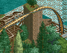
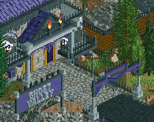
Love the windows in the rock wall, however I would use the same type of rocks throughout. Get rid of the 1k ruin rocks on the bottom and extend the same style of rocks framing the windows down to where the 1k rocks are. Just so it matches. Great screen, love the atmosphere.
Edit - Maybe even extend that style of rock wall way back to the left to replace the brown boring fence and the stale grey concrete side of the splashdown pond.
_jj Offline
Thanks, yes some more details for sure needed! Cheers for the tip on cropping, thought it looked odd.
Thanks! No expense spared...
Cheers. yeah need to think on what to put in the splashdown. Usually not a whole lot there IRL.
Thanks! Happy to be here.
Took a while, glad you appreciate it. Probably not the finished article yet, first time properly understanding how to clad buildings.
It is, can't believe I missed that!
_jj Offline
Cheers, trying to I guess go with 90s, around the time IOA opened.
The chairs and signage?
Thanks, yeah I need to find a better lamp post, something more jungle vibes.
Yep for sure, will definitely add more. Cheers!
Cheers, trying to I guess go with 90s, around the time IOA opened.
The chairs and signage?
Thanks, yeah I need to find a better lamp post, something more jungle vibes.
Yep for sure, will definitely add more. Cheers!
Agreed, and thanks!
I agree, it doesn't look quite right. Yeh gotta keep the dining peeps dry!
_jj Offline
Agreed, and thanks!
I agree, it doesn't look quite right. Yeh gotta keep the dining peeps dry!
mate love this. great interaction between the glass and the thatch. foliage is great, colors are great, and love that covered seating area. feels very real!