Screenshot / Tir na nÓg (2)
-
 27-November 23
-
Emerald Park
-
6 of 10
- Views 1,509
- Fans 0
- Comments 13
-
Description
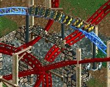
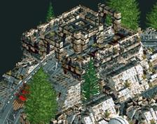
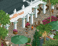
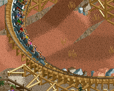
Imagination of the new themed area for 2024. Based on the presented model and 3D rendering as shown on Emerald Parks website. Quite the challenge to make something of it based on soley some screens. This shows some interaction of the new Vekoma coasters. Liberties taken.
-
Full-Size
-
No fans of this screenshot
-
Tags
Side note, if I recall correctly, I think Posix once mentioned an idea of all the expansion packs usable on a single park.
My thoughts are that the style is unique and different from vanilla RCT, and with open RCT now allowing more objects in the tab, all WW and TT objects could be available to use on one map. Maybe that’s a good idea or not. I’m not sure.
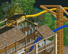
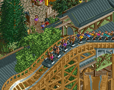
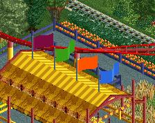
About the screen, I love it. The coasters look amazing. The composition is also lovely. I would like the roofs more if they were all from the same vanilla objects or strictly from WW and TT objects, while keeping the rest of the architecture pretty much the same I think. But that’s just my opinion.
I like where this is going for sure. Lot of saturated brown and a lot of fences going on in that middle pathway/swing ride area. The invert is very creative!
Quite nice and I applaud the effort to try out new things to realise technical ideas.
I think mainly you need to develop your game aesthetically. Currently it doesn't look pleasing enough for me to break into higher score ranges.
I often see you make comments like this, and I feel like they aren't really helpful as feedback. All your saying is "make it look better." Presumably if some one is posting on NE, they are already trying to make what they make look as good as possible? I feel like comments like this were only ever really discouraging when I was new to the site, because they don't really offer anything of substance- there's nothing concrete to improve on, just a very politely phrased "nice try, but it's not good." Just offering this thought to you- if you want the site to be more inviting and helpful. I get the sense that you have the best intentions and want to help people improve, but I don't think you are really accomplishing that when you say things like this.
Example 3D Model Tir na nÓg
I believe he means this is all very nice, but rather simple and on the safe side. It's nice, but you have potential to make more interesting structures and composition.
I didn't mean to be discouraging or unfriendly, sorry about that.
I really believe that making things look beautiful is key to "winning" at showcase parkmaking, and it's also fun when it works. It was the aspect of RCT that motivated me the most, by far.
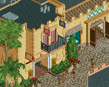
In the screen here there is a disbalance for me with too much importance given to technicalities. I see a lot of little hacks. Intricate trackitecture, painstakingly designed supports, a custom ride carousel. But at the same time I think stylistically there is a lot of disharmony and underdevelopment. The blue-grey ish tower breaks against the brown trees, the red flowers. The decoration that is done is individual and not seen as a whole. Hence I think it would be good if you could start prioritising these things more. You need to develop a stylistic language, ideally one that you try out on sandbox maps first and tweak it, over and over. Repetitive motifs, objects for specific purposes (in your screen you have 4-5 roof types that all look totally different). Things that you stick to, and that look nice together. Maybe google "design language" and familiarise yourself with these concepts. But don't idolise them or try to turn them into a formula for easy success. The creative process is one that should come from within you, and develop from the aesthetic feedback your mind gives you as you place down objects, choose colours, create decorative patterns, etc. I'm not saying it's easy, especially if you're new to it, or have told yourself that you "aren't creative". It takes time. To realise quicker progress (which helps with motivation), I would make something simple, limit the objects and colours you decide to go for, and then as you progress add more and more things.
Regarding your comment, is that the way I really want to design? I've not been playing the game so much, cancelled many parks this year, precisely because of the pressure and enormous amount of time to get things stylistically right. I am not here to win anything. That is not how I would like to play the game, nor prioritising design languages. Also a reason for me to stay away from CSO, I just don't enjoy working with that, even though it would make many things stylistically pleasing. But in the end that is not a motivation for me to play the game. I want to enjoy seeing the coasters go round and peeps walking along from ride to ride, as the game is designed to do, but with a few twists and cheats to make it look better. I do not own or have style, and do not want to spend time creating one totally my own. However, pointing out that roofs or colours don't really match and are distracting help polishing the park and feed my own criticism into improvements that'll most likely stick for future builds, so thank you all for that.
Perhaps consolidating one or two of the roof types might be beneficiary like the others have mentioned, but this is also mostly due to the fact that its NCSO, so options are limited anyways.
Perfectly okay Risiko. Just in the spirit of competitive park making as NE organises it, that approach will inevitably meet a ceiling.
Probably a little spicy to bring up in screenshot comments and I apologize to Risiko in advance, but I feel it's almost a rite of passage (Hex has entered the chat) to see RCT2 past accolade scores and meta restrictions and just build what you like. I personally love what I'm seeing here, especially near the top. Some very nice classic NCSO work. The swinger feels a bit squat compared to real-life examples though.