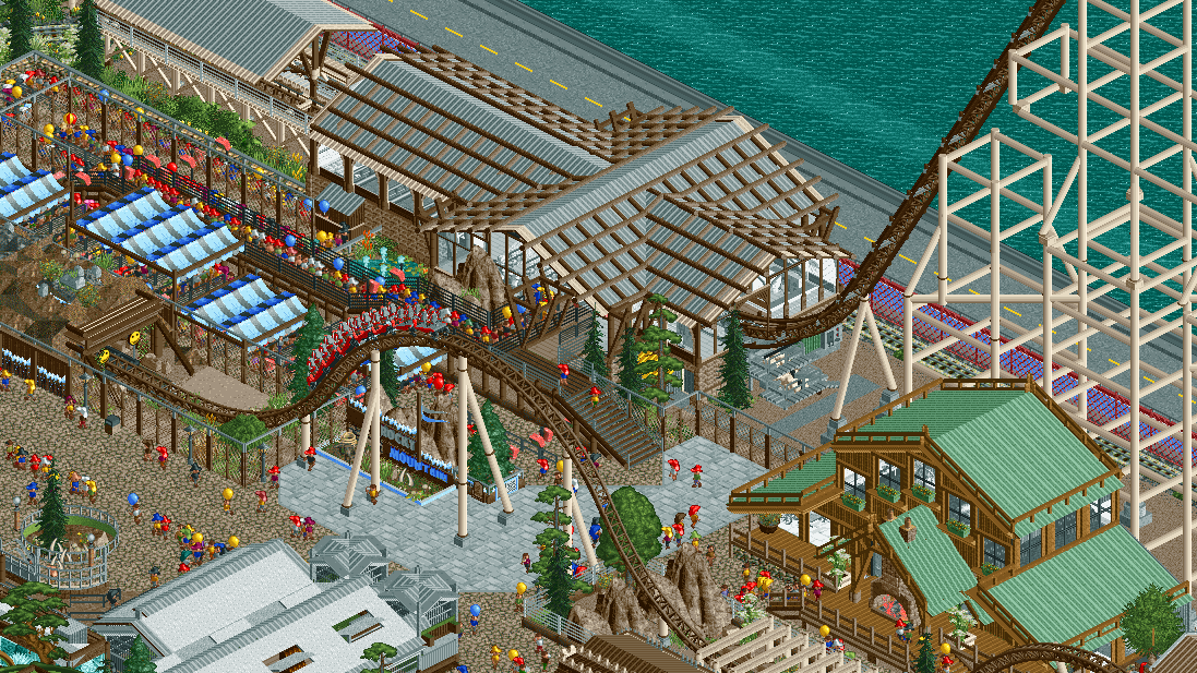
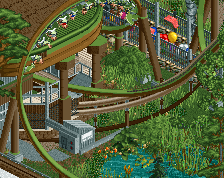
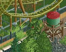
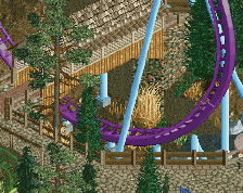
It has some good detail but it seems to lack a good focal point. Maybe you should change the color of the coaster, even just the rails, to something non-neutral to have it stand out against the rest. It's complex enough to elicit varied reactions though, so I'll see if other people agree or have a different opinion.
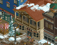
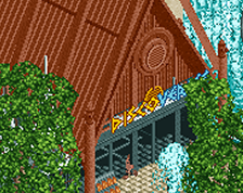
I'm finding the lifthill supports a bit questionable/messy/non-functional, but I'm liking the station are and again the queue. The tunnel entrance for the coaster is also really cool!
I'm finding the lifthill supports a bit questionable/messy/non-functional, but I'm liking the station are and again the queue. The tunnel entrance for the coaster is also really cool!
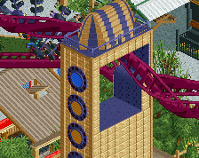
yeah, think the supports need cleaning up. Can be tricky to make a very tall coaster!
I like the station and even more that brown building with the green roofs on the right. I also think the lifthill supports could be done a bit better. Main itch with this are the coaster colors, there's really no need to add more brown into the park/screen with it and it doesn't pop out with brown. I'd try a brigher color or even maybe black.
 29-March 24
It has some good detail but it seems to lack a good focal point. Maybe you should change the color of the coaster, even just the rails, to something non-neutral to have it stand out against the rest. It's complex enough to elicit varied reactions though, so I'll see if other people agree or have a different opinion.
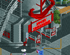
Big time Cedar Point vibes, nice
I'm finding the lifthill supports a bit questionable/messy/non-functional, but I'm liking the station are and again the queue. The tunnel entrance for the coaster is also really cool!
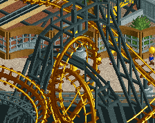
love it
I like the station and even more that brown building with the green roofs on the right. I also think the lifthill supports could be done a bit better. Main itch with this are the coaster colors, there's really no need to add more brown into the park/screen with it and it doesn't pop out with brown. I'd try a brigher color or even maybe black.