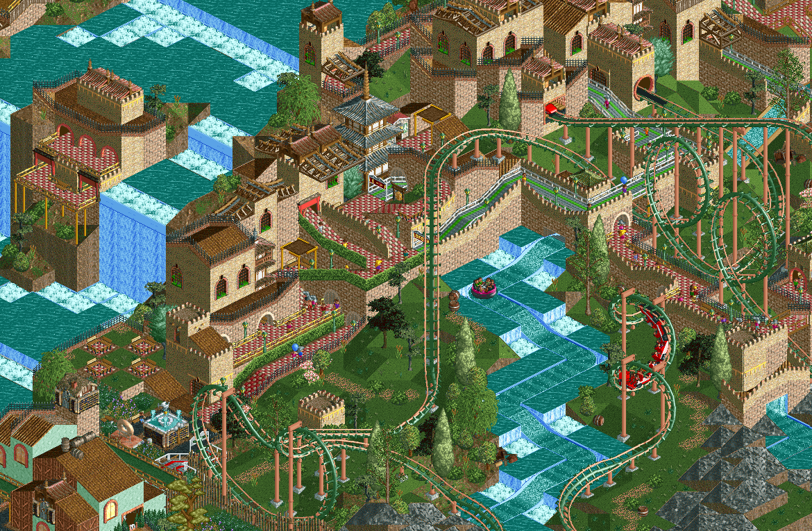
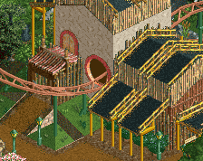
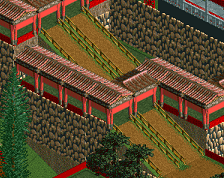
Unc still got it. Overall composition, framing with the river rapids and the path going under the queue wall are mint. Unwatered gardens made me laugh, such a neat idea which I think looks really unique here
this is absolutely great, colors are spot on, great vibes. some lovely little tricks like the unwatered flowers that blend with the foliage in a more natural way too
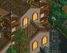
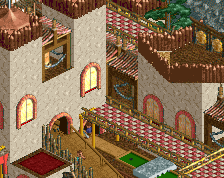
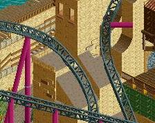
This is interesting. I still find it a little "messy" compositionally, but it walks a fine line between that and looking quite sophisticated otherwise, also what concerns aesthetics. A mixed bag. It's definitely impressive though to make something as fluent looking as this in LL.
I agree with posix, and this particular criticism is a recurring thing in all screens of this project. Though I would like to see you polish and aesthetically streamline the entire project, I also appreciate a consistent approach, and the eclectic look also makes this park stylistically distinct, similar to how Jaguar's modern RCT2 stuff is also messy and eclectic, but therefore also unique. It's a trade-off.
 18-November 25
hes a menace
Unc still got it. Overall composition, framing with the river rapids and the path going under the queue wall are mint. Unwatered gardens made me laugh, such a neat idea which I think looks really unique here
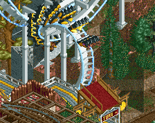
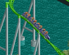
Woah. Only gripe is the green queue because the red path is soooo beautiful across the screen.
this is absolutely great, colors are spot on, great vibes. some lovely little tricks like the unwatered flowers that blend with the foliage in a more natural way too
The green and peach coaster, red checkerboard paths, and beige walls are on-point. Such a good color combination.
This is interesting. I still find it a little "messy" compositionally, but it walks a fine line between that and looking quite sophisticated otherwise, also what concerns aesthetics. A mixed bag. It's definitely impressive though to make something as fluent looking as this in LL.
I agree with posix, and this particular criticism is a recurring thing in all screens of this project. Though I would like to see you polish and aesthetically streamline the entire project, I also appreciate a consistent approach, and the eclectic look also makes this park stylistically distinct, similar to how Jaguar's modern RCT2 stuff is also messy and eclectic, but therefore also unique. It's a trade-off.
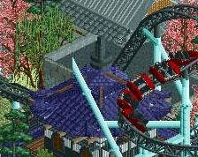
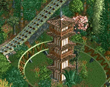
Love this - the elevation changes and the way the path climbs up the hill through switchbacks is really cool.
I think bolder, primary colours for the coaster would be welcome here.