The positioning of that queue is still one of the most beautiful features of this park.
The bridge actually turned out really well I think, great view of the iconic coaster element but also serves the practical purpose of preventing the entire japanese area turning into a big dead end with only one entrance/exit.
I clicked on the screenshot and a vacuum was generated with its point of convergence located at the center of my laptop screen; the resulting force ruining the ultimate aesthetic perfection formally known as my face, usually referred to as angelic-incarnate. Not to mention you completely destroyed my room. The sheer volume of suckage then quickly reversed as all the matter in the room was trying to occupy the same space. The result was that a hole was made in the space-time continuum, and the system collapsed and created a massive explosion. I was blasted backwards into my dresser in a giant fireball of robbiessucksass (its kinda hard to describe). Seriously, fruit of the looms are still raining down as I type this. Also I'm pretty sure that the structural capacity of any load-bearing wall in the general vicinity is non-existent at this point. You should really consider clearing out the entire map to avoid further catastrophes such as the one described above.
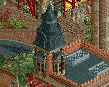
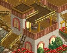
I have to agree with FK, I'm not to much a fan of the orange. I mean it doesn't look that awful but I think another color would fit in better here. Not sure what color though.
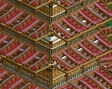
I really love this. I can't wait to see what this queue looks like when it's filled with peeps. I hope you take the time to adjust guest flow and dispatches to allow this to happen as it would bring so much atmosphere to this area that it would probably just break the game. Awesome as usual (though you might need a footer on the lower left support).
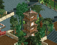
Amazing. I don't get how you do it man, everything is just in the right place. There are so many details, yet instead of looking like a mess, everything just flows together.
Don't feel like finding the thread; this is easily my most anticipated park. Finish it this year so we can have a 2015 spotlight.
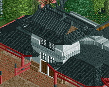
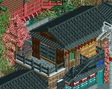
I'm not seeing much cohesion here though. As wonderful as all the forms on the buildings are, each one looks so incredibly different I don't know what I'm looking at. There's a pagoda, maybe a storage shed(?), a building with a crazy grey roof and one with weird orange supports. I dunno, Robbo. I mean, it's GOOD, but apart from the pagoda this part of the park isn't really selling me on Japanese. Or is it Chinese? SEE?! I have no idea what's going on!
honestly i think it looks really japanese. steve makes a decent point about the cohesion though. but i think that's mostly due to the lack of extra detailing on the path. i would consider recolouring those orange poles though, maybe add in the orange in things like flowers. also you are really missing out on those traditional red japanaese lampions!
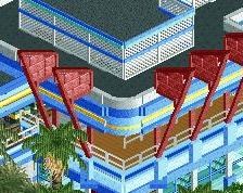
I do think that it looks Japanese, no question. But I agree with Steve that there's not enough cohesion in this screen. Might be the cropping, the angle, I don't know, but the area looked better in the streams. There seems to be too much going on with colours and textures. I think it's the darker, warmer colours that feel off in this screen: the sand path bottom right, and the dark orange and path top right. They don't match the area's greyish colour scheme. The triangle sun screens do, but I'd get rid off them anyway. They look so out of place.
The supports and both bridges are amazing, by the way.
Pretty awesome, tho you have nothing going on right at the base of the amazing supports next to the brown/dirt bridge. It's boring right now and could be spiced up with a photo-op spot, custom sign or a stall. Do something there and this gets near 10/10
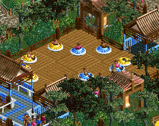
I think it is perfect. If only you could avoid the glitch of the tree over the red bridge, then the screen would be literally flawless. I also like the extremely subtle use of crazy path to break up the curved stone path and add just the slightest change in hue and texture- little things like that make a big difference in the overall composition.
 16-January 15
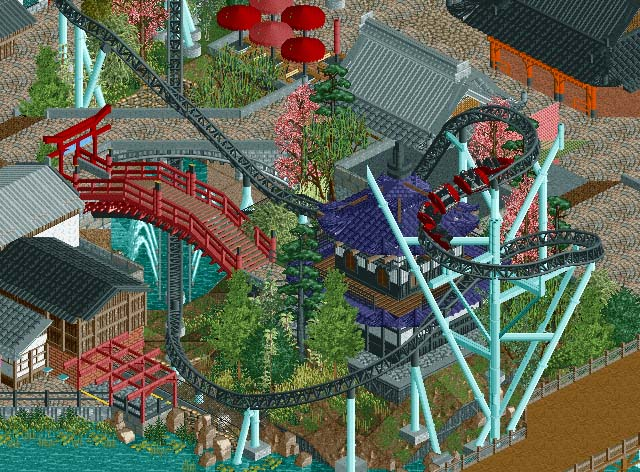
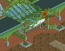
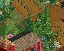
The positioning of that queue is still one of the most beautiful features of this park.
The bridge actually turned out really well I think, great view of the iconic coaster element but also serves the practical purpose of preventing the entire japanese area turning into a big dead end with only one entrance/exit.
Love the arch over the queue entrance and the contrast between the purple roof and the coaster supports.
Let me describe how hard this sucks:
I clicked on the screenshot and a vacuum was generated with its point of convergence located at the center of my laptop screen; the resulting force ruining the ultimate aesthetic perfection formally known as my face, usually referred to as angelic-incarnate. Not to mention you completely destroyed my room. The sheer volume of suckage then quickly reversed as all the matter in the room was trying to occupy the same space. The result was that a hole was made in the space-time continuum, and the system collapsed and created a massive explosion. I was blasted backwards into my dresser in a giant fireball of robbiessucksass (its kinda hard to describe). Seriously, fruit of the looms are still raining down as I type this. Also I'm pretty sure that the structural capacity of any load-bearing wall in the general vicinity is non-existent at this point. You should really consider clearing out the entire map to avoid further catastrophes such as the one described above.
You know my thoughts on most of this, but i gotta say, i'm not a fan of the orange
and remember who this is, its FK. I know i said i don't like it, but common, its FK!!
I have to agree with FK, I'm not to much a fan of the orange. I mean it doesn't look that awful but I think another color would fit in better here. Not sure what color though.
Other than that it looks awesome as usual.
I really love this. I can't wait to see what this queue looks like when it's filled with peeps. I hope you take the time to adjust guest flow and dispatches to allow this to happen as it would bring so much atmosphere to this area that it would probably just break the game. Awesome as usual (though you might need a footer on the lower left support).
Also Sephiroth... your post was amazing.
Amazing. I don't get how you do it man, everything is just in the right place. There are so many details, yet instead of looking like a mess, everything just flows together.
Don't feel like finding the thread; this is easily my most anticipated park. Finish it this year so we can have a 2015 spotlight.
Those supports are incredible, so is the bridge.
I'm not seeing much cohesion here though. As wonderful as all the forms on the buildings are, each one looks so incredibly different I don't know what I'm looking at. There's a pagoda, maybe a storage shed(?), a building with a crazy grey roof and one with weird orange supports. I dunno, Robbo. I mean, it's GOOD, but apart from the pagoda this part of the park isn't really selling me on Japanese. Or is it Chinese? SEE?! I have no idea what's going on!
honestly i think it looks really japanese. steve makes a decent point about the cohesion though. but i think that's mostly due to the lack of extra detailing on the path. i would consider recolouring those orange poles though, maybe add in the orange in things like flowers. also you are really missing out on those traditional red japanaese lampions!
2/10 would not bang.
10/2 would watch Gee try to not bang
TRY
The supports and both bridges are amazing, by the way.
Pretty awesome, tho you have nothing going on right at the base of the amazing supports next to the brown/dirt bridge. It's boring right now and could be spiced up with a photo-op spot, custom sign or a stall. Do something there and this gets near 10/10
I think it is perfect. If only you could avoid the glitch of the tree over the red bridge, then the screen would be literally flawless. I also like the extremely subtle use of crazy path to break up the curved stone path and add just the slightest change in hue and texture- little things like that make a big difference in the overall composition.