(Archive) Advertising District / stressed out...
-
 24-October 05
-

RMM Offline
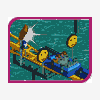
Yea I was all stressed out the other day and bored so I started to build sumthin different. Its colorful too. Woohoo... its great huh? . Well here... just sumthin I built.
-RMM-
-
 tracidEdge
Offline
i like it.
tracidEdge
Offline
i like it.
but use more custom supports than that if you're going to have them at all. they're really pointless right now. -
 yeshli2nuts
Offline
you shouldnt use the same type of track for the supports as you do for the rollercoaster.
yeshli2nuts
Offline
you shouldnt use the same type of track for the supports as you do for the rollercoaster. -
 RCTCA
Offline
A little too colorful for my taste.
RCTCA
Offline
A little too colorful for my taste. Other then that it's great.
Keep it up!
-Parkmaker- -
 Coaster Ed
Offline
The buildings could use a little work, but everything else about that screen is quality. The coaster layout looks pretty cool and I love the landscaping and tree placement. Nice choice of path too. Perhaps do something with the flowers. Put bushes around them or something so they don't look so much like a checkerboard. I'm not so sure about the custom supports either. They're a different color than the rest of the supports. Personally I think custom supports work best when you take out all of the game supports and make it all custom supports. But this could work too if they're just sculptures or something. Maybe that would be better even.
Coaster Ed
Offline
The buildings could use a little work, but everything else about that screen is quality. The coaster layout looks pretty cool and I love the landscaping and tree placement. Nice choice of path too. Perhaps do something with the flowers. Put bushes around them or something so they don't look so much like a checkerboard. I'm not so sure about the custom supports either. They're a different color than the rest of the supports. Personally I think custom supports work best when you take out all of the game supports and make it all custom supports. But this could work too if they're just sculptures or something. Maybe that would be better even. -
 Xenon
Offline
Well it's certainly colorful and different but nothing really outstanding. It seems a little messy too.
Xenon
Offline
Well it's certainly colorful and different but nothing really outstanding. It seems a little messy too. -
 Turtle
Offline
It's a screen that i'm enjoying looking at. I've never liked flowers when used like that, but that's your decision. I agree with CoasterEd, i'd put bushes around them...
Turtle
Offline
It's a screen that i'm enjoying looking at. I've never liked flowers when used like that, but that's your decision. I agree with CoasterEd, i'd put bushes around them... -
 Hexiage
Offline
Oh yes, a very coulorful screen.
Hexiage
Offline
Oh yes, a very coulorful screen.
The layout looks good, but the buildings are a little bit boring.
I'll see, whether your park will be beautiful or only good! -
 JKay
Offline
A bit sloppy around some of the buildings, but excellent overall. Very solid LL work right there.
JKay
Offline
A bit sloppy around some of the buildings, but excellent overall. Very solid LL work right there. -
RMM Offline
everything that has a novel behind it.
Can't sum1 just build for fun? This is different for me, its colorful, not all jagged, im havin fun mainly. And thats why I play. -
 Ride6
Offline
Personally I actually really like it, which is amazing since I don't think I've liked anything of RRM's up to this point. The architecture is so very pleasent it almost hurts. The coaster looks excellent too. The pathing works perfectly too. Not to say this is flawless, far from it actually, the folidge in general is a mess but somehow adds to the atmosphere. From the technical standpoint I want to demand that you change it but from a standpoint of art I can't bring myself to, I guess I like the way it challenges in that respect. But I don't like the custom support like things. The main supports need to be removed and they need to be more plentiful or they just need to go. Depends on how much time you want to take on this I guess, you could just get rid of them and change the supports to yellow and call it good...
Ride6
Offline
Personally I actually really like it, which is amazing since I don't think I've liked anything of RRM's up to this point. The architecture is so very pleasent it almost hurts. The coaster looks excellent too. The pathing works perfectly too. Not to say this is flawless, far from it actually, the folidge in general is a mess but somehow adds to the atmosphere. From the technical standpoint I want to demand that you change it but from a standpoint of art I can't bring myself to, I guess I like the way it challenges in that respect. But I don't like the custom support like things. The main supports need to be removed and they need to be more plentiful or they just need to go. Depends on how much time you want to take on this I guess, you could just get rid of them and change the supports to yellow and call it good...
Still something about those colors just pulls me in.
ride6 -
 posix
Offline
steve, of course.
posix
Offline
steve, of course.
rmm, no novel required.
why you build or not, i don't care.
i know what i like or dislike, kthx.


Tags
- No Tags