(Archive) Advertising District / RCT Majesty Project #3
-
 07-February 06
-
 Xenon
Offline
The park size is 140x140. The workers are g-ride (HandyAndyG), ziplock, lucas92, and me, Ultratycoon. There is one completed area so far, the hotel. The entrance is not built yet, which I know is often done with the hotel but in this case it's not. Here are four screens.
Xenon
Offline
The park size is 140x140. The workers are g-ride (HandyAndyG), ziplock, lucas92, and me, Ultratycoon. There is one completed area so far, the hotel. The entrance is not built yet, which I know is often done with the hotel but in this case it's not. Here are four screens.
The hotel front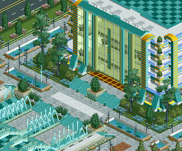
One of the parking lots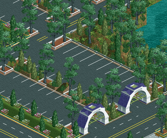
A side of the hotel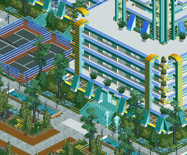
The monorail station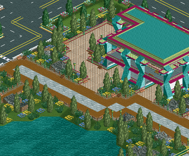
-
 RCTFAN
Offline
Fuck. that hotel is some sight!
RCTFAN
Offline
Fuck. that hotel is some sight!
i absolutely adore the amount of detail you have put in to the facade giving it just enough without making it strenuous so the eye. Love it.
my only doubts is the foliage in some screens, namely the parking lot. It needs a bit more colour and/or shrubs IMO. and i'm not found of those honey locust trees (i think). -
 geewhzz
Offline
The hotel looks great, not sure about the teal paths.
geewhzz
Offline
The hotel looks great, not sure about the teal paths.
Love the swimming pool on top of it also. The colors seem to be a bit to vibrant for my tastes, I think screen 1 and 3 have this problem, the other 2 look very nice and realistic.
Keep it up.. -
 posix
Offline
the hotel is pretty much what i wanted nspheres to look like (an older cancelled solo park of mine you won't know).
posix
Offline
the hotel is pretty much what i wanted nspheres to look like (an older cancelled solo park of mine you won't know).
very nice.
the colours aren't all perfect but the hotel makes sense and so do most of the other things you show. makes them convincing. good job.
landscaping is careless in places. not so convincing again.
possibly depens on who did what here.
well, keep us up to date with screens
-
Xenon
Offline
@Posix: When you say "careless landscaping ... possibly depends on who did what here." what exactly do you mean.
Thanks everyone for the comments. The next screens will come when the entrance is finished. -
 hobbes
Offline
Monorail station is very nice.
hobbes
Offline
Monorail station is very nice.
The rest are alright... I like the hotel, but the entryway with the gardens and custom path make it look bad, imo.
Parking lot is well done. But it's still just a parking lot. -
 JKay
Offline
Now this I like (with a few exceptions). This is just stunning. Let's just say I've definitely underrated you guys in terms of your skill level. My favorite aspects of this are the enormity of the building, the hotel facades and the footprint. IMO, in order to build a convincing hotel in RCT, it has to be BIG and you guys have done a wonderful job with that. Same with the facades. The facades of a hotel can make or break it, and in this case, you've convinced me that this is indeed a world-class hotel. Also would be the footprint of the hotel, or in other words, the basic foundational shape of the actual hotel building. Looking at screen #1, I thought it was just a square footprint, but I noticed in screen #2 that it extends out from there which is good to see. Screen #4 is just fabulous, no major complaints there, except I think you have too many of those medium-sized bushes. The parking lot is pretty nice, aside from some landscaping and foliage problems.
JKay
Offline
Now this I like (with a few exceptions). This is just stunning. Let's just say I've definitely underrated you guys in terms of your skill level. My favorite aspects of this are the enormity of the building, the hotel facades and the footprint. IMO, in order to build a convincing hotel in RCT, it has to be BIG and you guys have done a wonderful job with that. Same with the facades. The facades of a hotel can make or break it, and in this case, you've convinced me that this is indeed a world-class hotel. Also would be the footprint of the hotel, or in other words, the basic foundational shape of the actual hotel building. Looking at screen #1, I thought it was just a square footprint, but I noticed in screen #2 that it extends out from there which is good to see. Screen #4 is just fabulous, no major complaints there, except I think you have too many of those medium-sized bushes. The parking lot is pretty nice, aside from some landscaping and foliage problems.
Anyway, here are some of my suggestions:
1. Even though the color schemes are pretty solid here, I still think you should consider playing with some different colors, especially for those teal footers on the hotel facades. Those footers are great architectural pieces and I think a brighter color (besides any blue or teal) would really bring them out and add a lot of flare. Likewise for those tile rooves at top near the pool in screen #1. I'd also consider adding a fence up there so your inebriated guests don't fall and subject your hotel to lawsuits. As far as the other colors, well, they make me happy, except maybe for some of the flowers, which I would consider using only one color (besides blue) across the whole hotel front. Red maybe?
2. I'm really not liking those tall, weeping trees (honey locust I think). IMO, they just distract from the otherwise vibrant warm atmosphere you have going. Those trees belong in a gloomy, or spooky type setting imo and really think they could be replaced with more lush, green trees. Same goes for those smaller bushy pines; I'd re-consider those.
3. Your paths are a little iffy imo. I really don't like those teal staircases and think there are much better options for those. IMO, they blend too much with the surrounding fountains and water features. I would also get rid of that little section of brick in screen #1 and maybe replace it with the bright white path you have just to the left of that. The brown path in screen #3 is iffy too, but I realize that may be there to indicate you are entering a different are of the park. Don't know how to fix that, but I do think some more consistancy will do some good for the entire hotel front.
Ok...I'll stop here. There's probably a few other things I could elaborate on about these screens, but I want to let you guys remain true to your own parkmaking styles. But please continue and post more screens if possible. -
posix
Offline
look at the landscaping in the parking lot screen.@Posix: When you say "careless landscaping ... possibly depends on who did what here." what exactly do you mean.

this square pulled of from the right, this from the left, this a little flattened, etc.
at the end a few shrubs and trees are thrown over it. done.
that's something the hotel maker from screen1 wouldn't do.
lol, although it could be from the same guy as the bottom road in the parking lot resembles the one from the hotel screen. -
 cBass
Offline
The hotel looks great, but I think it would look better w/o the blue stairs and with the non-custom green lampposts instead of those black ones.
cBass
Offline
The hotel looks great, but I think it would look better w/o the blue stairs and with the non-custom green lampposts instead of those black ones. -
 Phatage
Offline
The hotel looks great, but I think it looked better when rwadams did it a million times the same general colors, paths and path layout, and unique uses for scenery that of course were only unique when he did them.
Phatage
Offline
The hotel looks great, but I think it looked better when rwadams did it a million times the same general colors, paths and path layout, and unique uses for scenery that of course were only unique when he did them. -
 JDP
Offline
one thing i dilike about you hotel is that you have way to many foutains imo(1st screen). And your hotel is very retro looking which aint really a bad thing. But i do enjoy looking at your screens all in all. good work.
JDP
Offline
one thing i dilike about you hotel is that you have way to many foutains imo(1st screen). And your hotel is very retro looking which aint really a bad thing. But i do enjoy looking at your screens all in all. good work. -
 zburns999
Offline
Holy crap. This kicks the crap out of my park. Excellent job! The hotel is brilliant, and the parking lot is well done for being, well, a parking lot. Great stuff.
zburns999
Offline
Holy crap. This kicks the crap out of my park. Excellent job! The hotel is brilliant, and the parking lot is well done for being, well, a parking lot. Great stuff. -
Ge-Ride
Offline
Since I'm already at this forum, how about you make the stairs grey and the wooden rails green?
-
newk
Offline
wow i love these screens. the colors look awesome and the parking lot entrance building are great as well. maybe a little too many flowers in that last screen, but everything else is good. show some rides on your next update!
-
newk
Offline
also i really like how you can see everything inside of the hotel (stairs, plants). nice detail
-
 Ride6
Offline
There's something called an "Edit" button man. Learn to use it.
Ride6
Offline
There's something called an "Edit" button man. Learn to use it.
The front of that hotel doesn't seem to have anything that really defines that as the front rather than just another side... And that grey "brick" footpath is polluting every screen. Oh, and the treeing needs some veriety both in gound area (full tile trees are good) and height rather than just using the same 1/4 tiles one with some bushes scattered about.
Otherwise it looks rather good, nothing amazing because it has too many little things going against it, which is a bummer since there's a very good effort there.
ride6 -
 Carl
Offline
I agree the Locust trees are more of a "spooky" tree, and I suggested the Chinese Cedar tree over on rct2.com basically because I think its suits your purpose the same way as the Locust does, but isnt in the "spooky" category.
Carl
Offline
I agree the Locust trees are more of a "spooky" tree, and I suggested the Chinese Cedar tree over on rct2.com basically because I think its suits your purpose the same way as the Locust does, but isnt in the "spooky" category.
Also, I think JunyaBoy's full-tile concrete path would be a great replacement for the teal stairs. -
 5dave
Offline
5dave
Offline

After Ge-rides part, I'll do the next island. As you can see it gets a very jungle-ish atmosphere.
"MFG"


Tags
- No Tags