Pro Tour 2 / Iris' Personal Review
-
 24-March 06
-
 iris
Offline
4...
iris
Offline
4...
Pros:
-So many great ideas found all throughout the park.
-Four very different, very well executed areas.
-Very unique ride ideas, not afraid to take chances with rides like launched wooden coasters or Schwarzkopf looping mine trains.
-Great readme (really does help the park experience)
Cons:
-Unfortunately it was basically a four-corners park that didn't flow very well at all.
-The middle time machine was ok...I didn't dislike it as much as others seemed to, but it did seem overly blocky.
-Some of the architecture in the futuristic area could have used a bit of work after further review.
-I wish you picked one theme or the other in the Mine Train/Wooden Coaster area instead of kinda cramming two together.
Screens:
-I thought this futuristic entrance to the park was really cool.
-I loved how X250 used the Intamin box track as theming all throughout this area as theming. One of my favorite uses of coaster track theming I can remember.
-The Sky Copters were alright...not my favorite detail, but worth pointing out.
-The now-famous bumper cars. Gotta love the hacking involved here, the bumper cars on the floor on the bottom floor, and for the more daring ones, the elevated cars on the grid up top.
-I loved those blue crystals...regardless if Titan used them before as french fries in "Arch Angel" as he claims. They looked really cool all throughout, especially in that claw formation pictured above.
-I really liked the "DigiFace" coaster (other then the name of course). Good paint scheme, good little intense layout, and good interaction with the theming.
-The use of glass here was overdue, and pulled off well. Good to see that X250 didn't overuse the glass in his futuristic area as most do.
-Loved the x-shaped box track.
-The insane war area....love the lookout towers everywhere.
-The "Torture Chamber" thing was one of the first things to catch my eye in the park...the flowing blood coming out of it was awesome. As were the propellers on top.
-I also really liked the idea of the "Acme Dynamite" building.
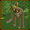
-I really liked the mine-field exploration adventure ride...especially as a secondary ride to "SpitFyre".
-Lots of cool details all over the adventure ride...from the land mines, the area where riders ride through cannon fire, the mud pit, the torches, etc. looked great.
-Also really liked the driller Heartline coaster...it's rare you see these, and even rarer that you see them with a theme that makes sense...so double props.
-Beautiful quarter tile landscaping.
-Here's a shot of "SpitFyre"...love the spiral launch tower with the overgrown foliage inside...really cool to watch the plane take off from there.
-The station with the mine train theming is awesome.
-I love the oil rig looking S&S Tower, despite how small it is.
-Nice shot of the actual "SpitFyre" plane that riders ride in.
-A shot of the wooden coaster, a ride many didn't like but I enjoyed for some reason. It never really went too far above the buildings, which I would imagine would be pretty exciting going at those high speeds.
-Neptune's Caves was also a beautiful looking dark ride, despite being pretty damn boring on the inside.
-The "Sphinxinator"...so cool. Only way to describe this one.
-The multi colored paths got real played out back in LL times, but they work here with the dirty/bazaar type of atmosphere you got going.
-The unusual map edge theming you have here (and all over the rest of the map) was strangely charming.
-So cool...just had to reiterate how cool this ride was.
-A pretty damn unusual rapids ride...that looks really cool, even if it would probably make for an awkward/somewhat boring ride in real life.
-The rapids bridge on the left hand side of the screen was done perfectly.
-The finale drop of "Bone Collector" was a bit cliche'd, but I love it anyway.
-The waterfall behind the drops really added so much to the screen, even if it didn't have any effect on the ride.
-Great use of jurassic looking colors.
Final Thought: Despite the obvious flaws of this park, I just enjoyed looking through it so much that I was pretty surprised by other judges' scores. I felt this was would be one of the more enjoyable ones across the board since it's not 'conceptual' and it's just fun to explore. There were some technical flaws throughout it, but I had a blast looking through this. -
iris
Offline
3...(shocker)

Pros:
-I LOVE storytelling parks...and I was completely engulfed into the storyline after reading the readme.
-Such a cool dark, horror movie-esque atmosphere throughout the whole park. Almost feels like a Halloween Horror Nights type thing..only with a universal plot, making it even cooler.
-Great ride line up...with the Diver, Mine Train, the Woody, the Rodent, the Shuttle Loop, the River Ride, the custom drop towers, etc.
Cons:
-The custom language was a noble idea, but really was unnecessary and over the top. I didn't even bother with this for 20 seconds.
-The fort area was a nice contrast from the rest of the park, so I'm glad it was there...but I felt quality wise it wasn't quite as good either.
-There were places of the park that were much better then others in my opinion...which could either mean some places were just downright amazing, others were lackluster, or both...I can't really tell.
Screens:
-Forts are pretty damn tough to pull off, and this was one of the better forts I've seen. The elevated cannons looked awesome.
-Had to show this awesome bridge.
-I really liked the walkthrough graveyard in the bottom right hand corner.
-In the top of the screen you can see the beginning to what becomes a very impressive walkway.
-The Shuttle Loop was kinda cool...but didn't really do anything for me honestly.
-A shot of the awesome journey the river ride takes you through. The bridge is executed perfectly...I never realized what a sucker I was for a damn good bridge.
-The drop with the walkway headchopper was picture perfect.
-Also a nice drop with another headchopper in the upper right hand corner..making the ride not only scenic, but pretty damn exciting too.
-The chamber with the 666 pour trapped souls...such a cool detail (lol I guess the first peep didn't drown yet, hence the '667' in the screen)
-You can barely see the finale drop to the Dive Machine, as the blood stained drop leads riders into the smokey abyss.
-The pool of blood was cool too.
-The awesome finale drop to the Dive Machine...including the blood waterfall where the literal head chopper is..
-The architecture with balconies overhanging the cliffs below looks awesome as usual.
-The blood drenched (noticing a trend here?) goblet of fire was such a cool added theme detail.
-I also really liked the walkway with the lit torches leading up...totally reminds me of some sort of foreign tribe.
-One of Cork's biggest strengths is his ability to make absolutely gorgeous gigantic buildigns. This large cathedral/castle thing was awesome.
-The four way blood waterfall coming down from the apex of the mansion was such an unexpected, yet awesome idea.
-I love the path lit by flames that lead up to the large loop of the Diver.
-The mine train was probably the coolest ride in the park...had to show a screen of it. I love that part held up by the slanted quarter tiles. Not to mention the diagonal part with the wooden support.
-I just really liked that little 'one-stop shop of death' thing right there.
-Good foliage in this area, as well as architecture.
Final Thought: Originally I had this in number one...and when I started this post I planned on putting it at 2. I'd say it's pretty dead even with the park I have at number two right now, but since I'm in a 'little things' kinda mood at the moment, and some parts of the park paled in comparison to others in Tierre Mortica, I gave the other one the edge...by the closest of margins. Still, I believe this is the most solid, complete, and memorable entry of the contest, and probably Corkscrewed's best work to date as well. -
iris
Offline
2...

Pros:
-An absolutely insane number of cool little details.
-While it doesnt LOOK like the most realistic park I've ever seen, the attention to detail and the little touches applied everywhere make it the most realistic park I've ever seen.
-Absolutely amazing coasters, including probably the best Invert I've ever seen in RCT2.
-So many cool hacks.
Cons:
-A bit overcramped...great quality everywhere, but might have served better as a full park project where more room between the areas would have been possible.
-I wish there was some way to make the overgrown forest idea (pulled off brilliantly) somewhat better looking. Only a minor problem though.
Screens:
-First off...the overgrown trees. How fucking brilliant. So much better then the goofy overgrown trees people used to make, these actually look like trees!
-I absolutely loved the escalators (bottom of screen)
-The log flume had several awesome little touches. The visible brakes after one of the drops (an awesome realistic touch), as well as the bobsled track that supports one of the turns (barely visible in this screen).
-I also thought the use of the foliage on the roof of the queue line kept in tune with the theme very well.
-More custom overgrown trees!
-I just wanted to point out the actual working rotating station here.
-Also a very cool, somewhat hidden large drop on the Log Flume, barely visible through the Redwoods.
-The now-famous super soaker coaster, with all the appropriate features to it. You got the waterfalls that each coaster car must go through. You got the water shoot flying up (the aqua spinning car in the upper left), a fountain shooting water at the cars in the upper right, as well as the merged track, making the perfect super soaker track.
-The lazy river is always fun to have in a waterpark.
-Also want to mention the working water slides, first seen in SFWOE, but still awesome to this day.
-The Mardi Gras/Louisiana area, such a huge contrast from the neighboring overgrown forest (in a good way). First I want to point out the awesome lights used, really brightening up the festive atmosphere of New Orleans.
-Here we see the Intamin Rocket coaster, fully equipped with realistic touches like the brake on the ride's hill...something I've never seen done in RCT before (or at least dont remember).
-The custom ferris wheel is just pure Phatage hacking goodness.
-I also appreciated the Hurricane Katrina Memorial placed in the lower left hand corner. I'm not sure if the area would have felt right without it.
-Somehow, in such a small space, Phatage really pulled off an amazingly convincing western town. The storefronts are damn near perfect.
-I love how Phatage gives us a shot at the back of some of the facade's on the roovetops. Great realistic attention to detail.
-Gotta love the multi-layered land/mudstains on the rocks he made with tan glass walls all throughout this area. Little things like this are what separates Phatage from everyone else.
-Also, gotta love the working gears underneath the Magic Carpet ride.
-The very impressive dueling wooden coasters, obviously modern with the steel crossbraces.
-For some reason I also really liked the overgrown desert shrubs invading the scrambler.
-The insane ski resort area of the park. Here we get our first shot of the coaster of the contest, "Denali", with the custom ski-lift hill as well as the floor for the brake run area.
-I love how well you portrayed the ski lodge at the ride's station. Very reminscint of Alpengeist, but not in a rip-off kinda way.
-I also really appreciated the addition of advertisements in this park, with the beer ad on the side of the bridge, as well as what appears to be a baseball score right next to a Verizon logo. Little touches...
-Another amazing shot of "Denali", once again showing off the custom ski-lift, some of the beautiful sweeping turns, as well as the perfect custom support job.
-So anyways...how damn cool does that whirlpool look? And then add that to the fact that the rapids ride swoops around it, as if getting sucked in was just the icing on the cake. Too much.
Final Thought: A most deserving winning entry. It may not be the best looking piece of the contest, but with all the cool touches you're bound to find everywhere in the park for months and months...I really can't remember a piece of work quite like this (except maybe for my #1 park). From far away the park may look like a mess, but zoomed in and under the magnifying glass, it's pure realistic genius. Congrats Phatage on the well deserved win..and for representing Sydney in the meantime
-
iris
Offline
1.

Pros:
-Just as much (or more) little touches as Phatage's park...only with a Disney twist!
-So many of the rides and ideas just seemed like realistic Disney ideas...and still managed not to be too boring or kiddy.
-The attention to detail was absolutely insane...from the hidden Mickeys to the murals on sides of buildings, to everything. Incredible.
-The whole concept of the park was just genius.
Cons:
-It's missing a corner.
Screens:
-First off, he MADE THE DAMN DISNEY LOGO.
-Secondly, I love the miniature versions of the hot-air balloon, helicopter, and plane...each serving as mere appetizers for what's in store on the inside.
-Little touches, such as referring to each entrance gate as 'terminals' really helped convey the theme.
-Don't forget the Disney logo.
-Just wanted to point out two of the large custom planes that can be found on the DisneyAir 'runway'.
-Love the sirens placed everywhere also.
-Also, not to give it away or anything, but wanna point out the cleverly hidden Mickey in the flower bed to the right.
-It doesn't look perfect, but it's about 1000X closer then I thought anyone would ever get to recreating the look of Mission: Space.
-You gotta love the landing pod that guests are open to explore on the adventure car ride. American flag was a cool little touch too.
-There's one little shop you have to enter through futuristic little tubes towards the left side of the screen that's partially blocked by the Rocket Rods. Still, an awesome idea.
-Simple yet effective, the heartline track works wonders for the screen on the Rocket Rods.
-Lots to see here. First of all, I love the simply yet aptly named "Flying Saucers", as they're buried in the large moon crator, dwarfed by what seems like a huge alien creature or something. The elevators/operating booths are such a damn good touch too.
-Gotta love the realistic looking launching pad.
-I also really liked how he had a plethora of rockets decorating the midway of the Starry Skies area. Almost reminds me of my visit to the Kennedy Space Center.
-Also, worth checking out the little atrium that seems to house it's own oxygenated environment.
-Here we get what seems to be a sneak peak of the launched looper, with the beautiful sweeping turn leading into the corkscrew.
-Here's one of the absolutely brilliant mirages on the sides of the building. Space, and even a rocket taking off can be seen on the sides of these buildings, something that just screams out Disney to me.
-Also, always fun to have the Mickey logo on top of the building.
-Here we see the entrance to the impressive Open Skies area. First and foremost, it's impossible to ignore the rideable hot-air balloon.
-We also get to see the entrance to "Around The World In 80 Days" here, as it sits under the base of the Eiffel Tower. Great job with the supports on that.
-Also a great little shot of the launch tube of the looping Intamin coaster, as well as the sun/moon it flies by.
-A better shot of "Discovery Mountain"...again with the sun and moon you fly through.
-The large satellite on top of the building was a cool idea.
-Also, the now famous hack that I don't even have to mention that everyone will immediately try and copy (the vertical cars going up and down)
-Not pictured, but still incredible, is that this coaster has custom supports...even though it's indoors! Wow.
-What you see when you simply cut away some of the ceiling pieces to the "Discovery Mountain" building.
-The Laputa area. So not only do you have custom track holding up a suspended car, but you also have a huge custom tree it goes around. And not only do you have a huge tree, but you even have custom clouds at the base of the tree! And not only do you have those stationary clouds, but higher up, clouds in rotation as well. At a loss for words at this point.
-Another little atrium to enjoy here.
-I love the queue line theming you got here. Not to mention the part where the queue line hangs precariously over the ditch, held up by the slanted inverted supports.
-The phoenix-looking logo is pretty bad ass. Plus it's held up by two robots which is always cool.
-I also really liked the diplidated house you've got there, that comes with steps for those who want to climb to the top of the house.
-Getaway planes! At least that's what they felt like to me.
-Two cool little fighter jets.
-Also, another custom plane, this time with it's own boarding ramp. And to make matters even cooler, there's a shop under there!
-Who knew such a simply shaped, huge amphitheater could look so awesome! Soarin' Over The Globe really looks amazing here.
-I love how the murals continue, this time painting the top of the buildings to look like clouds in the sky.
-The hectic, yet realistic queue line works perfectly at the entrance to these massive buildings.
-There's also a small taste of the park's centerpiece mural in the bottom right of this screen.
-So who else thinks "The Rocketeer" logo looks absolutely sick right there?
-The spotlight on top of the warehouse was an awesome idea, pulled off perfectly.
-I love how the coaster flys directly out of the top of the warehouse.
-Another little plane to add to the atmosphere over by the entrance.
-Nice watertower too.
-More murals! Now you see the setting sun against the cloudy sky as you ride "The Rocketeer". It really doesn't get much cooler then that.
-For the "Condor Racing", you've got the street light starting post. You've got the stands that come equipped with motor oil advertising. You've got the checkered flag station. Oh yeah, and the insane Flying Coaster flying above.
Final Thought: Even 15 screens of the coolest parts doesn't do this park justice. My favorite park of the contest now, and I'm still wondering why I gave it 4th back during the judging. Not sure if it would have made a huge difference in the scoring, but congrats to X-Coaster anyway...you're fast becoming one of my favorite two or three parkmakers at the site! -
 J K
Offline
Disney air is definatly the best entry of the competition for me. It shocked me how much i enjoyed it.
J K
Offline
Disney air is definatly the best entry of the competition for me. It shocked me how much i enjoyed it. -
 Toon
Offline
You probably ranked it lower than you should of for the same reason I did. It was so outside the box and not in the classic NE-style that it was hard at first to digest how great it was. There's so much there to take in that I saw things in the pics you posted that I hadn't noticed before...and I've looked at the park a lot. I still have minor problems with the 'warmth' of the park, but the brilliance of the ideas and execution were unmatched in this competition.
Toon
Offline
You probably ranked it lower than you should of for the same reason I did. It was so outside the box and not in the classic NE-style that it was hard at first to digest how great it was. There's so much there to take in that I saw things in the pics you posted that I hadn't noticed before...and I've looked at the park a lot. I still have minor problems with the 'warmth' of the park, but the brilliance of the ideas and execution were unmatched in this competition. -
 Phatage
Offline
Nice review of all the parks, I appreciate the time and effort you put into this. I'm also very interested to see if Nate or Fatha's opinions have changed as they have been the only two not to really voice it.
Phatage
Offline
Nice review of all the parks, I appreciate the time and effort you put into this. I'm also very interested to see if Nate or Fatha's opinions have changed as they have been the only two not to really voice it.
btw, that wasn't a score for a baseball game, but if you take a step back then it will be a tidbid more clear
-
Corkscrewed Offline
Geez, I've got a lot of catching up to do in the details department! Iris found several details I had missed, and I'm in total awe. Yeah, I dont' mind getting bumped to third if it's behind these two masterpieces. Congrats, and thanks Iris, for doing this! -

Fatha' Offline
Yes, DisneyAir is incredible...unfortunately for me Phatage still wins this only because of Denali....but both are pretty much interchangeable at 1 and 2. -
Xcoaster Offline
Thanks for the reviews, Iris. They've been interesting to look at. I'd never noticed the cannons in Cork's fort before. That's a really, really cool detail. And thanks for the 1st place. I really didn't expect that, especially after you gave me 5th in the judging. I still probably wouldn't have beaten Cork's though, so it doesn't matter.
That was actually supposed to be the Encounter Restaurant from LAX over the crater. Despite being really scaled down, it thought it worked well for a few reasons:-Lots to see here. First of all, I love the simply yet aptly named "Flying Saucers", as they're buried in the large moon crator, dwarfed by what seems like a huge alien creature or something. The elevators/operating booths are such a damn good touch too.

1. It goes with the airport theme.
2. The Encounter Restaurant at LAX was themed by Disney and they've talked about doing something similar in their parks (which I didn't hear about until after I'd made it).
3. It has a UFO/alien/sci-fi look to it that also works well with the futuristic Starry Skies area.
4. It's a cover for the Flying Saucers ride, while looking sort of like a Flying Saucer. This wasn't in the original plans, but it saved on space and having the entrance through a crater provided a more distinct transition into the area.
Anyways, I have a feeling I'm going to have a hard time topping DisneyAir with any of my future parks, especially those based on my older concepts, like my A. C. Clarke park. I think it's largely just because I found building with the knowledge of what Disney parks are like made it a lot easier than just throwing together one of my Xcoaster Int. parks where I have little to base it off of. Plus, with this it was easy to think of lots of little details that fit in. I guess I'll just have to get more creative. -
eman
Offline
I found a ton of other tiny details on your park Phatage, I'm just too lazy to post screenies. Some of the details are really astounding though, and hence why I think it was deserving of the number 1 spot. Iris, these reviews were great, they really convinced me that your ratings were accurate to how they should be, and its great to see you showing so much interest in all of the great PT entries.
-
 JKay
Offline
Nice thread Iris, a great read. I still think this contest was like the "Top Gun" of RCT contests and that I "goosed" myself....
JKay
Offline
Nice thread Iris, a great read. I still think this contest was like the "Top Gun" of RCT contests and that I "goosed" myself....
-
 Coaster Ed
Offline
I didn't even look at these parks until recently, and there's so much cool stuff that writing reviews would be a big project, but since this got bumped I might as well take the opportunity to say that Disney Air is very close to the coolest thing I've ever seen anyone do in RCT. Just an amazing accomplishment. I hadn't looked at it yet when we went to Disneyland or I would have said so. Very nice work Xcoaster. Very very nice.
Coaster Ed
Offline
I didn't even look at these parks until recently, and there's so much cool stuff that writing reviews would be a big project, but since this got bumped I might as well take the opportunity to say that Disney Air is very close to the coolest thing I've ever seen anyone do in RCT. Just an amazing accomplishment. I hadn't looked at it yet when we went to Disneyland or I would have said so. Very nice work Xcoaster. Very very nice. -
 chapelz
Offline
I agree Ed I just recently went over all the parks and I too came to the conclusion that Disney Air should have won.
chapelz
Offline
I agree Ed I just recently went over all the parks and I too came to the conclusion that Disney Air should have won. -
Fatha' Offline
I didn't even look at these parks until recently, and there's so much cool stuff that writing reviews would be a big project, but since this got bumped I might as well take the opportunity to say that Disney Air is very close to the coolest thing I've ever seen anyone do in RCT. Just an amazing accomplishment. I hadn't looked at it yet when we went to Disneyland or I would have said so. Very nice work Xcoaster. Very very nice.
I agree Ed I just recently went over all the parks and I too came to the conclusion that Disney Air should have won.
I would agree if Denali was not in Phatage's park.
But DisneyAir has the best "attention-to-detail" that Ive ever seen in a park, and because of that it feels the most like a true theme park out of anything ever made. Couple of details:
- Wall facades with landscaping going into it to make it appear like a horizon.
- Roof facades to make it seem like Rocketeer is soaring above the clouds.
- Wall facade in lunar base to give the impression of space.
- Various airplanes/helicopters
- Control Tower
- Condor Flats Elevation Sign
Etc Etc....All of these details means the park was VERY well thought out and executed very well. Ive come to realize that paying attention to little details in a park is far more important that making a park very detailed. Confused? Here Ill use screens as an example:
Attention-to-detail
The sun, the moon, the radar tower in the bottom left.
The building facades along with the landscape, the stadium seating, the finish line, etc etc.
The coaster entrance is majestic, just like the ride....the "ruin" feel, etc.
Area entrances should have much more effort put into them, and this is a good effort.
Being Detailed
I can criticize myself. For an Aruban theme, it looks a bit generic, and while the hacking has effort, it has no though put into it in regards to theming.
For a pirate ride, that speaks nothing. Its just blocks stacked with windows and roofing.
Again, it looks pretty, but what purpose does it serve?
Same as above.
See what I said about my first BGSS screen.
That is why DisneyAir is so incredible while parks like Sea World Brisbane got hammered by me. Phatage's park does have some of the same qualities as X-Coasters, but what separated Phatage's park was Denali and the Rocket coaster. Rides are also very important. -
Coaster Ed
Offline
Excellent assesment, I agree. You can make something detailed and it could still be boring if the details aren't thoughtful. And I thought the same thing about parts of BGSS. Your landscaping is incredible and so are your rides, but there was a lot of hacking that looked a little too random. Some areas like El Dorado and Macchu Picchu were better in that regard. The difference is that a park with a lot of details looks good, but I lose interest after a little while because I'm essentially looking at a flat canvas. But a park with a lot of attention to detail will hold my attention for a long time because I see something new and interesting around every little corner. It feels more interactive, more three-dimensional. More like I'm there.
(Which is also why I say Cajamarca isn't very good. Lots of detail, not nearly enough attention to detail. Blood Island was much much better in that regard.)


Tags
- No Tags