(Archive) Advertising District / Kingdoms of Zaria
-
 25-December 06
-
 Lloyd
Offline
Well guys, i finished a micro park so now its on to bigger (and hopefully better) things. I've started a new solo, which at this moment in time i can't tell you much about. I dont want to pre-plan themed areas, as they're likely to change
Lloyd
Offline
Well guys, i finished a micro park so now its on to bigger (and hopefully better) things. I've started a new solo, which at this moment in time i can't tell you much about. I dont want to pre-plan themed areas, as they're likely to change
Here's something to kick things off with: Entry Plaza
Comments please?Edited by Lloyd, 22 February 2007 - 08:50 AM.
-
 woofenskid
Offline
wow.. those colors.. but somehow, they work. I like the feeling i get from this screen, it's got a very.. i don't know, almost rustic feeling to it.
woofenskid
Offline
wow.. those colors.. but somehow, they work. I like the feeling i get from this screen, it's got a very.. i don't know, almost rustic feeling to it. -
Lloyd
Offline
Yeah i went out on a limb with the colours. I suppose i'm bored of the same old, same old. Ofcourse i'm not saying that the colours will be like this throughout!
-
 Carl
Offline
The archy is solid, good color scheme, but I dont like the use of those tall trees in this case, I think they are the "Scots Pine Trees"
Carl
Offline
The archy is solid, good color scheme, but I dont like the use of those tall trees in this case, I think they are the "Scots Pine Trees" -
 trav
Offline
The foliage is crap to be honest. The archy is cool though, interesting colours. I don't like the bins either...I think the regular bins that come with the game would be better.
trav
Offline
The foliage is crap to be honest. The archy is cool though, interesting colours. I don't like the bins either...I think the regular bins that come with the game would be better. -
 Milo
Offline
Yeah, the full tile trees are not very good. Rework those a little. The archy and colors are nice tho. The large windows and doorways kind of give it a unique feel. I also like the use of ivy on the buildings. It gives it kind of a lush, relaxing feel.
Milo
Offline
Yeah, the full tile trees are not very good. Rework those a little. The archy and colors are nice tho. The large windows and doorways kind of give it a unique feel. I also like the use of ivy on the buildings. It gives it kind of a lush, relaxing feel. -
Lloyd
Offline
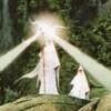
I have a story behind the park now. I'll type it up tomorrow, but for now i'll leave you with this:

Thanks for the comments so far guys! -
Lloyd
Offline
Hate to double post, but can i ask what you think of the colours inparticular? I think they work but i'd like your opinions.
-
 Genius638
Offline
the colors are great, and it looks like you have agreat atmosphere iage.....I dislike the borwn path in the middle, I would turn it to gray....but that might take away from the overall look....I'd have to see it. It looks fantastic, keep up the good work!
Genius638
Offline
the colors are great, and it looks like you have agreat atmosphere iage.....I dislike the borwn path in the middle, I would turn it to gray....but that might take away from the overall look....I'd have to see it. It looks fantastic, keep up the good work! -
Xcoaster Offline
I like the aqua blue/light red color combination. You could use a few more colors to vary it a bit, but I can't complain about what you have. It's looking good. -
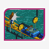 RCTCA
Offline
Just like Xcoaster said that combination of aqua/red goes really well with the surroundings. The second screen seems very misterious.
RCTCA
Offline
Just like Xcoaster said that combination of aqua/red goes really well with the surroundings. The second screen seems very misterious.
Keep it up!
-RCTCA- -
 Levis
Offline
it looks pretty nice but I misses something .... maybe you could add some minor things to the buildins is some brither colors.
Levis
Offline
it looks pretty nice but I misses something .... maybe you could add some minor things to the buildins is some brither colors. -
Lloyd
Offline
Thanks for the comments everyone, i've reworked the little things like bins etc, and also concentrated on the foliage in the first screen. Now for a little more. I don't want to show too much of this because I think if you over advertise, then the atmosphere kinda goes. More to come of this coaster though...

It is still slightly unfinished, I went back after I had taken the pic and noticed little things, nothing too major though, I suppose.
Comments, please? -
 dr dirt
Offline
I don't see how there is enough foliage to concentrate on, but you do have the amount of foliage pretty much right. I like it for the most part, but the rock arch(bottom) could use some work with the inside. Other than that it looks alright. I like.
dr dirt
Offline
I don't see how there is enough foliage to concentrate on, but you do have the amount of foliage pretty much right. I like it for the most part, but the rock arch(bottom) could use some work with the inside. Other than that it looks alright. I like. -
Lloyd
Offline
Yeah, foliage and that little bit of rock arch, little things i saw myself and changed, I should have really gone back and re-taken the pic, but i suppose i'm too lazy. I will post an update pic soon. Thanks.
-
 Todd Lee
Offline
Nice use of colors on the buildings. That's not a mix you see too often. The pink doesn't look too great though, it seems to be working against the other choices.
Todd Lee
Offline
Nice use of colors on the buildings. That's not a mix you see too often. The pink doesn't look too great though, it seems to be working against the other choices.Edited by Todd Lee, 10 January 2007 - 03:28 PM.
-
 J K
Offline
I love how you've themed the station then the drop into the lifthill, Nice job. The only things i can really say for you to do is to add a bit more detail to the buildings, develop a consistent theme throughout the area and add a few higher trees with a grass texture. It'll bring the whole screen together then. Nice work.
J K
Offline
I love how you've themed the station then the drop into the lifthill, Nice job. The only things i can really say for you to do is to add a bit more detail to the buildings, develop a consistent theme throughout the area and add a few higher trees with a grass texture. It'll bring the whole screen together then. Nice work.


Tags
- No Tags