(Archive) Advertising District / Lost Lands
-
 08-March 07
-
 Alex Rider
Offline
Lost Lands has been bringing it's guests the most cutting edge thrills and family fun for over 80 years and we wont be stopping anytime soon. This year will see tons of improvements round the park and a brand new beautiful hotel. But of course I've been a bit rude and failed to introduce you to the worlds most thrilling theme park. So without further ado:
Alex Rider
Offline
Lost Lands has been bringing it's guests the most cutting edge thrills and family fun for over 80 years and we wont be stopping anytime soon. This year will see tons of improvements round the park and a brand new beautiful hotel. But of course I've been a bit rude and failed to introduce you to the worlds most thrilling theme park. So without further ado:
Fire Hill
The first area that you need to see is Fire Hill a small village that habours many secrets...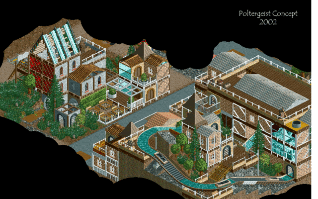
Have a facinating look at the on going restoration of the towns beautiful church. Unfortunatly guests will have to look round themselves due to some problems finding the tour guide...You can also go on a tour of the towns old factory who knows what secrets it holds.
For the braver among you take a trip to the top of Fire Hill itself and marvel at the view. You can also view the lovely abandoned houses built into the hill...Edited by X250, 05 April 2007 - 02:02 PM.
-
 FK+Coastermind
Offline
well it looks interesting. i like the feel of that log flume going through the buildings and sorta a tangled look. as for the buildings themselves they are very open. almost like someone forgot to put the walls on them. it also looks VERy random. lots of different textures per wall on one building. also make sure you detail doesnt ruin the building. in the center of the first screen and some in the second alot of building have a bar going up the middle of the window, almost like a jail. detail is good but not if it becomes inpractical. i liekt eh look of the second screen but again someplaces bad detail and other places not enough. also most buildings have some sort of pattern within the building itself. good start!!
FK+Coastermind
Offline
well it looks interesting. i like the feel of that log flume going through the buildings and sorta a tangled look. as for the buildings themselves they are very open. almost like someone forgot to put the walls on them. it also looks VERy random. lots of different textures per wall on one building. also make sure you detail doesnt ruin the building. in the center of the first screen and some in the second alot of building have a bar going up the middle of the window, almost like a jail. detail is good but not if it becomes inpractical. i liekt eh look of the second screen but again someplaces bad detail and other places not enough. also most buildings have some sort of pattern within the building itself. good start!!
FK+Coastermind -
 Genius638
Offline
The first screen is good, nice theming for the log flume
Genius638
Offline
The first screen is good, nice theming for the log flume
what's with the castle stuff in the second pic....I'm not sure what theme you're going for -
Alex Rider
Offline
FK+Coastermind: I'm not sure quite what you mean about the buildings lacking walls really but I get what you mean about the detail. I quite like the detail I have on there if I'm honest as it looks unique but if anyone else says anything negative about it I'll change it. I may make some tweaks to it anyway.
tracidEdge: Cheers I'm glad you like it and I belive this is one of the most positive coments I've had about one of my parks.
Genius638: Thanks. I use the castle doors because they look more interesting than the other non custom scenery doors.
Gwazi: Some people do seem to ignore the text but I'll give Genius the benefit of the doubt.
Next update...When I have something finished to show. -
 JDP
Offline
I think ride6 is going to have to change his favorite n00b. I really think this is promising... il ike it.
JDP
Offline
I think ride6 is going to have to change his favorite n00b. I really think this is promising... il ike it.
-JDP -
 Lloyd
Offline
Your style is really unique, easy to identify.
Lloyd
Offline
Your style is really unique, easy to identify.
Personally though, i've never been attracted to your work, clearly other people are. But for me, it doesn't work. I think it makes your stuff look too basic in places, and overall i really dont find it aesthetically pleasing. -
JDP
Offline
^I'm not either. But its unique so it makes me like it if that makes sense...
-JDP
Edit for the sake of te :-D
-JDPEdited by JDP, 12 March 2007 - 02:53 PM.
-
Genius638
Offline
^ Why don't you read the text?
screw you, I read it. There's nothing abotu a castle in there. A church, I guess, could have castle walls but i didn't think that was the chruch in the second screen. -
 Gwazi
Offline
1) He has no custom scenery, and since when did you have to be doing a castle theme to use castle walls?
Gwazi
Offline
1) He has no custom scenery, and since when did you have to be doing a castle theme to use castle walls?
2) I was just trying to help, not insult you, so I think you over-reacted slightly. -
Genius638
Offline
well you assumed that I didn't read it....when I really do take the time to look at everything before I post.
-
Gwazi
Offline
I didn't assume you didn't read it, I assumed you either missed that part or misinterpreted. Sometimes I miss text and have to edit my post myself...
But whatever. Sorry for screwing up your topic, Alex Rider. The screens look nice. -
Alex Rider
Offline
Just to add the text does add quite a bit to my parks as I sometimes enjoy creating the ride stories just as much as the ride it self. But I'm not acusing anyone of not reading it I'm just advising that it's a good idea to read the text with my screenies. This applies to other people parks too.
But I didn't explain why I used castle walls (mainly because the posts with screens are meant to seem realistic and by the park.) I needed some sort of detail on that side and decided windows were best. Now quite a few churches were built in medievil times so the castle windows do fit in. They also have no glass in them which helps to make the church look run down (which is why I used wooden coaster for the roof and it has scaffholding on it.) Hope that clears up why I used the windows and gets the topic back on track a bit. Oh and you didn't screw up my topic either Gwazi.
JDP & Lloyd: Thanks for comenting even if you don't like the style of my work.
I will also take this opertunity to say that the next update could be a while away and will be small when it does come mainly because I've been struggling to build stuff I like. But I've changed the theme for the next area and planned it pretty well so it should get back on track. -
Alex Rider
Offline
Post removed as this ride will be going in a different park in the resort. Thanks for all coments on it and I will take these into account when I start on the other park.
Edited by Alex Rider, 05 April 2007 - 04:25 AM.
-
![][ntamin22%s's Photo](https://www.nedesigns.com/uploads/profile/photo-thumb-221.png?_r=1520300638) ][ntamin22
Offline
fire river, eh? intruiging. the station structure looks good, nice trackitecture roof.. not sure what that path on the right is about. you've gota glitched window on the left side, too. is that yellow grid in the distance? just to have to see more of that before commenting.
][ntamin22
Offline
fire river, eh? intruiging. the station structure looks good, nice trackitecture roof.. not sure what that path on the right is about. you've gota glitched window on the left side, too. is that yellow grid in the distance? just to have to see more of that before commenting. -
Alex Rider
Offline
You on about the one that has the queue sticking out of it? I sort of had to bodge the queue a bit to fit it into that building so the queue sort of goes through the roof (it's not that noticable.)you've gota glitched window on the left side, too.
Thanks and the whole floor of the station is pathed to add a bit of realism (I couldn't fit proper waiting areas in.)the station structure looks good, nice trackitecture roof.. not sure what that path on the right is about.
Yep there will a building built there at some point although it's not actually in this land.is that yellow grid in the distance?
Correct.I think its fire starter... looks teasing...
-
Genius638
Offline
the last screen is decent. I'm not really fond of the colors, they're just so dark and, pardon, but ugly. there's too much gray. but the archy of the station is decnt, though we can't really see much of it's surroundings
Tags
- No Tags