(Archive) Advertising District / Dump-Place
-
 19-April 07
-
 disneylandian192
Offline
I think what you built with the right color scheme would look pretty good actually. Unfortunately you picked two colors that aren't just awful together, but would look awful separately on any building in this manner. Your archy is getting much better DH, really. Just hone your coloring abilities to match that.
disneylandian192
Offline
I think what you built with the right color scheme would look pretty good actually. Unfortunately you picked two colors that aren't just awful together, but would look awful separately on any building in this manner. Your archy is getting much better DH, really. Just hone your coloring abilities to match that. -
 nin
Offline
I actually thought your building was an attempt at some for a studio park. If that's the case than wood is probably not the best texture to go with. No matter where the building is placed , the elements just aren't working together. You've colored it like it was meant to be some eye-catching rollercoaster rather than a building, plus there's some texture clashing going on as I already mentioned.
nin
Offline
I actually thought your building was an attempt at some for a studio park. If that's the case than wood is probably not the best texture to go with. No matter where the building is placed , the elements just aren't working together. You've colored it like it was meant to be some eye-catching rollercoaster rather than a building, plus there's some texture clashing going on as I already mentioned. -
 Steve
Offline
Steve
Offline
I need to see more of this.
This is actually moving pretty quickly!
Lets see if I can play some RCTNW style;] -
 trav
Offline
There are some things in real life that don't transfer to Rct very well. This is one of them I'm afraid.
trav
Offline
There are some things in real life that don't transfer to Rct very well. This is one of them I'm afraid. -
 FK+Coastermind
Offline
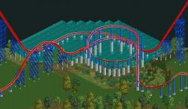
I do understand the supports, as that is realistic to the original coaster i believe you are using as inspiration. That difference, however, is that the original has such low to the ground supports. idk how it would affect this coaster, but it might look better and less "oversupported" if you lowered the feature to be just above the water. That being said, i appreciate the simplicity of the screen.
FK+Coastermind
Offline
I do understand the supports, as that is realistic to the original coaster i believe you are using as inspiration. That difference, however, is that the original has such low to the ground supports. idk how it would affect this coaster, but it might look better and less "oversupported" if you lowered the feature to be just above the water. That being said, i appreciate the simplicity of the screen.
FK -
 A.S.Coasters
Offline
i think it would look perfect just as long as the footers arent so tall, they look good on the bottom of the drop though.
A.S.Coasters
Offline
i think it would look perfect just as long as the footers arent so tall, they look good on the bottom of the drop though. -
 Dark_Horse
Offline
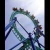
Having ridden this, the one at SFA, multiple times, you did a pretty good with the inspiration, but...
Dark_Horse
Offline
Having ridden this, the one at SFA, multiple times, you did a pretty good with the inspiration, but...There are some things in real life that don't transfer to Rct very well. This is one of them I'm afraid.
-
 Sephiroth
Offline
Holy frickity-fracking-frick-frack, I did not expect much of a reaction to the screen. Anyway, I should explain that this was a quick experiment for Intamin style box supports, so the supports on the helices were not that much of a concern.
Sephiroth
Offline
Holy frickity-fracking-frick-frack, I did not expect much of a reaction to the screen. Anyway, I should explain that this was a quick experiment for Intamin style box supports, so the supports on the helices were not that much of a concern.
All of you have valid points, and I'll explain more in the release topic later. -
Talonfan#1
Offline
I'm surprised none of you have tried this yet, but anyways here is a layout of Wing Coaster I just started working on tonight with keyholes over the entrance.

-
 AK Koaster
Offline
Layout looks pretty nice, pretty much Gatekeeper with a different drop, but still cool.
AK Koaster
Offline
Layout looks pretty nice, pretty much Gatekeeper with a different drop, but still cool. -
 Austin55
Offline
Austin55
Offline
A quick five day, 8-hour project inspired by CD5's "My first Coaster".
This reminds me of my SF:LSA days. I miss those times.
Enjoy being young, kids.


Tags
- No Tags