(Archive) Advertising District / Dump-Place
-
 19-April 07
-
 disneylandian192
Offline
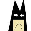
At Merlin's Magic Shoppe, one can meet the magical mischievous Merlin himself and his sidekick Archimedes, as well as purchase tokens and trinkets to aid even the smallest young wizards.
disneylandian192
Offline
At Merlin's Magic Shoppe, one can meet the magical mischievous Merlin himself and his sidekick Archimedes, as well as purchase tokens and trinkets to aid even the smallest young wizards.
"Higgitus Figgitus Miggitus Mum Prestidigitonium!"
-
 Luigi
Offline
Wow....You need interior path on the left and I'm not really a fan of the hedge-on-pole thingy. I only hope there is not too much path....Great work otherwise!
Luigi
Offline
Wow....You need interior path on the left and I'm not really a fan of the hedge-on-pole thingy. I only hope there is not too much path....Great work otherwise! -
 rct2isboss
Offline
Sorry Sparkh its really not that good. The dueling part is the only half-decent idea you have going on. Dont use to many premade objects and you need more foilage and more buildings. Look at some accolade winning parks for ideas and inspiration.
rct2isboss
Offline
Sorry Sparkh its really not that good. The dueling part is the only half-decent idea you have going on. Dont use to many premade objects and you need more foilage and more buildings. Look at some accolade winning parks for ideas and inspiration.
@robbie92 That screen is fantastic. Enough said. -
 Fisch
Offline
Fisch
Offline
At Merlin's Magic Shoppe, one can meet the magical mischievous Merlin himself and his sidekick Archimedes, as well as purchase tokens and trinkets to aid even the smallest young wizards.
"Higgitus Figgitus Miggitus Mum Prestidigitonium!"
DEFINITELY change the flat roof texture. Make it just normal black colored building blocks instead of this stuff. Besides that this is incredible! -
 Comet
Offline
That looks awesome disneylandian
Comet
Offline
That looks awesome disneylandian
Only thing other than what Fisch said is I would consider adding some detail like the sword in the stone in the middle of that path to break it up a little -
 djbrcace1234
Offline
The castle height looks appropriate, if this in fact is inspired by Walt Disney's original park.
djbrcace1234
Offline
The castle height looks appropriate, if this in fact is inspired by Walt Disney's original park.
I also agree with Comet and Fisch-- add some minor details like the little market carts that sell some merchandise on the lower left hand side, and also the castle can use some more love as well, but all in all, this is looking great! -
Sparkh
Offline
By the way, where is exactly the "top ten" of the best parks ever on this website ? There is a lot of compete and rankings, I'm a bit lost
-
 Midnight Aurora
Offline
I like your ideas, but think outside of symmetry, Sparkh
Midnight Aurora
Offline
I like your ideas, but think outside of symmetry, Sparkh
Inversed, it's ambitious, but I don't think it's very effective. Kind of lifeless without some kind of plant life, too. -
 JDP
Offline
JDP
Offline
Sorry Sparkh its really not that good. The dueling part is the only half-decent idea you have going on. Dont use to many premade objects and you need more foilage and more buildings. Look at some accolade winning parks for ideas and inspiration.
...ever think about taking your own advice?
-JDP -

inVersed Offline
Sparkh,I think the most important thing is:Fuck symetry!
Thats not necessarily always true. -
 chorkiel
Offline
Disneylandian, other than that overkill on path it's awesome
chorkiel
Offline
Disneylandian, other than that overkill on path it's awesome
Some interior path in the building to the left and different path in the castles would do too !
Sparkh, Ideawise that screen is FANTASTIC!
Too bad the execution just plainly, sucked.
Try cs and make some buildings instead of just using premade objects.
The layout isn't really realistic but that's not what I really care about right now.. -
 Dark_Horse
Offline
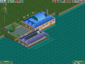
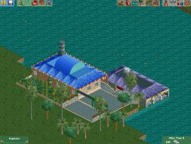
Wow, I've missed a ton of good screens since I've been gone. robbie you never cease to amaze me, inVersed, love the LL work. Pretty good shop you got there disneylandian. Agree that the flat roof texture needs to be changed there. As for me, I've been working on a Caribbean/Calypso themed hotel, and I kinda like where this backside facade is heading.
Dark_Horse
Offline
Wow, I've missed a ton of good screens since I've been gone. robbie you never cease to amaze me, inVersed, love the LL work. Pretty good shop you got there disneylandian. Agree that the flat roof texture needs to be changed there. As for me, I've been working on a Caribbean/Calypso themed hotel, and I kinda like where this backside facade is heading.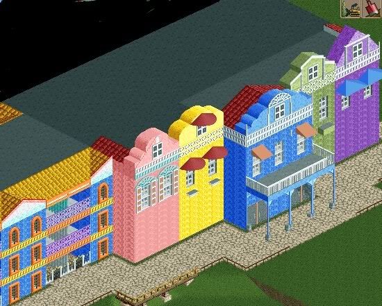
-
 SSSammy
Offline
hey dh, do you have any source pictures? it looks like you're freestyling here, which isn't in itself a bad thing, but i feel as though a more influenced approach would benefit this a lot more.
SSSammy
Offline
hey dh, do you have any source pictures? it looks like you're freestyling here, which isn't in itself a bad thing, but i feel as though a more influenced approach would benefit this a lot more.
welcome back, too. -
 robbie92
Offline
Definitely your best hotel work so far, although I do agree with SSSammy that this could use a bit more direction. Rather than just separate facades, maybe see if you can tie things in together in a better way. The middle blue building is wonderful, although the one on the left has too many crazy colors for its own good imo. The two-tile facades have a disconnect from the rest of building.
robbie92
Offline
Definitely your best hotel work so far, although I do agree with SSSammy that this could use a bit more direction. Rather than just separate facades, maybe see if you can tie things in together in a better way. The middle blue building is wonderful, although the one on the left has too many crazy colors for its own good imo. The two-tile facades have a disconnect from the rest of building. -
 Jaguar
Offline
Good to see that you haven't quit. The hotel looks decent, but I really don't like the colors on the left like Robbie said.
Jaguar
Offline
Good to see that you haven't quit. The hotel looks decent, but I really don't like the colors on the left like Robbie said. -
Dark_Horse
Offline
Thanks for the comments guys. It helps me keep going, knowing that not only can I see improvement myself, but others can as well. Sammy, I have source pictures, but I kind of was picking bits and pieces from each, so maybe that's why it looks rather unorganized. Robbie, thanks. I can see where the facades don't flow from the rooms right now, so I will change that in the new version. Jag, thanks. I will also change the colors on the left. I'm pretty sure I will be making a new version of this hotel, but I definitely want to keep the multi-facaded lobby/entrance.
-
rct2isboss
Offline
Hey guys, here are some pics from the Bridge contest but I have only done a restaurant called Medusa's Liar which it's named will be changed. Also I currently am still working on your layout trav and will try to send the park asap. One question, what are the Dat files for Kumba's 1k bush that can be placed under trees and the flowers as well?


Tags
- No Tags