(Archive) Advertising District / Dump-Place
-
 19-April 07
-
 Xeccah
Offline
SC, The architecture is great. This is thing thing that can make NCSO more effective than CS, having just enough detailing without blurring the building with all this quarter-tile objects.
Xeccah
Offline
SC, The architecture is great. This is thing thing that can make NCSO more effective than CS, having just enough detailing without blurring the building with all this quarter-tile objects.
The SLC is very accurate, as this looks pretty standard for their most common model. I'm loving the queue interaction with the coasters first drop.
The only thing I would do is to add another kind of path with the paving. It starts to get monotonous. -
 Casimir
Offline
The thing I'm not actually allowed to talk about due to rules #1 and #2 seems to have a pretty far-fetched influence humor-wise these days ;P
Casimir
Offline
The thing I'm not actually allowed to talk about due to rules #1 and #2 seems to have a pretty far-fetched influence humor-wise these days ;P
For those who are not familiar with it:
In a quirky, meme-y kind of way, this was actually a compliment to robbie! -
 Silver Edition
Offline
Silver Edition
Offline

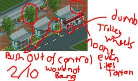
I feel so baddie right now. Any suggestions?
It's based on Silver Stars. But it looks horrible to me.
Edit: Pic fixed.. -
Silver Edition
Offline
I still see a 320x240 image. Not much to comment on.
How about now? I guess I'll upload post full size next time. -

disneylhand Offline
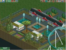
It looks pretty good to me except for the straight track and dip before the s-bend. I would suggest that you also rethink the brake run/turn into station with transfer tracks, etc. in mind.
-disneylhand -
 Ruben
Offline
Overall it's okay, but it needs cleaning up. I'd suggest:
Ruben
Offline
Overall it's okay, but it needs cleaning up. I'd suggest:
For the straight bit & s-bend in the middle you should go directly into a half-way outward bend after that hop, and then have it turn back twice. So half bend to the right, then two to the left and then one to the right. That way you'll be able to bridge that distance without awkward straight pieces, and any height differences can be smoothed out in the sections between turns.
For the end it'd be better to not have that last element after the small bunnyhop, but have a curved s-bend to the right instead. That way you end up parralel to the lifthill and you can easily create the brake section and station in a lot less sloppy way.
This feels like I didn't explain it clearly..... Is it at least kinda clear what I'd suggest? -
 Faas
Offline
Oh god I hate cropping like that.
Faas
Offline
Oh god I hate cropping like that.
Good work though. Try spicing up the top part of the tower more. -
 MorganFan
Offline
Very refreshing. I don't like the tree on the left, but I like the building a lot. I think you should keep the tower the same way.
MorganFan
Offline
Very refreshing. I don't like the tree on the left, but I like the building a lot. I think you should keep the tower the same way. -
Ruben
Offline
I think this is a major step back from what you've shown us lately. It's not bad or anything, but very uninspired. Whereas lately most of your work has been extremely interesting and refreshing.
-
 trav
Offline
I actually like this more than the other stuff you've shown. What I'd do is make the tower 1 floor higher, than make the roof into a flat style roof with turrets and just generally make the tower a bit more detailed, up to the standard of the other stuff in the screen. It's got a very peaceful atmosphere.
trav
Offline
I actually like this more than the other stuff you've shown. What I'd do is make the tower 1 floor higher, than make the roof into a flat style roof with turrets and just generally make the tower a bit more detailed, up to the standard of the other stuff in the screen. It's got a very peaceful atmosphere. -
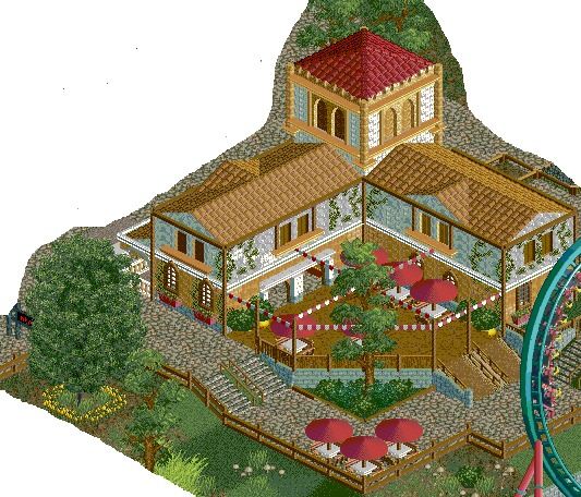
 ScOtLaNdS_FiNeSt
Offline
@Faas: It has to be done, There is nothing else built yet in that area. I will see what i can do about the tower.
ScOtLaNdS_FiNeSt
Offline
@Faas: It has to be done, There is nothing else built yet in that area. I will see what i can do about the tower.
@morganfan: Not making any promises about the tree, Cheers.
@ruben: Trust me it is inspired, This was an old bell tower. But a local resident bought it and refurbished it into a riverside restuarant.
@trav: Cheers, Its a peaceful place until the coaster comes flying by . I was thinking about making the tower bigger myself, Thanks for the suggestions.
-
 Fizzix
Offline
Very nice execution of mixing the two colors of the blocks. It's easy to add details in another color, but doing as you did with the top of that tower can be a little tricky.
Fizzix
Offline
Very nice execution of mixing the two colors of the blocks. It's easy to add details in another color, but doing as you did with the top of that tower can be a little tricky. -
 posix
Offline
Good stuff Scot. The consistent improvement in your screens never fails to impress for me. The cropping is a no-no I agree though. Hope to see a new submission from you soon.
posix
Offline
Good stuff Scot. The consistent improvement in your screens never fails to impress for me. The cropping is a no-no I agree though. Hope to see a new submission from you soon. -
 Scoop
Offline
The spanish style building project that I was working on was deleted by some rascaly little sister. So instead I have decided to go the Sixflags route.
Scoop
Offline
The spanish style building project that I was working on was deleted by some rascaly little sister. So instead I have decided to go the Sixflags route.
I present to you.....
Six flags over Charleston (the entrance). -
Fizzix
Offline
Please, no more Six Flags projects people! It's getting seriously old. It's just getting so boring to view basically the same thing over and over. mrbuckeye, if I were you, I'd build a small park off of that, not necessarily Six Flags. Just a small park. Seriously people, no more Six Flags, please.
Sorry that this happened after your post, mrbuckeye, I just needed to get that out there for everybody. You can build realistically without branding it, take a look at Watkin's Woods, the park that for the most part, started this realistic movement. Not a real brand. Again, sorry if I seem anal of dickish(didn't mean to use those two so close, lol), but it just bothers me that so many people build the same thing so often.
mrbuckeye, I like what's there, although roofs in that shape(the green ones) are very awkward. I would at least change those. Otherwise, it's nice.
That's WW/TT scenery isn't it? Bad idea...


Tags
- No Tags