(Archive) Advertising District / Dump-Place
-
 19-April 07
-
 BelgianGuy
Offline
Inspired is inspired, I don't care why or how he got inspired, I'm just glad we're having good players build good stuff... I'm eating cake so I'm happy
BelgianGuy
Offline
Inspired is inspired, I don't care why or how he got inspired, I'm just glad we're having good players build good stuff... I'm eating cake so I'm happy -
 Mr. Coaster
Offline
That looks pretty cool however trav, I like it. Maybe a big sword in one of his hands?
Mr. Coaster
Offline
That looks pretty cool however trav, I like it. Maybe a big sword in one of his hands? -
 Ruben
Offline
Trav. Have I ever told you're a hero? If not: You're a hero dude! That just looks like wicked fun.
Ruben
Offline
Trav. Have I ever told you're a hero? If not: You're a hero dude! That just looks like wicked fun. -
 Liampie
Offline
Liampie
Offline
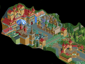
Why havent you shown me this? That looks great from the map lol
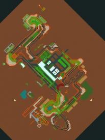
Is this your old race track? Looks cool, Austin.
-
Liampie
Offline
The individual buildings are great, but it's a collection of mostly two-toned buildings and in my opinion that doesn't work well. A little cohesion is missing.
That's my only complaint. In every other way it is a lovely screen. -
 Steve
Offline
I agree with Liam on this one. Really great shapes going on though, and love the little flourishes on the buildings.
Steve
Offline
I agree with Liam on this one. Really great shapes going on though, and love the little flourishes on the buildings. -
Ruben
Offline
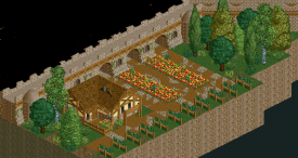
I like that you changed the ground type to grass, way better. Overall it's just very nice, quaint.
Only comment is the cracked pathing is a bit overdone/randomly scattered now. Maybe it's better if you have some bits where the path is more cracked, and others where it's hardly the case. Makes it look more natural, as right now it feels kind of all over the place. -
 posix
Offline
Very nice. Perhaps change the brown dirt path to the version with soft edges? Would look less choppy and smoother.
posix
Offline
Very nice. Perhaps change the brown dirt path to the version with soft edges? Would look less choppy and smoother. -
 wheres_walto
Offline
CF, I think the path combinations really detract from the screen. Otherwise, looks phenomenal
wheres_walto
Offline
CF, I think the path combinations really detract from the screen. Otherwise, looks phenomenal -
 BC(rct2)
Offline
Amazing, looks amazing! But I think that it would look better with other type of path, maybe what posix said.
BC(rct2)
Offline
Amazing, looks amazing! But I think that it would look better with other type of path, maybe what posix said. -
 MikaRCT2
Offline
Thank you all, I've changed the brown roof textures on the path. I've used more round pieces on the path and I've cut down the use of the roof textures. It looks way better and nicer to look at now, so thanks again
MikaRCT2
Offline
Thank you all, I've changed the brown roof textures on the path. I've used more round pieces on the path and I've cut down the use of the roof textures. It looks way better and nicer to look at now, so thanks again
-
SGT BLOOPER
Offline
Colorado-Fan: Every time I see archy like that I think about how much fun the builder must've had placing all those 1/8 and 1/16 blocks. I'm with Liampie though. It's great but the flow of it all is kinda choppy.
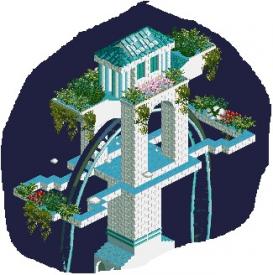
Got rct2 running on my new machine. Want some input on this particular part of a crazy fantasy design I got going. I like the main part of the tower, but then I tried extending the brick trim to interface with the ride a little more...I think I like it, but maybe I've been looking at it for too long. Thoughts?


Tags
- No Tags