(Archive) Advertising District / Dump-Place
-
 19-April 07
-

Sephiroth Offline
Curse you StormRunnerFan for doing that look well when I'm working on something similar. Good job.
-
 Steve
Offline
StormRunner, extremely classy and I'm a sucker for anything Disney. Though, maybe the black path is a little harsh? I'm not sure how it is in real life, but a new path could really inject even more atmosphere in there. Nice job!
Steve
Offline
StormRunner, extremely classy and I'm a sucker for anything Disney. Though, maybe the black path is a little harsh? I'm not sure how it is in real life, but a new path could really inject even more atmosphere in there. Nice job! -
 Kumba
Offline
It's nice and has pretty impressive architecture, just it seems a little lifeless without peeps, lamps, benches, ect...
Kumba
Offline
It's nice and has pretty impressive architecture, just it seems a little lifeless without peeps, lamps, benches, ect... -
 stephan
Offline
the entrance for my woody (because i just started with rct, i was thinking of just making entrances and learn to make good entrances and stuff)
stephan
Offline
the entrance for my woody (because i just started with rct, i was thinking of just making entrances and learn to make good entrances and stuff)
tips are welcome but just remember i just started to play this came like you guys!
*note it's not finished obvious -
 csw
Offline
Definitely do something about that huge garden, at the very least make sure it stays watered. But I would recommend not having massive seas of flowers, it's impractical. The building could do with some more trim (or something to break up the continuous brick texture). Other than that, it's a good start
csw
Offline
Definitely do something about that huge garden, at the very least make sure it stays watered. But I would recommend not having massive seas of flowers, it's impractical. The building could do with some more trim (or something to break up the continuous brick texture). Other than that, it's a good start
-
 Arjan v l
Offline
Not bad.
Arjan v l
Offline
Not bad.
I only dislike some textures, they don't really fit in the game.
I'dd like to see this more finished, since i can't really give a useful comment right now. -
stephan
Offline
hwhat you mean with trim ? sorry english isn't my first language :$Definitely do something about that huge garden, at the very least make sure it stays watered. But I would recommend not having massive seas of flowers, it's impractical. The building could do with some more trim (or something to break up the continuous brick texture). Other than that, it's a good start
/>
wich textures ? maybe i can change themNot bad.
I only dislike some textures, they don't really fit in the game.
I'dd like to see this more finished, since i can't really give a useful comment right now.
More tips are welcome! -
 Insanity
Offline
Darn I missed the Ncso fest a few pages earlier, but the AD's been shining bright recently!
Insanity
Offline
Darn I missed the Ncso fest a few pages earlier, but the AD's been shining bright recently! -
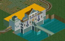
Arjan v l
Offline
It could also be because the picture is a bit screwed, jpg always screwes up rct screens.
But it's the front walls of the building (white gray), except in the middle.
The texture of those arches, at the bridge, look strange too.
Dutch: Het kan ook komen omdat het plaatje jpg is, daardoor ziet het er vaak raar uit.
Maar ik bedoel de voorste muren die wit grijsig zijn, behalve in het midden.
De textuur van die bogen bij de brug, ziet er ook wat vreemd uit.
Met trims worden lijnen bedoeld om het gebouw te accentueren. -
stephan
Offline
It could also be because the picture is a bit screwed, jpg always screwes up rct screens.
But it's the front walls of the building (white gray), except in the middle.
The texture of those arches, at the bridge, look strange too.
Dutch: Het kan ook komen omdat het plaatje jpg is, daardoor ziet het er vaak raar uit.
Maar ik bedoel de voorste muren die wit grijsig zijn, behalve in het midden.
De textuur van die bogen bij de brug, ziet er ook wat vreemd uit.
Met trims worden lijnen bedoeld om het gebouw te accentueren.
aah okay thanks! yeah i guess it's the jpg because it's the NE workbench 2013 but i'll show later a new screen not as a jpg
-
stephan
Offline
aah okay thanks! yeah i guess it's the jpg because it's the NE workbench 2013
/> but i'll show later a new screen not as a jpg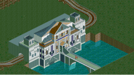
here the screen is as a png and a bit more finished.. any ideas on the back of the castle ? -
Arjan v l
Offline
^^ That's a lot better.
Forget what i said about the front walls, they look fine now.
The arches would look a lot better if they where brick, but that arch doesn't exist yet.
I'll probably make a big arch in brick texture one of these days.
About the back, i don't know what you want it to look like.
But if you need some examples of castles in rct, then check my profile.
-
 Liampie
Offline
I don't understand what's so hard about spotting fucked up colours in your own screenshots. Both screens are fucked up.
Liampie
Offline
I don't understand what's so hard about spotting fucked up colours in your own screenshots. Both screens are fucked up.


Tags
- No Tags