(Archive) Place-To-Release-Your-Parks Land / Tarean
-
 11-May 07
-

 vekoma9
Offline
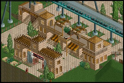
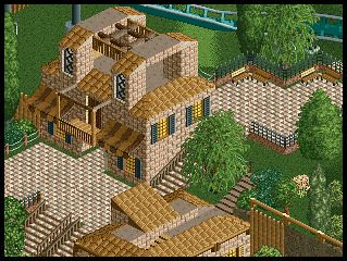
I can see why this did no get design. It seemed poorly organized and rushed. The supports also were not touching the ride on the lift, and everything seemed everywhere. Especially with the mountain it was just barren, and did not look good at all. The coaster layout it self was ok, but not nearly as good as design quality. The design lacked alot of work. the drop seemed odd, and the ending corkscrews at the end seemed to be just thron in their. I mean it wasn't horrible, but it was shown that you rushed this way too fast. The supports do need alot of work. They just need to look better. They seemed like the ride would fall down. Also, I would of suggested putting a net at the break run, it looks way too tacky. One other thing I noticed is that at the front of the park, the whole texture was grass, and there was not alot of scenery to attract the eye.
Overall I give it a 6/10. -

 Hepta
Offline
^Thanks for the rate V9. Your right, this was very poorly organized. I thought I had a good park layout, and then it just wasn't right, so I added that little below ground dockside section. Personally, in my humble opinion, I think the layout was better than OK. The corkscrews definitely weren't just thrown in there, but carefully thought out so the layout would flow. The drop was the best way I could make an Alpengiest-esqe drop, i.e. a 270* drop. The layout was meant to be fairly original, and not the norm B&M layout. I'm sure you know supports are not my thing, and they never have been, so I have to agree with you that they weren't that good, but sometimes, when the supports are connected in one angle, in the other angle they are sticking 15 feet through the track, which explains the unconectiveness that you see in certain angles. I'm must agree that I suck at supports though. Which break run are you talking about?
Oh, and the grass, that was Kumba's main complaint.
Thanks for all the comments.
P.S. This was half finished yesterday, and I just wanted to get it done, the main reason I didn't win. -

 Hepta
Offline
I was going to do a standard dual side catwalk on there, but it covered up the building behind it, so I went with one side. Thanks though.
 -

 eyeamthu1
Offline
I actually like the segment of the mid course brakes, to the final brake run. I thought it flowed nicely, the elements just looked good together, the corkscrews worked well. But I didn't really dig any of the rest of it. Firstly, it looked totally unfinished, like 50% done. Secondly, it was rushed with plenty of mistakes - e.g supports. It needed a WHOLE lot more to be design worthy.
 -

 Lloyd
Offline
Well i just took a look at this, and yeah you can see why it didn't get design. The layout started off alright, but it seemed forced. Especially those corks, it's like you thought you must have interlocking corkscrews, so you just shoved them in for the sake of it.
The mountain look pretty half arsed, and the water ride seemed pointless (if it's going to be that short or boring).
It was alright, but not design quality, clearly. -

RMM Offline
I didn't look yet. I don't have rct2 installed but it looks ok.
But I bet you would've won design if you were Phatage. -

 Gwazi
Offline
^ lol When I first read that, I thought I was in the Der Koloss topic. Then I went to that one and got a little confused for a sec.
Not bad, Hepta. Rushed, though. Too much grass too. The layout seemed fine enough to me, though. -

 Hepta
Offline
Thanks guys. This was just one of those things that I wanted to finish before I lost it, which is the reason that it's so rushed.
Lloyd: The two corks was the best way I thought to end the ride. I tried other ways, but they didn't seem to work. Oh, and if you look at pretty much any real shoot the chutes ride, you'll see that they're pretty short. Thanks for the comments.Edited by Hepta, 12 May 2007 - 09:21 PM.
-

 Kumba
Offline
I feel bed rejecting all these designs, but yeah as I told Hepta this was just to simple imo.
So thats like 5 rejected designs in a row, id feel like Bill Russel, but today I failed to shoot one down...
-

 Six Frags
Offline
Yeah, I'm expecting to see a lot more failed designs here, with the new PT qualifying possibility...
It indeed looks too simple of the screens, but I'll take a closer look in-game soon
SF -

 RCFanB&M
Offline
So thats like 5 rejected designs in a row, id feel like Bill Russel, but today I failed to shoot one down...

You mean that you shouldn't have rejected that last one...please tell me that you got more than one design
Anyway...
Hepta: it's good to see that everybody is working on something for getting into the PT3 or just for completing a park.
I think that the design was going good, but it looks like if you had suddenly stopped, and left many things kinda unfinished. First, you should have worked more on the foliage...the lack of foliage creates such an empty feel, so you must consider it as a main aspect. The buildings were ok, in cuality terms, but there wasn't enough quantity of them...a few more structures would have helped. The layout was ok I guess, it flowed well, maybe a little bit fast in some parts, but I think it was good enough. The landscaping was another aspect which looked rushed, the mountain was like too...hmm..."square".
Anyway, hope you make it next time (considering you've improved a lot and you keep doing it) and I'm looking forward to see more of your work.
 Tags
Tags
- No Tags
