(Archive) Advertising District / Music Masters
-
 25-May 07
-

Havingfun Offline
Your welcome Susanne. Its amazing what your doing with the left hand alone & I`m glad I could help make it a little easier for you.(The music-notes on the wall are made for me by Rick -Havingfun- who made a few more vey nice ones that I by no means can puzzle together from existing scenery.....thanks a lot again Rick!)
I can`t wait for the next update.
~Havingfun~ -
 Milo
Offline
Fantastic screen. My only complaint is that there is a lack of contrast on the building with all the blacks a grays. I'd like to see a little more color but it looks great otherwise.
Milo
Offline
Fantastic screen. My only complaint is that there is a lack of contrast on the building with all the blacks a grays. I'd like to see a little more color but it looks great otherwise. -
 Lloyd
Offline
Maybe it would look even better with a bit more colour, but i'm sure it'll fit in nicely with it's surroundings.
Lloyd
Offline
Maybe it would look even better with a bit more colour, but i'm sure it'll fit in nicely with it's surroundings.
Looks good, still can't believe you're more productive then most of us, even with one hand. Brilliant. -
 RCTNW
Offline
Simply stunning. I would not change a thing. As for the color, I’ve never known Suzanne to not use color. The SS shown is of a very small area in comparison to the rest of the park and perhaps this one small SS is not showing the other areas around it. For all we know, the area has too much color and this piece is balancing it out.
RCTNW
Offline
Simply stunning. I would not change a thing. As for the color, I’ve never known Suzanne to not use color. The SS shown is of a very small area in comparison to the rest of the park and perhaps this one small SS is not showing the other areas around it. For all we know, the area has too much color and this piece is balancing it out.
Again, great work!
James - rctnw -
 Midnight Aurora
Offline
It looks good, but the colour scheme doesn't scream Swan Lake to me. I'd be willing to send you copies of the peice if you'd like to hear it.
Midnight Aurora
Offline
It looks good, but the colour scheme doesn't scream Swan Lake to me. I'd be willing to send you copies of the peice if you'd like to hear it.
(i'd suggest just changing the name to Stravinsky's ballet, The Rite of Spring)Edited by Midnight Aurora, 26 October 2007 - 10:37 PM.
-
 Ride6
Offline
If you want anyone to do a design, coaster layout critique, or some landscaping I'm completely willing.
Ride6
Offline
If you want anyone to do a design, coaster layout critique, or some landscaping I'm completely willing.
I'm not worthy to build architecture next to the stuff you're doing... Damn...
Ride6 -
 Emergo
Offline
Thank you all again fo the comments!
Emergo
Offline
Thank you all again fo the comments!
For the ones that like more colour in this screen: as I said above, the surroundings are that colourfull already that I think this does fine here, but as you'll cannot see that surroundings in this screen -as well as the fact that it is taken from the "dark side", the other sight shows much lighter in RCT and shows better how the lightest yellow contrasts with the grey - I can very well understand the wishes for more colour.
So, when the surroundings are completely finished, I will certainly look at it again with your remarks in the back of my head......(but...eh..still good chance it just stays as is.... )
)
@Midnight Aurora
^ That's really a very sweet thought of you, to send me the piece. (thanks! I appreciate it when people are thoughtful like that!)It looks good, but the colour scheme doesn't scream Swan Lake to me. I'd be willing to send you copies of the peice if you'd like to hear it.
(i'd suggest just changing the name to Stravinsky's ballet, The Rite of Spring)
But ....ehhh...to be honest.... I am a lover of "classical" music from the first Gregorian singing to the newest developments now, and everything in between....and my music collection is rather large (including 5 or 6 different performances of Swan lake), and I have also seen the ballet - life, on stage - over 5 times.
Can fully imagine that this semi-modern "theater" has no particular associations with the classic-romantic music and ballet. And good that you are thinking of that!
But the small stage on the water, with it's "dancers" and the swans around it, will come closer to the romantic atmosphere...(so have patience...)
Also: interpretations of ballets develop with time......the more contemporary choreographies differ a lot from the older ones.
Will give you a small collage, of which most people will recognise/associate the first pics as the "classical" Swanlake, while the pics at the bottom are of newer performances. (Bourne, a.o.)
Those later ones impressed me very much.......so it is not just "coincidence" that I chose a strong-looking theater for it, and a more romantic "scene" for the stage....(would have preferred it the other way around, but I could not express the modern choreography in RCT.... )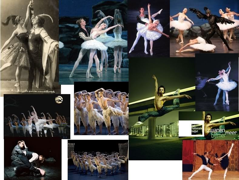
@Ride6:If you want anyone to do a design, coaster layout critique, or some landscaping I'm completely willing.
I'm not worthy to build architecture next to the stuff you're doing... Damn...
^ don't diminish yourself: I know some beautiful architecture from you in last PT-park, and in that Olympic park....but yeah...for sure amazing coasters and landscaping are your special specialty...
I'll gladly pm you
Emergo
-
Midnight Aurora
Offline
Well then... My bad. Glad to see you're actually doing your homework, rather than just assigning names that you googled. And as far as ballet goes, I'm much more interested in the music than the dance aspect.
And as far as music goes... Medea Ballet Suite by Barber is the best. -
 Fr3ak
Offline
I haven't had the time to post something to the "older" screens, but now I'm able to.
Fr3ak
Offline
I haven't had the time to post something to the "older" screens, but now I'm able to.
This brown villa is just incredible! I can't stop looking at it .. x)
The other building is very nice, too .. but I can't think of this flatride working and hiding the beautiful house, but you should have chosen another attraction for this place?
There are 2 things in this screen I don't like.
First one is this little metal fence building, next to the exit of the flatride.
And the second one are the palm trees in here ... I would remove them and maybe place some other trees .. or just have some more free space.
But don't talk about those which aren't perfect to me .. the screen is too nice in the whole.
I haven't got anthing to say about the entrance to the Armstrong area, it's just perfect
This Swanlike thing is also stunning, but I think it's a little bit to gray ..
But if the area around isn't that gray, it's okay though.
Very nice park so far .. you're doing your job perfectly despite of your handycap ..
-Fr3ak
...is waiting for bigger screens
-
Emergo
Offline
^ good to hear you like it, Freak.
Most things (not all, Lol!) I am also contented with how they came out.
Don't worry about the Enterprise taking away too much of that white bulding: first, after all the building is scenery, and second: I checked it again (so still good you mentioned it!) and the enterprise-in-operating-mode still is rather transparant.....
Peeps are with their backs to the building, and if they have time to see anything when they are on the ride, they'll face Satchmo's trumpet.....
Yeah, the grey fence-building is a little stall: wanted it to take up as little room as possble and a bit in the style of the N.O.-fenced-balconies.
The palm-trees: cannot help it, but I seem to like them....even if I know many people don't (see other comments)
And, as said, the area around the theatre will fully make up for the grey there, with purple and red and pink and blue...... Unfortunately I won't have much time coming weeks/(months?) to build, so patience on the next screens...
Emergo
-
Valp
Offline
Everything is brilliant. Lots of love.
As for the Tchaikovsky sign, would his name fit if you left off the "T?" I myself prefer the original spelling, but alot of music history texts today are spelling it "Chaikovsky."Edited by Valp, 10 November 2007 - 03:09 PM.
-
Emergo
Offline
Everything is brilliant. Lots of love.
As for the Tchaikovsky sign, would his name fit if you left off the "T?" I myself prefer the original spelling, but alot of music history texts today are spelling it "Chaikovsky."
Thank you Valp.
Good to hear you like it, wish I could call it "brilliant" myself also, but that's not the case, although I am not unsatisfied
Yep, I am sure (T)Chaikovsky also fits.
I just get a bit mixed up....like what is the best translation from Russian, what is it in my own language and what is most recognisable in English.....so just give me advice please....
And yep! there will certainly be areas themed to classical music (my biggest passion, lol!)
Emergo
![][ntamin22%s's Photo](https://www.nedesigns.com/uploads/profile/photo-thumb-221.png?_r=1520300638)

Tags
- No Tags