(Archive) Advertising District / Roslyn Resort
-
 23-August 07
-
 Comet
Offline
Logo, thanks to hpg:
Comet
Offline
Logo, thanks to hpg:
Hotel (unnamed)- 5%
Casino (unnamed)- 1%
The Boardwalk at Roslyn Resort- 50%
-Main Street- 85%
Comet- Wooden Coaster- 85%
Tango- Spinning Cups- 100%
-FunFair-100%
Flying Fish- Enteprise - 100%
Retro Cruiser- Custom Looping Coaster-100%
Sandblaster- Top Spin- 100%
Scrambler- Scrambler- 100%
-Buccaneer Bay- 5%
Unnamed- Water Coaster- 0%
Unnamed- Swinging Ship- 0%
-Fantasy Forest- 35%
Dune Blasters- Dodgems- 100%
Grand Carousel- Carousel- 50%
Hornet- Inverted Impulse Coaster-15%
Vintage- Car Ride- 10%
Comments and criticism appreciated...Edited by Comet, 15 September 2007 - 01:02 PM.
-
 CedarPoint6
Offline
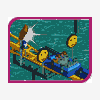
Too much path. Some games sections in the middle and more planters would help. Maybe some signs as well, but besides that, it seems pretty nice.
CedarPoint6
Offline
Too much path. Some games sections in the middle and more planters would help. Maybe some signs as well, but besides that, it seems pretty nice. -

inVersed Offline
The atmosphere (or lack there of) really downs that screen... it just looks so bland for some reason. I do love the spinning cups, some great details on that ride... I look forward to seeing more from this park
BTW... nice logo, i really need to contact hpg for a logo for my solo
-
Comet
Offline
Replies:
CedarPoint6- Yeah, I'll take care of the path problem. And by signs, do you mean on the buildings? Because I have food stalls inside the buildings for naming purposes, because whenever I add signs it makes my buildings uglier.
--------------------
inVersed- I don't know what it is but I keep getting comments about the lack of atmosphere, hopefully other screens will be different, what is it that would make a good atmosphere? And yeah, hpg did an AMAZING job with the logo.
-------------------- -
 RCTCA
Offline
This is some really good work Comet. Though i hate the overload of path everything seems to be in order and looks great. Looking foward to the casino.
RCTCA
Offline
This is some really good work Comet. Though i hate the overload of path everything seems to be in order and looks great. Looking foward to the casino.
Keep it up!
/RCTCA\ -
 Grand Admiral
Offline
The atmopshere is that of a boardwalk alright. Except, there is a bit too much path in the lower left hand corner towards the wood, that can be solved with a simple planter. The buildings could also be spruced us to be more exciting looking, put some bright colors and signs up to make people happy to be there.
Grand Admiral
Offline
The atmopshere is that of a boardwalk alright. Except, there is a bit too much path in the lower left hand corner towards the wood, that can be solved with a simple planter. The buildings could also be spruced us to be more exciting looking, put some bright colors and signs up to make people happy to be there. -
Comet
Offline
Replies:
RCTCA- Yeah the pathing is being taken care of.
--------------------
Grand Admiral- The colors are more bright on the other buildings, and I really don't like putting signs on my buildings.
--------------------
lucas92- I'm just gonna add foliage here, but I will definitely do that elsewhere.
--------------------
Tornado6- Well that's a full screen so I don't know what to tell you.
-------------------- -
Comet
Offline
Replies:
ride_exchanger- Yeah, I actually agree with that, it was kind of just lazy foliage.
--------------------
Update:
Comments and criticism appreciated... -
 Lloyd
Offline
I'm not a fan of the foliage, i think there's just too much variety (not to mention vegetation that i wouldn't expect to find on a boardwalk).
Lloyd
Offline
I'm not a fan of the foliage, i think there's just too much variety (not to mention vegetation that i wouldn't expect to find on a boardwalk).
The enterprise looks nice though, i like the control booth. -
 Gwazi
Offline
Firstly, I like your foliage, except for the jungle bushes, replace those with other bushes. Secondly, I think you should cover up the queue line a bit, but maybe that's just me.
Gwazi
Offline
Firstly, I like your foliage, except for the jungle bushes, replace those with other bushes. Secondly, I think you should cover up the queue line a bit, but maybe that's just me.Edited by Gwazi, 30 August 2007 - 02:56 PM.
-
Grand Admiral
Offline
You could add a few more buildings to the screen and certainly add more foliage around your coaster in that last image. Overall this is excellent.
Edited by Grand Admiral, 31 August 2007 - 04:42 PM.
-
lucas92
Offline
Add some freaking sand.
Otherwise it's good. Foliage doesn't seem too bad since it's a park so.
-
Jazz
Offline
Yeah, the foilage definitely needs work; way too much variation in there. The looping coaster looks decent, but the rest of the screen is rather mediocre.
Edited by Jazz, 01 September 2007 - 08:31 AM.
-
Comet
Offline
Replies
Lloyd- I guess since I didn't supply any type of back story I was bound to get some comments like this.
The idea behind this park, is more like the Boardwalk at Disney World. It's just a cleared piece of land in Florida with a resort around a man made lake. So that's the answer to the jungle foliage, but I'll cut down on the variation.
--------------------
hobbes- It's coming.
--------------------
CF- I personally like the ground how it is, I'll experiment with a few things though.
--------------------
Gwazi- Yeah, you're probably right about covering the queues, I'll do that for some rides.
--------------------
Grand Admiral- Buildings...nah. There's enough and I wanted the area around the coaster to be more open.
--------------------
lucas92- There will be sand around the water, not here though.
--------------------
Jazz- Foliage is being changed.
--------------------
Update:
Comments and criticism appreciated. -
CedarPoint6
Offline
That colored water dye would diffuse into the lake and you'd have an off-color lake and a lighter pocket from the extra cash spent on dye. Also, from the impact of the fountain, it would disturb the water enough to overflow it onto your path. I've never been a fan of path right on the water, I'd rather see that on the same height as the rest of it.
The building seems a bit odd with the 2 different types of the same kind of material (brick), but it does look kind of nice after a while. I do like the broken up path with the little winding one to the back right. Lastly, I would just cut that 1x2 section of the building. Unless you're using it as a facade (which I also wouldn't recommend) there's nothing that could really happen in a place that small. Either move it up one and away from the coaster and make it 2x2 or scrap it, I'd say.
Still a really nice screen so far... I like what you're doing with the park.


Tags
- No Tags