(Archive) Advertising District / Dreamport!
-
 31-January 08
-
 CedarPoint6
Offline
"I have something to say. But I'll just provoke things a little and leave it at that."
CedarPoint6
Offline
"I have something to say. But I'll just provoke things a little and leave it at that."
Anyway, I think the screen is pretty nice for the most part. The structures are all rather solid, although your colors could maybe use a little work. I could 7 or 8 primary colors used in the buildings. While a variation is good, I think trying to reach a bit too far in hopes of keeping it varied. I think you could stick with a few main structure colors and then use the variations in detailing. The details are quite good (with the camera and things), and I like the atmosphere created. I would say that I'm not really a fan of the yellow or green roofs-- for some reason I feel it's a bit too much of that one thing. Of course it's a personal preference, though. But either way, I like what you're doing-- I'll be interested to see some rides and how you do the themes. -
 Kumba
Offline
That camera is awesome. The rest looks great too, I don't really have anything bad to say, or anything im orgasming over.
Kumba
Offline
That camera is awesome. The rest looks great too, I don't really have anything bad to say, or anything im orgasming over.
K, next screen
-
 Turtle
Offline
Jonny, i've just realised why this screen doesn't make me really happy. Because it should, all the basic ingredients are there, but something's missing, and i've just realised what it is.
Turtle
Offline
Jonny, i've just realised why this screen doesn't make me really happy. Because it should, all the basic ingredients are there, but something's missing, and i've just realised what it is.
It's the textures. They're all too similar, and not very interesting. Consequently, there's nothing for the eye to really pick out. It's a bit smooth.
Now, it's up to you whether you change it or not, obviously, but I think other, more 'busy' textures dotted around will help this no end. Also, you could cheat it a bit by just putting things like vines up the walls, that would really help too.
The seating area looks much, much better like that. And the tops of the buildings, too. This has the makings of a great park. -
 Cocoa
Offline
Cocoa
Offline
I don't know, why don't you give him some instead of coming in here and telling me what to do?
Because I like this screen. -
 J K
Offline
All critisicm is good and i'm taking every comment into account.
J K
Offline
All critisicm is good and i'm taking every comment into account.
Its fine if you think the screen is "Fucking terrible" Steve i can understand it may not be up your street but instead of posting three times, why don't you leave some kind of comment that could help me better this screen.
I'm not being a dick or anything but i actually want bad crit so i can build on it. -
 JDP
Offline
^Yeah man you have a right to be a dick. Don't know why Steve stated that with with not criticism, but it's whatever and I have no say in getting involved. I have always been a J K fan, so keep up the nice work.
JDP
Offline
^Yeah man you have a right to be a dick. Don't know why Steve stated that with with not criticism, but it's whatever and I have no say in getting involved. I have always been a J K fan, so keep up the nice work.
-JDP -
 Steve
Offline
The biggest grievance I have is the lack of notable theme. What exactly am I looking at here? A bunch of buildings colored differently? That's nice. Also, you are on your way to that classic mistake of posting a screen of an entrance you JUST started and will end up not finishing the park. However, I will admit that the camera is nice, but I'm not convinced. The fact that you had to build a giant camera just to identify the building shows a lot of how you're going to go about portraying your park.
Steve
Offline
The biggest grievance I have is the lack of notable theme. What exactly am I looking at here? A bunch of buildings colored differently? That's nice. Also, you are on your way to that classic mistake of posting a screen of an entrance you JUST started and will end up not finishing the park. However, I will admit that the camera is nice, but I'm not convinced. The fact that you had to build a giant camera just to identify the building shows a lot of how you're going to go about portraying your park.
I do like that building in the lower righthand corner, which I assume are lockers? That building is nice. That building has character.
There. Are we all satisfied now? -
 Lloyd
Offline
Lloyd
Offline
I couldn't agree more. I'm not a huge fan of the screen, i just can't get into it. I think this is where the lack of any real theme comes into play.The biggest grievance I have is the lack of notable theme. What exactly am I looking at here? A bunch of buildings colored differently? That's nice. Also, you are on your way to that classic mistake of posting a screen of an entrance you JUST started and will end up not finishing the park.
I was also surprised that you started a topic for this with only an incomplete screen to show. -
 Louis!
Offline
Louis!
Offline
I couldn't agree more. I'm not a huge fan of the screen, i just can't get into it. I think this is where the lack of any real theme comes into play.
I was also surprised that you started a topic for this with only an incomplete screen to show.
Same here. No offence but IMO if anyone else, who doesnt have the RCT background like J K, started this topic with the screen the comments would have been minimal and what comments there were would be slating the park.
There are bits of this I like, for example the lowered seating area, but there are more things I don't like. All the textures are too similar, the colours IMO don't match that well.
The trouble is the details are there, but the basics arent.
Sorry
-
Turtle
Offline
Steve, i'm pretty sure that this will get finished. Just saying. To be brutally honest, JK's finished more parks than you.
However, I might agree with you on the theme thing, having a neutral entrance is all well and good, but doesn't give off any character. -
J K
Offline
Thankyou to everyone whos posted in the topic you've helped me out alot by giving me tips on how to refine the theme and add the finishing touches while scraping a few other things.
------------------------------------------------------------------------------------------------------
StormRunnerFan - Gotcha. The tables were too simielur to the architecture before but now they have two tones on them bringing them out ab bit more. Thanks alot buddy.
Zodiac - Thanks alot. Atmosphere is number1 for me so glad you thought this screen had some.
Zburns- I'm also glad that you liked the screen. I thought it worked at first but after all the comments i could see where i went wrong and what didn't look good. I've changed alot. Hope you still like it as much.
FK- Rides are coming up shortly although this area won't feature many at all. I think the problem i came across was i was making every building stand out too much on its own to realise how the full composition should look. I've learnt and hopefully this time its worked.
Ge-ride - I understand completley. Thanks alot for your comment. Feedback or conversations i have with you are always good as i can figure stuff out lol. Hopefully you like the updated screen as much as i do.
Ride_exchanger- I've worked alot on the colour scheme and I think I have the right balance. I guess this colour scheme isn't as common so i think its harder to pull off. I've gotten rid of the gold altogether and changed the colour of the flowers to compliment the architecture. Cheers mate.
Camcorder22- I've added another roof texture in there to mix it up a little bit. I've also given the roof "realistic colours" to hopefully tone the screen down alot.
Comet - I've kept a few things the same but alot has changed. For the better in my opinion and hopefully yours. I did try another path down there but i didn't like it as much as i had it before. However thats just my personal opinion whereas it would of worked for you. Thanks alot for the comment.
OLE - Thanks for noticing a few of the little deatils, glad they're so clear. Different flower colours have been added and i think there is more of a blance in the screen now. As someone said below you definitely hit the nail on the head. Thanks for your constant feedback in most of my projects. Its always good to hear from you.
Ekimmel- Rooves have had an overhaul and hopefully they look alot better. There is more of a variationg in shape and colour but i think it all works well.
Gwazi - Hopefully i've fixed them. IMO they're alot better.
Liampie - I always do
Sulakke - I like alot of the things that have gone into it. Glad you like it.
Six Frags - Glad your following this. I've planned some pretty cool stuff so hopefully i can pull it off. I think so far it's bettered Spellbrook by far. Nice to know you liked the screen and the details etc.
RaPiDo- Thanks for the comment(s). Glad you like the screen. Hopefully your'll find this one nicer.
Cedarpoint6 - That yellow is completly gone. There isn't much green on the rooves but on the one building i feel it looks ok. Glad you like the atmosphere. Your right about the textures and colours etc. Thanks alot for the constant feeback. It always helps.
Kumba - Glad you like the camera. It was really easy to do although i did try a few out to see which one looked best. Thanks for the comment mate.
Turtle - You hit the nail on the head. I've never been awesome with textures but now all the stuff about the screen has been pointed out i can only get better at them. i've changed a few textures on the rooves and a few basic shapes to give each building identity with shape and colour and details as well. I'd like to hear if you think i've pulled it off.
I'm sure you will see it has the makings of a great park soon. Cheers.
JDP - Cheers for the support.
Steve - The theme itself is quite hard to explain. However i didn't really think this would be the case with the entrance. Its basically a redesign of the entrance from spellbrook. I liked how i tackled the sub-theme of transport in SS and i wanted it to be made a bigger thing in this new solo. This area i want to be the port of adventure for all guests. It will feature a contemporary monorail station and have other defining features to give the feeling of transport.
I will do that by adding various number of things but Grand Central does symbolise a train station name round by me (and all over the world) and also the centrepiece of the park.
I know themes are easier said than done but i'll try to bring it out in my next screens.
I'll also take you back to this screen if you remember it.
Spellbrook entrance screen
Bar an unfinished design in Fusion Survivor (which i will finish) I have never not finished anything i've ever started. The link i've also posted is alot like my newest solo screen. I posted the new one following tradition of the first and showing people i've undertook in another full scale solo.
The camera is also a nice touch but i don't see how you can get the whole outlook of my park from that one bit of work. I can see the point your trying to make though.
Yeah they are lockers and they're one of my favourite details. Cheers for noticing and thanks for the in depth comment. i took alot of it on board as you can see. Hope you enjoy the new screen.
LLoyd - All my screens are never really complete. As you can probebly tell i post to get feedback on how to improve. This topic has really helped. Just think if i hadn't posted it the gold rooves may be still in my park. Lol.
Pineapple - I couldn't disagree with your comment any more. I havn't got the best RCT background at all. I've only been playing for a few years and there are alot of extremeley better players than me. Quite a few not parkmakers. Most of the comments in here are off most of my friends in the community who i'd gladly repay the favor and give them feedback on there work if they asked me too anyday.
I don't see how if i did have minimal comments they would just be slating the park. This screen has mixed feelings which is always good as it causes conversation. Just because i'm a parkmaker it dosen't mean that is the talking point of the topic.
Your very right though about the basics not being there. As i said before to FK the problem was i was making individual buildings rather than looking at the overall composition. it's alot better now. Thanks for your comment anyway.
Turtle - Just because i've proved the screen has atmosphere dosen't mean I should loose character. Thanks for picking up on that. I'll be sure to throw alot of ideas into this area to make it stand out.
-------------------------------------------------------------------------------------------------------
So heres the new updated screen. I'm not posting this to get more comments but i'm posting to show you that i've took into account every piece of feedback thats been given. i really like the final outcome so thankyou to everyone for posting.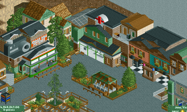
JK -
 geewhzz
Offline
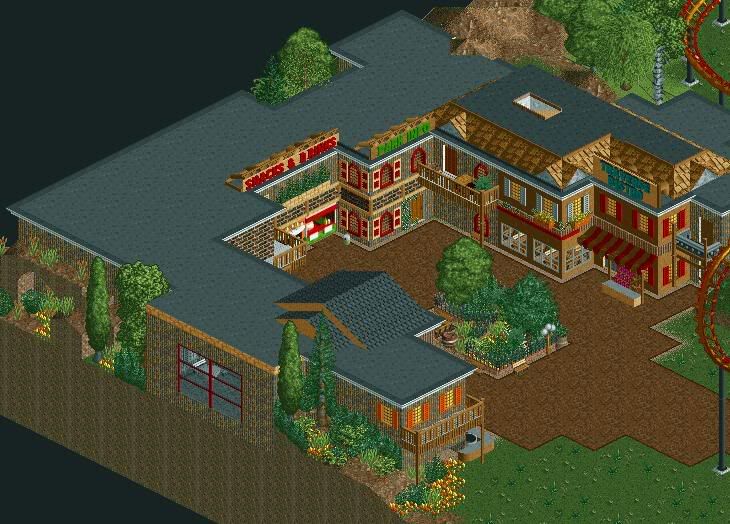
I'm a bit disappointed by the fact that you just started the park and are already advertising an unfinished screen. I think you need to spend a lot more time on ride development rather than churning out archy.
geewhzz
Offline
I'm a bit disappointed by the fact that you just started the park and are already advertising an unfinished screen. I think you need to spend a lot more time on ride development rather than churning out archy.
Other than that the second screen looks a bit better, but the theme idea seems very weak. -
 Milo
Offline
new screen looks better... I like the new flowers and the area as a whole seems better now that each individual building has been straightened out
Milo
Offline
new screen looks better... I like the new flowers and the area as a whole seems better now that each individual building has been straightened out
the theme does seem kinda shaky from the screens but I think this will be one of those areas that looks good in-game -
Xcoaster Offline
I'm definitely liking this second screen better, though I can't identify much specifically without looking at the first version. I think the extra brick on the restrooms is new? If so, I think this texture variation would also be nice on the first aid building. Aside from that, I might recommend a little more path stuff, like benches and lamps and such. Otherwise, it looks good, though I have to admit I originally wasn't that convinced. But now it's definitely looking better, and I think it'll look even better in-game. -
Cocoa
Offline
The new screen isn't that different, although it is better and more flowing. When you said "updated screen" I thought you meant update with a screen so I got really excited
-
Turtle
Offline
Just a couple of little things.
1) Vines.
2) Single square flower/shrubs in the square under the speaker where the benches are, instead of path.
3) Lose the Kodak photos sign, the camera does more than enough to advertise that building, and instead put some elaborate window(s) there.
2 and 3 will really help, 1 may do, i'm not sure.

![][ntamin22%s's Photo](https://www.nedesigns.com/uploads/profile/photo-thumb-221.png?_r=1520300638)

Tags
- No Tags