Fiesta! / Project: Classix- New Screen
-
 20-March 08
-
 JDP
Offline
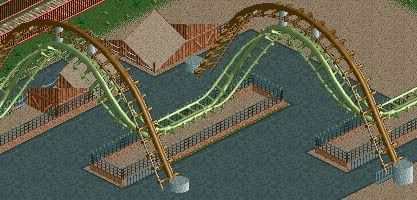
Ha ha, sweet, a Flying Turns.
JDP
Offline
Ha ha, sweet, a Flying Turns.
As for my comment about the brake runs, I just felt that you should have just had one straight brake run instead of having two. What you have there does work but just looks a bit sloppy imo.
Keep up the good work buddy.
-JDP -
 Comet
Offline
Sulakke- Thanks.
Comet
Offline
Sulakke- Thanks.
JDP- Oh, yeah, I see what you mean. Although some coasters do have brake runs that way. -
 Ling
Offline
I don't like the awnings over the queue in the first screen, maybe cover it all like gir mentioned, but put it up a bit higher (just one or two spaces) so you can still see the queue beneath it and it's not wasted effort. The coasters look nice but having two extremely long brake runs seems odd, and really only works out, in my eyes, on strata coasters where you need to slow the train down smoothly from a really high speed. You know my thoughts on the corkscrew supports, and the third screen is lovely. As a side note, I think this park would benefit from RctModified as the giant station buildings are just kinda there in the middle of the woodie's station and it might look better without the station bits.
Ling
Offline
I don't like the awnings over the queue in the first screen, maybe cover it all like gir mentioned, but put it up a bit higher (just one or two spaces) so you can still see the queue beneath it and it's not wasted effort. The coasters look nice but having two extremely long brake runs seems odd, and really only works out, in my eyes, on strata coasters where you need to slow the train down smoothly from a really high speed. You know my thoughts on the corkscrew supports, and the third screen is lovely. As a side note, I think this park would benefit from RctModified as the giant station buildings are just kinda there in the middle of the woodie's station and it might look better without the station bits. -
 Louis!
Offline
That last screen is fab. And the cork supports have been done before, because I ripped them off a few years back
Louis!
Offline
That last screen is fab. And the cork supports have been done before, because I ripped them off a few years back but they're great.
-
Comet
Offline
Ling- I'll try that with the queue, and some coasters other then strata coasters do the brakes that way, and they're not really extremely long. It's funny that you mention RCTModified because I downloaded it like a day after that screen.
Louis!- I'd like to see those supports if you have a screen or anything...and thanks. -
Louis!
Offline
after looking I didnt use the same track but you get the idea, here you go
Edited by Louis!, 23 March 2008 - 06:36 PM.
-
JDP
Offline
^Yeah, nice try (Wrong type of track).
But yeah comet, I did the supports like that before and I like the white the best (That's why I recommended it).
-JDP -
Louis!
Offline
I never said mine was better. I just said that I had copied someone's a few years back and comet wanted to see.
I am fully aware that mine was crap.Edited by Louis!, 24 March 2008 - 10:55 AM.
-
 CoasterAnne
Offline
Awesome! But I think you've got too much diarea brown in the houses in your last screen.
CoasterAnne
Offline
Awesome! But I think you've got too much diarea brown in the houses in your last screen. -
 ChillerHockey33
Offline
Lovin' it.
ChillerHockey33
Offline
Lovin' it.
Screen 2 - For the corkscrew supports, instead of going vertical, why not keep the impulse track at the steep angle? However that may throw off the flow of the land and surrounding area.


Tags
- No Tags