(Archive) Advertising District / Värmland Park
-
 31-March 08
-
 Dimi
Offline
Hi, I'm Dimi, I live in a Belgian village near Antwerp and like some other people here I'm member of a Dutch RCT-site. Here's my first park on this site, Värmland Park. It's located in the central forest regions of Sweden. Värmland is built to be realistic and typical Swedish, so the buildings can look a bit simple but that's just because real Swedish buildings often aren't very detailed.
Dimi
Offline
Hi, I'm Dimi, I live in a Belgian village near Antwerp and like some other people here I'm member of a Dutch RCT-site. Here's my first park on this site, Värmland Park. It's located in the central forest regions of Sweden. Värmland is built to be realistic and typical Swedish, so the buildings can look a bit simple but that's just because real Swedish buildings often aren't very detailed.


-
 SUPA-X
Offline
i like thoes buldings in the first screen and 2nd screen,
SUPA-X
Offline
i like thoes buldings in the first screen and 2nd screen,
even though there a little blockly
the coaster looks like flying dutchman are w/e
but overall it looks great -
 Cocoa
Offline
Nice, but the buildings blocky and they look way too similair and monotonous.
Cocoa
Offline
Nice, but the buildings blocky and they look way too similair and monotonous.
And you overkilled on those trees.
But otherwise, I really like it. -
 Comet
Offline
Use a different texture on one or two buildings and they'll be great.
Comet
Offline
Use a different texture on one or two buildings and they'll be great.
Also, those kind of doors aren't really conveniant for an amusement park.
Other then that I really like the park and the pirate ship has tremendous setting the forest.
Oh, and add another tree type or two into the mix there. -
 Gwazi
Offline
Looks good, except that the buildings look rather repetetive and the same, simple, 2X2 form is used on almost every one. You could afford to mix it up a bit without changing the feel that you are going for.
Gwazi
Offline
Looks good, except that the buildings look rather repetetive and the same, simple, 2X2 form is used on almost every one. You could afford to mix it up a bit without changing the feel that you are going for. -
 Splitvision
Offline
Scandinavian themes seems to be very popular ATM, though I've been away from RCT for awhile, so it might have been like that for a time. You said that "swedish buildings often aren't very detailed." I must say this is true (I live in Sweden.) There are not much that marks a typical swedish building, that I can think of. So for this reason, I would never choose a swedish theme for my parks, since there would be loads of forest and few buildings, and the buildings would be pretty boring. Still, it's fun to see my country being selected as the location for a park.
Splitvision
Offline
Scandinavian themes seems to be very popular ATM, though I've been away from RCT for awhile, so it might have been like that for a time. You said that "swedish buildings often aren't very detailed." I must say this is true (I live in Sweden.) There are not much that marks a typical swedish building, that I can think of. So for this reason, I would never choose a swedish theme for my parks, since there would be loads of forest and few buildings, and the buildings would be pretty boring. Still, it's fun to see my country being selected as the location for a park.
SV -
Dimi
Offline

1980
The new Far West village with a darkride in the central houses.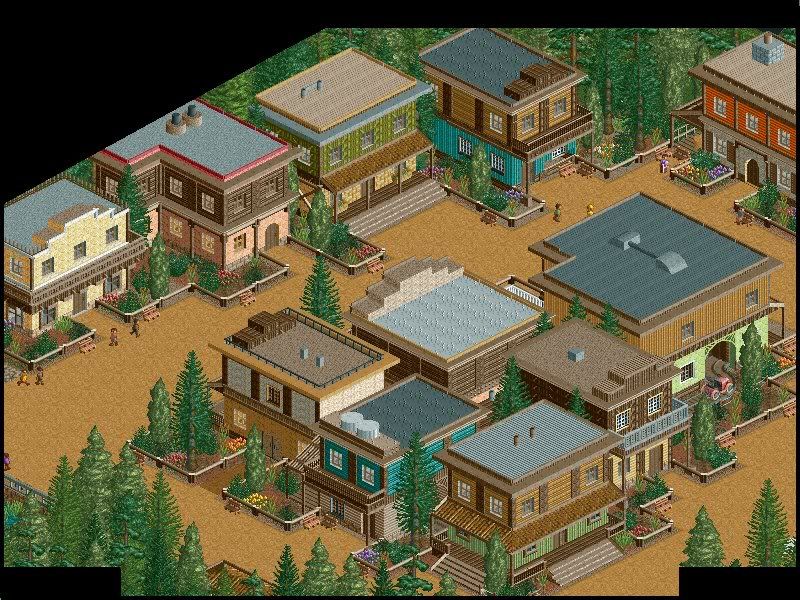
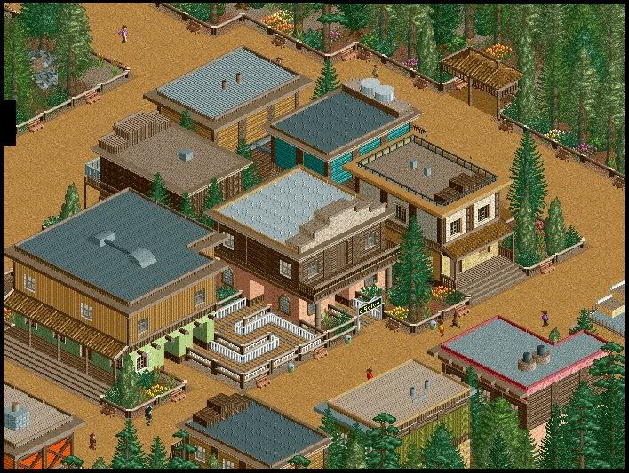
And a toilet building.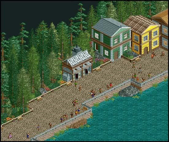
-
 RCTFAN
Offline
i absolutely love how you incorporated the queue line with the buildings, the 1/8th block either side to create the arch way is great.
RCTFAN
Offline
i absolutely love how you incorporated the queue line with the buildings, the 1/8th block either side to create the arch way is great.
Your archy is very pleasing too, although im not sure that the toilet block in the last screen fits in the context. -
 Nokia
Offline
you need to work on your color choices a little bit more.
Nokia
Offline
you need to work on your color choices a little bit more.
but besdies that it looks pretty good. -
 Fanatic Of RCT
Offline
I actually don't mind the colors. I think it looks really good the way it's presented. These last few screens are quite the improvement from the first ones you posted, in my opinion.
Fanatic Of RCT
Offline
I actually don't mind the colors. I think it looks really good the way it's presented. These last few screens are quite the improvement from the first ones you posted, in my opinion. -
Dimi
Offline
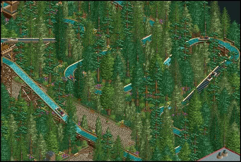
Trädstammar, a log flume trough the forest hills:
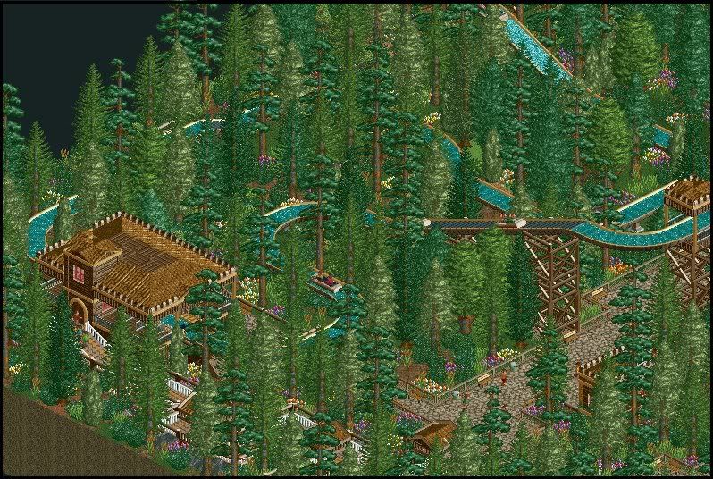
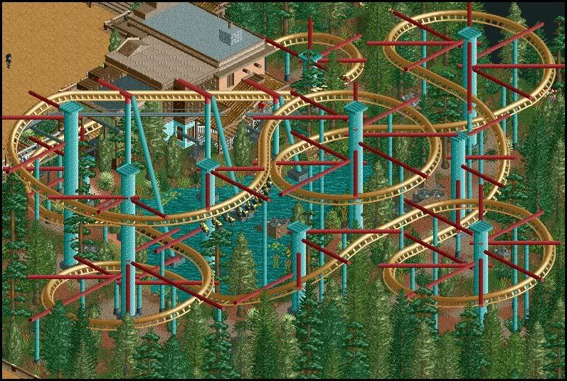
Örnflykt, a suspended coaster near the Far West town.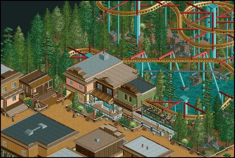
-
Nokia
Offline
 whoa!
whoa!
im really starting to like that coaster.
at first i hated thoes supports but their ok i guess.
but for the log flume thing.
way too much trees -
 Drew
Offline
I like those last two screens, but at the same time, I don't like the supports... I don't know what it is about them. I think they look very cool, but it looks very... cluttered? It just looks like there's a lot going on.
Drew
Offline
I like those last two screens, but at the same time, I don't like the supports... I don't know what it is about them. I think they look very cool, but it looks very... cluttered? It just looks like there's a lot going on.
Looks nice though! -
Ge-Ride
Offline
I think that the supports are quite unique and work well, but aqua and crimson supports for a tan coaster track isn't what I'd consider a great color combination. I think that the supports don't work, not because they're too cluttered or because of the colors but because they seem overly anachronistic with your Western theme. The coaster is well designed, as well as any other suspended coaster I've ever seen, and if you made a few adjustments to the supports to make them go with the theme, then you'd definitely have a fantastic coaster. After seeing that last screen, I'll be paying more attention to this park and its future development.
-
![][ntamin22%s's Photo](https://www.nedesigns.com/uploads/profile/photo-thumb-221.png?_r=1520300638) ][ntamin22
Offline
Slightly overtreed, as others have said. The log flume, I understand, is supposed to feel like it is out in the woods, but if you wanted it to feel that way it probably shouldn't be as close to the path as it is. Nothing wrong with the colors or architecture really, and anything I have to say about the supports has been said; just to repeat- they're nifty, but colors are off and they're very cluttery.
][ntamin22
Offline
Slightly overtreed, as others have said. The log flume, I understand, is supposed to feel like it is out in the woods, but if you wanted it to feel that way it probably shouldn't be as close to the path as it is. Nothing wrong with the colors or architecture really, and anything I have to say about the supports has been said; just to repeat- they're nifty, but colors are off and they're very cluttery.Edited by ][ntamin22, 11 May 2008 - 05:11 PM.
-
Dimi
Offline
I know the log flume isn't that good, that's because I made it a long time ago when I wasn't as skilled as I am now. And for the colors/supports of the coaster: I've based them on Dreamcatcher in a Belgian amusement park. I actually like the colors, and I don't think there's another way to make the supports like Dreamcatcher.
-
Dimi
Offline
I've made the queue line of Örnflykt a bit longer.

Hämnd av Skogsanden, a simple enterprise.
Some new/adapted houses on the shore.
The new entrance. I didn't like the old one, but I'm not really content with this one too.
And there's a carroussel in these three houses.
-
Comet
Offline
Sorry...but, where is there a carousel.
And the entrance is only ugly because the buildings are all just backs, but everything else about that is nice.
God though, if the supports for that coaster would be gray, I would like it about ten times more.


Tags
- No Tags