(Archive) Advertising District / Disney's Future Sight.
-
 24-July 09
-
 SSSammy
Offline
Think Sofas, Think DFS.
SSSammy
Offline
Think Sofas, Think DFS.
those screens are great, alot of detale, perhaps even too much, id consult a compotent parkmaker
-
 J K
Offline
Every inch of every screen is perfect. I love it.
J K
Offline
Every inch of every screen is perfect. I love it.
Edit - LMFAO SAMMY, typical british advert for all who doesnt know what DFS is. -
 Comet
Offline
Pretty good.
Comet
Offline
Pretty good.
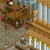
The train station should be on more of a hill then it is, but it's fine to be unique too if that's what you're going for.
Other then that, the scale of the main street just feels off to me, can't really tell why.
And what's the theme of the ride shown? I don't really like the colors but it might work if your going for something particular, not sure. -
 dr dirt
Offline
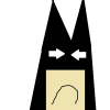
What's with mickey's face? Maybe I'm behind here but I don't think mickey has a white face or a red smile. It's kind of creeping me out atm. Other than that, very solid work.
dr dirt
Offline
What's with mickey's face? Maybe I'm behind here but I don't think mickey has a white face or a red smile. It's kind of creeping me out atm. Other than that, very solid work. -
 spartan
Offline
that mickey head is kinda creepy... oh well, I'm sure it's the best that can be done in RCT. Everything is beautiful though, I love all your buildings and that last screen is especially gorgeous.
spartan
Offline
that mickey head is kinda creepy... oh well, I'm sure it's the best that can be done in RCT. Everything is beautiful though, I love all your buildings and that last screen is especially gorgeous. -
 Liampie
Offline
What themes will be featured? The name sounds like the park is going to have future themes, but all I see now is some common Disney architecture and an unrecognizeable Pixar area. The composition of all the components in the last screen is great, but it's definitely NOT pixar. It looks more like China to me, but it still doesn't look like China. Get it?
Liampie
Offline
What themes will be featured? The name sounds like the park is going to have future themes, but all I see now is some common Disney architecture and an unrecognizeable Pixar area. The composition of all the components in the last screen is great, but it's definitely NOT pixar. It looks more like China to me, but it still doesn't look like China. Get it?
BTW, the peep in the first screen looks like a stoned Hans Teeuwen. Pretty pathetic.
-
 posix
Offline
Wow, looks pretty amazing. But a full scale disney solo with this level of detail is not possible in RCT2, no? I mean, object limit, and stuff ...
posix
Offline
Wow, looks pretty amazing. But a full scale disney solo with this level of detail is not possible in RCT2, no? I mean, object limit, and stuff ... -
 MCD
Offline
I agree with Posix but I think you will be able to find a way for not hitting the object limit.
MCD
Offline
I agree with Posix but I think you will be able to find a way for not hitting the object limit.
I think the fence around the fountain at the first screen is too high. And also if is a rainy day it would easily overflow because the water is at the same level as the path.
about the peep: I also noticed it when I was working on the RCT-Guide group project. That was pretty funny.
-
 FK+Coastermind
Offline
besides the peodofile mickey in the first screen, i think this is some of your best work. as is the greatest most delicate boundry in RCT, be careful to mix amazing detail with more simple basic areas. viewers need a place to rest the eyes, so you have to avoid putting to much detail and avoid no putting enough. a good example is having an amazing store front with lots of detail, but having the side of the building being a pretty simple wall with only some structural details as such.
FK+Coastermind
Offline
besides the peodofile mickey in the first screen, i think this is some of your best work. as is the greatest most delicate boundry in RCT, be careful to mix amazing detail with more simple basic areas. viewers need a place to rest the eyes, so you have to avoid putting to much detail and avoid no putting enough. a good example is having an amazing store front with lots of detail, but having the side of the building being a pretty simple wall with only some structural details as such.
FK -
 Nokia
Offline
not really feeling the mouse, does'nt feel real disney, but i dont really think there's much you can do about it
Nokia
Offline
not really feeling the mouse, does'nt feel real disney, but i dont really think there's much you can do about it
-
 Louis!
Offline
You know what I think, it's awesome stuff, but to me it doesnt feel Disney. Apart from the Emporium, but thats only because its the Emporium.
Louis!
Offline
You know what I think, it's awesome stuff, but to me it doesnt feel Disney. Apart from the Emporium, but thats only because its the Emporium. -
 Maverix
Offline
All of those screens are freaking amazing. Please, for the sake of everybody, finish this.
Maverix
Offline
All of those screens are freaking amazing. Please, for the sake of everybody, finish this.


Tags
- No Tags