(Archive) Advertising District / Six Flags Santa Fe
-
 24-April 10
-
 robbie92
Offline
robbie92
Offline
BREAKING NEWS (April 24 2010)-In a press conference held at company headquarters in New York City, Six Flags, Inc. president and CEO Mark Shapiro announced the end of conversion of their purchased property in Santa Fe, NM into a full-fledged Six Flags-branded amusement park. Up until now, the property, while owned by the company, ran under its original name that it was given while under family ownership. Six Flags acquired the property in 1992, after the owning family filed for bankruptcy. For the past 18 years, Six Flags has been converting the park into a Six Flags branded property, including adding new rides, revamping and renovating areas, and creating new areas.
Shapiro told members of the press that the fully-converted park would be open in time for the 2011 season, paving the way to become "New Mexico's premier family destination." Six Flags, Inc. has had a large prescence in the park's history ever since 1994, when the Anasazi Pueblo section was demolished to make room for Batman: the Ride, a state-of-the-art suspended looping coaster, and the Gotham City area, based off of the adventures of Batman. Subsequent additions included Pandemonium, a spinning roller coaster; Medusa, a large "stand-up" coaster; and Leviathan, the largest coaster in the Southwest. Shapiro also mentioned that the 2011 season might debut with a new coaster, but kept quiet on the details. This conversion is expected to drastically increase tourism revenue to the city, and is welcomed by many in the city.
The press conference marks a period of resurgence for the company, which filed for Chapter 11 bankruptcy in 2008. However, Six Flags Santa Fe, as the "new" park is called, has become their largest announcement since, and one that Shapiro hopes will restore the company's financial strength.
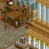
The main part of the press conference that gathered attention were Shapiro's "teaser" photos, which showed off new parts of the park. Although captions were not given, the photos are reproduced, with the permission of Six Flags, Inc. in this article.


NOTE: Images are copyright of Six Flags, Inc.
-
 Goliath123
Offline
Well personally i think its too clean, not a single thing is out of place. Like broken garbage bins, pieces of rubbish, theres no lights and benches etc, maybe try a little bit of grass overgrowing the path. Stuff like that
Goliath123
Offline
Well personally i think its too clean, not a single thing is out of place. Like broken garbage bins, pieces of rubbish, theres no lights and benches etc, maybe try a little bit of grass overgrowing the path. Stuff like that
Parks cant be attended to 24/7
Apart from the "perfectedness" of it its brilliant, keep going with it
-
 Louis!
Offline
You know I love this park. And I think I already gave you massive comments on it so I'll keep this simple.
Louis!
Offline
You know I love this park. And I think I already gave you massive comments on it so I'll keep this simple.
I think every screen is brilliant. I think this park has helped you get out of your 'over detailing' stage. This is the style of your work I love, clean, fresh, detailed just enough.
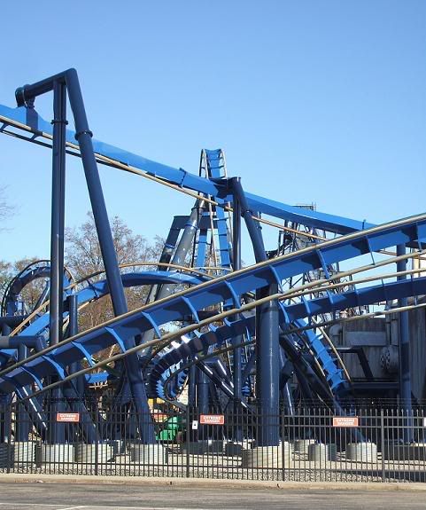
The batman logo on the sign is brilliant, well done with that I can imagine much frustration went into getting it to look decent I prefered the old colours to these ones but I think you can make the blue work if you changed the grey rails to maybe purple or dark blue.
-
 Pacificoaster
Offline
Precise and clean detail down to the dumpster behind the shop in photo 1. Not too sure about the batman colors, but everything else about these screens screams six flags. Very Nice.
Pacificoaster
Offline
Precise and clean detail down to the dumpster behind the shop in photo 1. Not too sure about the batman colors, but everything else about these screens screams six flags. Very Nice. -

inVersed Offline
Robbie, you know what I think about this. To keep it short, everything here amazes me, although I am still not a fan of the BTR colors. -
 nin
Offline
Eh, keep Batman's colors as they are; they look stunning irl. Goliath mentioned the "too clean" ordeal but it's a brand new theme park, it should be clean...
nin
Offline
Eh, keep Batman's colors as they are; they look stunning irl. Goliath mentioned the "too clean" ordeal but it's a brand new theme park, it should be clean... -
RamSam12
Offline
Word.please, finish this. okay?
CP6 now has some serious competition with this going. I don't see anything wrong with this except for a missing fence in front of the Batman logo. I also agree with Louis that the gray rails should be changed to blue. After all, the ride was repainted for this season at other parks like SFMM and SFOG and would not have had time to wear down the paint to the steel yet if yours was the same. Looks great so far! -
 posix
Offline
i think it's wonderful, robbie. my daily ne visit is always so much better when you have posted new screens.
posix
Offline
i think it's wonderful, robbie. my daily ne visit is always so much better when you have posted new screens. -
nin
Offline
They look about right to me..I also agree with Louis that the gray rails should be changed to blue.
-
 CedarPoint6
Offline
Rails should be gray:
CedarPoint6
Offline
Rails should be gray:
http://rcdb.com/421.htm?p=26912
As we've talked, I'm sure you know most of my thoughts, but to express them here: I think when finished, this could be one of my favorite parks ever and definitely the best Six Flags park going. I know you still have a ways to go, but I'm really enjoying watching this happen. It's coming out great. -
Pacificoaster
Offline
So there is indeed a batman clone with gray rails, but Great White has the same paint job which is what really threw me off.
-
 Splitvision
Offline
Wow, there's not a single thing that I dislike. Nothing that seems to not fit in and nothing that seems to be missing. Great. I'm just not completely sold on the orange building in the first screen, it might stand out just a tad bit too much.
Splitvision
Offline
Wow, there's not a single thing that I dislike. Nothing that seems to not fit in and nothing that seems to be missing. Great. I'm just not completely sold on the orange building in the first screen, it might stand out just a tad bit too much. -
 jusmith
Offline
Screen 2 and 3 are sooooo good! The foliage in screen 1 is kind of ugly to me, to many strange custom textures mixed together creating a mess...maybe incorporate more regular trees?
jusmith
Offline
Screen 2 and 3 are sooooo good! The foliage in screen 1 is kind of ugly to me, to many strange custom textures mixed together creating a mess...maybe incorporate more regular trees?
And...although the coaster colours aren't completely conventional, I like them a lot as they add some character to the area. -
 Kumba
Offline
Love the second and third screens. Your really good at the tex-mex style that is Santa Fe.
Kumba
Offline
Love the second and third screens. Your really good at the tex-mex style that is Santa Fe.
In the first screen you seem to have a fence identity crisis. You have the nice brown poles, then they turn to black and then the stacked mesh fence which never looks as good as it should. Id stick with the black if I were you, then lose the other two. On the other hand it was kinda hard to notice it since that orange buildings is awesome. Way to make that color look good, that was a ballzy move
-
inVersed Offline
I've changed my opinion on your BTR color scheme, I hadn't realized BTR had been repainted that color at SFoG. Still, I have no idea what SF was thinking with that color scheme. Since when does royal blue have anything to do with Batman? -
 Six Frags
Offline
^I agree, the BTR color scheme looks off. It should definitely be black, it doesn't matter if SFoG repainted it, it just doesn't suit the theme of a bat.. The station also looks kinda boring, maybe add some more details here and there, or theme it to Batman's mansion. I know SF doesn't rely heavily on theming, but they actually do theme it to some extend.
Six Frags
Offline
^I agree, the BTR color scheme looks off. It should definitely be black, it doesn't matter if SFoG repainted it, it just doesn't suit the theme of a bat.. The station also looks kinda boring, maybe add some more details here and there, or theme it to Batman's mansion. I know SF doesn't rely heavily on theming, but they actually do theme it to some extend.
I agree with kumba about the fences and turbine about the peeps; they would add so much life to all the concrete..
Also watch you don't fall into the 2x2 trap; sometimes you nearly have too much of them. Variation is key.
Overall it looks very nice though, your pathing is brilliant. Nice forms and composition. Very realistic.
SF


Tags
- No Tags