(Archive) Advertising District / New.
-
 28-April 10
-
 Dyll
Offline
I know what you guys are thinking, "huh?, another park of Dyll?'. Yes, and this park is going to be finished even if it is the last thing in my life to do. And since I have a problem with finishing parks, I made this extra small so it's easier for me to finish this piece.
Dyll
Offline
I know what you guys are thinking, "huh?, another park of Dyll?'. Yes, and this park is going to be finished even if it is the last thing in my life to do. And since I have a problem with finishing parks, I made this extra small so it's easier for me to finish this piece.
The entrance area:


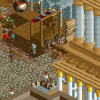
And here we've got the German zone:


Thanks for watching! I aprecciate comments on how to improve certain things. -
 Luketh
Offline
I guess you could call it "cute", I call it cool.
Luketh
Offline
I guess you could call it "cute", I call it cool.
Great job, Dyll. Can't wait for more. -
Themeparkmaster
Offline
I don't really get the queue for the top spin, I can't tell if it's meant to be a cattle pen queue or individual sections for each gondola (in which case this isn't necessary on top spins...top scans yes).
Everything else I really like. The German section looks very cool, especially the station for the woodie. -
 Cena
Offline
Again.
Cena
Offline
Again.
^ That topic title would be a lot better.
Dyll, I know you from the Dutch boards and in the last 1.5 years or longer I have hardly seen any improvement at all in your RCT creations, I think it's because you have a lack of inspiration and therefore you don't experiment a lot to get better at this game. I would like to see more research in the theme you are doing and in the end your screens + parks will become a lot better then!
Edit: Six Frags, if you are going to post in this topic, don't mention the cjk roofs please ...Edited by Cena, 28 April 2010 - 04:27 PM.
-
Dyll
Offline
@Cena: Ok, you don't see any improvement the past 1.5 years? Then compare this with the screens above.


And a bit more recent.
Now say it again.
But anyway, everbody thanks for the comments!Edited by Dyll, 29 April 2010 - 05:07 AM.
-
Alpengeistfan1
Offline
That looks like a step down.
Screens 1 and 2 are blocky, undetailed, and the foliage looks bad.
Screen 3 is ok though. -
 turbin3
Offline
Don't listen to Cena.
turbin3
Offline
Don't listen to Cena.
I agree with SSSammy, it looks cute.
Here are a few tipps:
- not every wall needs a window
- don't use to much different colours
- the umbrellas don't look good, use awnings or other roofs
- put some more details on your roofs, like chimneys
Good luck!
-
Luketh
Offline
>.>
Alpengeist... it looks like a step down because it IS a step down... read what Dyll said.. -
Cena
Offline
Why not? Something wrong with that I am giving my opinion?Don't listen to Cena.
And Dyll, I said 'hardly seen any improvement'. Sure there is improvement but it's almost nothing in 1.5 years if you ask me ... (if you look at your firstpost and the one with the older screens, you will see a lot of resemblances). -
 Gwazi
Offline
its not that you are giving your opinion, its that you are forcing it on everyone else as if they must believe it too
Gwazi
Offline
its not that you are giving your opinion, its that you are forcing it on everyone else as if they must believe it too -
Cena
Offline
its not that you are giving your opinion, its that you are forcing it on everyone else as if they must believe it too
Read my first comment and you would see I didn't. -
Alpengeistfan1
Offline
Crap, sorry I didn't see that. Well the third screen looks good anyway.>.>
Alpengeist... it looks like a step down because it IS a step down... read what Dyll said.. -
 Evil WME
Offline
The buildings look very cute indeed. Try making them with the fluffy flowers, since their color is much more like the colors you are using for your buildings.
Evil WME
Offline
The buildings look very cute indeed. Try making them with the fluffy flowers, since their color is much more like the colors you are using for your buildings. -
Dyll
Offline
Yes, it has been a very long time since the last update more than a year ago, but here is a small one.
First, I added a small playground in the German sector:
A new house house next to that small one. Behind the houses I've built a new ride to fill up that lost space.

See you in a year! No, just kidding. I hope. -
Luigi
Offline
Nice stuff. I love the old-typical dutch atmosphere. I only think you should vary more with colors. There is too much red and white only. I'm also not a big fan of the back of the buildings.
-
 posix
Offline
Looks good, but you have a vision only for what you want the buildings to look like. What will go in them or what comes at the end of your path seems pretty much non-existent. Thus you need a much more global plan and direction in your parkmaking if you want to finish a large scale project and have it look remotely flowing, well connected and sensemaking.
posix
Offline
Looks good, but you have a vision only for what you want the buildings to look like. What will go in them or what comes at the end of your path seems pretty much non-existent. Thus you need a much more global plan and direction in your parkmaking if you want to finish a large scale project and have it look remotely flowing, well connected and sensemaking. -
 Cocoa
Offline
I know they use flat facades in real life, but it doesn't translate well into rct2. put some structures behind those walls so they feel like actual buildings.
Cocoa
Offline
I know they use flat facades in real life, but it doesn't translate well into rct2. put some structures behind those walls so they feel like actual buildings.
^listen to posix, this park does need some more sensemaking.


Tags
- No Tags