(Archive) Advertising District / LOEA`s official construction thread
-
 13-November 10
-

 Dotrobot
Offline
In case you don't understand which you implied about the ranking system.
Design competetive is focused on a single coaster and it's surroundings. It only has 1 level of award. No bronze,silver,gold etc. But it's standards are higher than a bronze.
Spotlight competetive is a park (mostly). Ranging from bronze, silver, gold, and the highest award you can get spotlight.
This is the submitting system in a nutshell. I'm not an expert on it either though. -

 Liampie
Offline
You can get an accolade. Just work on your architecture, beacuse in my opinion that's your weakness. Try to add more colour to your buildings! In this case I wouldn't go for bright colours, use some soft pastel colours instead like tan, salmon and white. And use more varation!
You're on your way to your first accolade.
-
 F0ndue
Offline
K,since its a park(although it focusses on the coaster)I`ll upload it as Spotlight.Might have a lot of concurence,but if you mind that I`m literally a beginner
 ...
...
Could this affect in the rating?
I got a lot of ideas from downloading almost every mentionable park here and studying them,also a bit of knowledge about coasters. Its good to go back to the roots,since RCT2 was my first game about coasters and made me to a coaster enthusiast.That was long ago,I began with custom objects some months ago,but my first project sucked so I froze it up and begann with this one as my first project with trainers.
Its really a huge joy to build it an getting so much positive feedback.
BTW a question:Does anybody want that I upload a workbench of this? -

 Dotrobot
Offline
if it's a park. Try to make it have a park layout that parks would have. By what i can see. It looks like you have enough space to add another coaster. Or a mini coaster. Something that can be in the same park as that huge woodie but not take away from the focus of that woodie.
I love that lift hill and the tunnel. By the way. all your land texture under the shrubs and trees seem to be grass. Vary it up with dirt and dirt/grass. -

 F0ndue
Offline
Okay,I plan to add a Kiddie coaster in Schoggiland and a Giant Plunge by Intamin called Lampert Moulin SA,So Lampert Mill Inc..So far thats the name,but I have to complete the parking,I have some nice cars now,but I hope you understand that they can`t vary the cars since I need other objects too.
 -
 JoeZia
Offline
Really cool so far dude, however I'd use a little less foliage in the those compact spots.
 -

 F0ndue
Offline
That is a effect of the park history:When the investors and the travelling fair bought the land there it was heavly wooded.Exept the road which cut through the forrest.On the land there were also some remains of a old casle.These are the station of Tell now.The train station was found abandonned,as part of a former railway line.
 -

 F0ndue
Offline
Update!Yes its not that eye charming like the last ones but its a update.I`m about to add the storage area,where also a special guest will build up his tents!Its the in Switzerland very known Zirkus Knie(yes it does exists IRL),who honors us with his fabulous visit for some days!
I`m also building another station of the park internal trams.It will share the location with a railway line which leaves the park,but its not a pulic line,guests have to come by car or walk.next to Tells turnaround island the stunning Intamin Giant Plunge will be located,construction starts soon together with Cervin, a flatride next to the Plunge,Schoggiland will follow.Now a little thing about the park,I`ll feed you with infos in the next weeks.The park can be entered for free you just have to pay for food and other stuff and the rides as well.Or you can just go out for a picnic and enjoy your day in the Genfer Gärten!
Okay now the darker sides,the storage area is glitchy,I have no idea for a (fitting swiss and coast theming) for the Inta/S&S Drop Tower(which still needs to have that dammit mode so please help me!!!),parkdating drives me crazy and the spots for testers are still open...So yeah get yours before they`re all occupied(I wonder why nobody asked me about it yet I posted something an update ago or so)... -

 Louis!
Offline
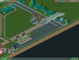
You need to break up all that black tarmac, and not just with white lines.
Also the tram/train track seems to be running directly down where peeps would potentially be walking, which isnt a problem as it could be a pedestrianised tramway thing, yet later on it crosses the path like a level crossing, as if its suddenly unsafe. This seems odd. I think it could be due to the station location, it seems to disrupt the flow.
The little bridge at the top is really nice though, and the foliage up there also seems pretty good. -

 Louis!
Offline
Ok lol. I take it it's just the middle park of my comment that is difficult to understand.
So simpler expanation: The way the track goes down the path seems odd because it then goes off the path to the station and then crosses back over the path.
I think you would be better if you put the station on the opposite side of the path and then when it comes off the path and into the station, it then doesnt have to cross the path when it leaves the station.
Does this make sense now? -

 F0ndue
Offline
Yeah sure,but unfortuneatly there will be the parking lot located wher you`d like to see the station.But thanks for pointing that out!Testers spots are still open
 -

 F0ndue
Offline
Update!
My poor attemp...
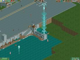
at recreating this:
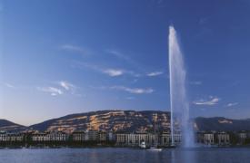
The world famous Jet d´eau,in Genf/Geneve.
Would somebody please like to create me a huge fountain on one tile,it should look like the fountain on the bottom left of the first screen.If you help me I can add you as tester.
Also should I extend the "arm" which is the fountains basement?
Okay here another screen:
The basic parking lot,some stuff needs to be added and the goddamit glitches and ghosts must be removed,it drives me crazy you can see them in the upper right corner of the pic.
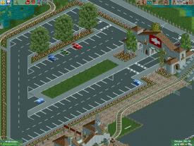
So,bye to the next update suckers!
Cheers
LOEA -

 That Guy
Offline
Your finished (or relatively finished) work is SO much better.
Good luck with the fountain, I personally have no suggestions, but don't use the current one.
-
 Faas
Offline
It looks good but ditch the non-fitting custom objects. Like the giant people in the first screen and the buoys(or however you write that word.)
 -

 F0ndue
Offline
Do I have to?I like them so much
Maybe you´re right,but is there a way to change the scale of objects?The scale of the buoys is okay I think,but the employees are a bit to big. -

 Faas
Offline
They don't fit in texturewise. It looks like WW/TT.
And by the way, the standard game employees are fucking awesome, why use other ones?
 Tags
Tags
- No Tags

