(Archive) Advertising District / SoK
-
 08-January 11
-
 rK_
Offline
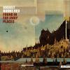
the logo/que entrance is great. I really like the jungle bushes too, they give a off a overgrown feel but they are very cleanly placed and organized and looks kept. Ive been gone to long i never seen this topic before
rK_
Offline
the logo/que entrance is great. I really like the jungle bushes too, they give a off a overgrown feel but they are very cleanly placed and organized and looks kept. Ive been gone to long i never seen this topic before
-
 Metropole
Offline
For me, jungle bushes should never really be lined up in an ornamental fashion, especially to the degree that you have done here. The layout looks sharp though, and the queue entrance is quirky.
Metropole
Offline
For me, jungle bushes should never really be lined up in an ornamental fashion, especially to the degree that you have done here. The layout looks sharp though, and the queue entrance is quirky. -
 posix
Offline
the bushes are the speciality of kumba and sok. i think he does them in a fascinating way.
posix
Offline
the bushes are the speciality of kumba and sok. i think he does them in a fascinating way. -
 Midnight Aurora
Offline
Midnight Aurora
Offline
My opinion is the exact opposite of this.I hate that SOK entrance thing.
Everything else is awesome ! -
 tyandor
Offline
tyandor
Offline
In a few weeks I hope to see this released as an NE Design

Like you have any doubt about that
-
rK_
Offline
i think people are hating on these little aspects of this design, and kumbas style overall with this due to the fact this dude is insanely productive and always has a solid vision of what hes set out to do and executes it to a beautiful standard and most of the time exceeds it in my eyes. haters going to hate though.
-
 nin
Offline
nin
Offline
See, I adore it as I love the over manicured look of it. Except for the custom tree at the bottom of the screen, that should die.the foliage is so so bad. everything else is sharp.
-
 wildroller
Offline
wildroller
Offline
is that the storage shed from your other kumba design??
Yep, it's not just the storage shed that you see, you are seeing Kumba itself it looks like.


Tags
- No Tags