(Archive) Advertising District / Work-in-Progress: Xenaverse
-
 02-April 11
-
Disney Freak
Offline
OK so a quick response to both highroll3r's and Luigi's suggestions:

What do you think? I'm not completely sold on it. Any other suggestions? -
 Dotrobot
Offline
to be honest i liked both equally. but seeing how it's a carousel the screen with highroll3r's advice is better for me.
Dotrobot
Offline
to be honest i liked both equally. but seeing how it's a carousel the screen with highroll3r's advice is better for me. -
 highroll3r
Offline
Thats a massive improvement! Im glad you took my advice.
highroll3r
Offline
Thats a massive improvement! Im glad you took my advice.
As i looked at this i instantly noticed the brown, too much brown. Just colour it the same as the walls, pale green i think and itll be less of a colour clash/texture clash issue.
Theres one more way to make this from great to awsome. Heres what i think:
Crown moulding is the yellow lines. Definately have crown moulding folowing the shape around the building at the top. Again this eliminates the "flat faced" visual.
Green means go i know, but here it means have white base blocks at the bottom of those towers to go with the border better. Even texture diffenrence is possible.
Again if you proceed with this advice, this carousel building will be fantastic!
-
Disney Freak
Offline
Thanks for the advice, highroll3r. I tried out the crown mouldings and that didn't work but I did change the color for the columns as well as the texture. All in all it looks much better now so thank you! I've started working on the central hub to the park, Amazon Village. I should be updating soonish...
-
Disney Freak
Offline
Amazon Forest
Welcome travelers of ancient times, to the Amazon Village. At the very edge of the quiet town of Potedia lies a hidden forest, where one of the many scattered Amazon tribes rest and live. To all who enter will find the hub from which they can pick there first adventure in the park: The Norse Lands, Mount Olympus, Land of Chin and Streets of India.
Here is a taste of the "feel" of the land. I'm going for a cross look of Disney's Animal Kingdom park and Islands of Adventure's Port of Entry + Disney Sea's Lost River Delta architecture and style for what little there is to show and explore here.
Here's an initial screen of this area:
Again, I know it's not much but I'm really trying to find the right feel for the land. I'm finding it a bit complicated sprucing up something which essentially is a glorified forest that serves as a hub to more important areas.
Suggestions, as always, are welcome. -
Luigi
Offline
^Yeah agreed. I only hate the roof texture in the top-right of the screen, but that might just be personal.
-
 Liampie
Offline
I agree with chorkiel and Dotrobot. The tent makes sense but it's not aesthetically pleasing. You can do more with that! The bright green stuff hurts my eyes, with more natural colours I think the foliage is looking pretty good and unique.
Liampie
Offline
I agree with chorkiel and Dotrobot. The tent makes sense but it's not aesthetically pleasing. You can do more with that! The bright green stuff hurts my eyes, with more natural colours I think the foliage is looking pretty good and unique.
I haven't replied before in this topic but I enjoyed every screen you've posted. I'm not feeling like posting in depth criticism on the previous screens but I can tell you that red and green is not a very good looking colour combination. I'm looking forward to see what you're coming up with next! -
Disney Freak
Offline
I'll see what can be done about the tent, and thank you for the compliments!I agree with chorkiel and Dotrobot. The tent makes sense but it's not aesthetically pleasing. You can do more with that! The bright green stuff hurts my eyes, with more natural colours I think the foliage is looking pretty good and unique.
I haven't replied before in this topic but I enjoyed every screen you've posted. I'm not feeling like posting in depth criticism on the previous screens but I can tell you that red and green is not a very good looking colour combination. I'm looking forward to see what you're coming up with next!
Hmm... I'm going for a jungle feel. What would you suggest?No it's great. My only eye sore is that sick colored grass
If you're talking about the tent, well it's supposed to be a tent so I'm probably gonna keep it that way, maybe spruce it up a bit. If you're talking about the wooden planks above it, yeah I'm not completely satisfied with them either. I'll probably get back to it later on.Yeah agreed. I only hate the roof texture in the top-right of the screen, but that might just be personal
Thanks! I remember loving your work from my "early" days here, so it means just a bit more that the compliment is coming from you!Very nice. Good colours. Good atmosphere
Anywhoo, continuing to the next area, Kingdom of Chin: The house of Lao will welcome guests into their asthetically pleasing gardens surrounded by a lake. Those who choose to will continue venturing into the castle to explore. The braver ones will probably choose to go to the dungeon area, where a thrilling coaster will await them.
Attraction line-up:
Lao Gardens - Maze style attraction
Dragon Riders - A calm ride above the gardens of Lao Kingdom (style ala Suess vehicles in IoA).
The Green Dragon - Rollercoaster, undecided on the type.
The Dungeon - Walkthrough
Journey to Chin - A dark ride housed inside Lao Palace, where we journey with Xena through past and present and discover the story behind Xena's debt to the queen of Lao province, Lao Ma.
A preview at the entrance to Kingdom of Chin:
-
 chorkiel
Offline
I'm not a fan at all, of that screen.
chorkiel
Offline
I'm not a fan at all, of that screen.
Try to make that entrance go underwater as well, currently it's floating.
Other than that, that wood doesn't fit the stone. -

inVersed Offline
I'm not a big fan of this screen either. It just lacks composition in my opinion and those paths look horrible -
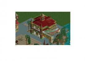
Disney Freak
Offline
Initial (and for some reason, pixelated) picture of work on the entrance to Lao Palace and Lao Gardens:

It's far from complete but I was enjoying the atmosphere so I figured I'd see if the joy is shared with the other members... -
Luigi
Offline
Massive texture clash indeed.
You need another texture underneath your paths, other than that I like it.


Tags
- No Tags