(Archive) Advertising District / Fränkisches Abenteuerland
-
 02-May 11
-
 Jonny93
Offline
Hey there, i am new on this forum and i want to present my first park here, called "Fränkisches Abenteuerland".
Jonny93
Offline
Hey there, i am new on this forum and i want to present my first park here, called "Fränkisches Abenteuerland".
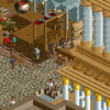
Here is the first screen of the mainstreet and the main entrance:
In the background you can see the "deep in africa"-Area.
Another picture of the mainstreet:
The second area is "Mexico":
In the front of this picture is "deep in africa" in the background "mexico":
The last screen is from the second park space and the entrance of the mystery area:
I hope you like my park. Comments are welcome.
MfG Jonny93 -
 Liampie
Offline
I've been waiting for you to post here! You're so good!
Liampie
Offline
I've been waiting for you to post here! You're so good!
The mainstreet and especially Mexico are just fantastic. However I think the mainstreet is too narrow to have these big trees in there too. Make the street wider or get rid of these trees. The same goes for the entrance area... Everything is nearly perfect except for the (lack of) space on the paths. Also I think the birches have the wrong trunk colour, grey looks more natural than white.
I'm disappointed by Deep in Africa, on the other hand. The big building looks very blocky and underdetailed, and I'm not sure if such a complex ventilation system on the roof is necessary. The coaster does not interact as much as I would expect from a Black Mamba inspired coaster. The extremely straight path grid doesn't really help either... I'm sure you have great plans with area, but I might better say it in advance: the area needs a curved flowing path layout, with more path-coaster crossovers and more architecture to add some colour and life to the area. But yeah, talking is easy. I know from experience that Black Mamba is really hard to pull off. Good luck dude!
The second entrance is incredibly credible. Good job here again.
By the way, please use another image uploader. The thumbnails really annoying... Here are the links to the full images, without popup shit.
http://www.lupiuploa...41fa6df7522.png
http://www.lupiuploa...5b543392787.png
http://www.lupiuploa...461a3eac71a.png
http://www.lupiuploa...1ef69cb2629.png
http://www.lupiuploa...06c1b5fae91.png -
 Fisch
Offline
Great that you finally decided to register on here. Seems that our little talk from yesterday had an impact on you.
Fisch
Offline
Great that you finally decided to register on here. Seems that our little talk from yesterday had an impact on you. I've been waiting for you to join the community ever since I first saw your park.
I love it all basically besides the African area. While the rest of the park just seems to be soooo sooo realistic (because it's based on the Layout of Phantasialand) the African area just isn't very believable to me. I couldn't really picture this in a real park compared to the rest of what you built. Everything besides the African area is stunning. I think the main thing that is wrong with the African area is its layout. Not the coaster's layout but the area's layout. I hope you kind of improve that. Good luck with your park. -
 posix
Offline
Err, where does everyone know him from exactly?
posix
Offline
Err, where does everyone know him from exactly?
Thanks for the links Liam. I think the screens look fantastic. Is this like a semi-recreation of Phantasialand?
Very dense, yet very clearly laid out and arranged. Very complex path layouts, again à la Phantasialand, yet very strong guidance for the eyes. Rare combinations. It looks a bit as though you concentrate a lot on one area, finish it, and then move to the next. I would suggest you allocate your main and biggest rides on the map first to gain a bigger picture and then go into detail on each.
I look forward to seeing more of this! -

Wicksteed Offline
rct-world, i suppose?
really good work! The Black-Mamba-esque buildung needs work though, now it looks more like a factory hall then like a convincing african building. I'd suggest to make it less symmetrical, and to break up the columns, which would make it look not so high. -
 Cocoa
Offline
those are some really nice screens! maybe work on the flow a bit and reducing blockiness in paths and buildings but you have nailed the atmosphere. it feels very phantasialand-like.
Cocoa
Offline
those are some really nice screens! maybe work on the flow a bit and reducing blockiness in paths and buildings but you have nailed the atmosphere. it feels very phantasialand-like.
^i think we have been getting tons of great new members recently. -
 highroll3r
Offline
Excellent screens Jonny. Really impressive work. I too think you should widen the paths and recolour the tree trunk grey. The architecture is flawless. I would personally make custom windows, but this is still awsome. My only advice to you is to move all of the buildings on the left, of Main street backwards four blocks or so. Its alot of work, i know, ive had to do it before, but itll widen the path, give a better view and give you room for something in the middle of the path. ie flowerbeds, fountains and or more buildings etc. For your first topic in the advertising district this is absolutely great. You will, fit in juuuust fine.
highroll3r
Offline
Excellent screens Jonny. Really impressive work. I too think you should widen the paths and recolour the tree trunk grey. The architecture is flawless. I would personally make custom windows, but this is still awsome. My only advice to you is to move all of the buildings on the left, of Main street backwards four blocks or so. Its alot of work, i know, ive had to do it before, but itll widen the path, give a better view and give you room for something in the middle of the path. ie flowerbeds, fountains and or more buildings etc. For your first topic in the advertising district this is absolutely great. You will, fit in juuuust fine.
-
Fisch
Offline
^Actually even if I'm not Jonny I'm pretty sure he's not gonna widen the path. I mean I wouldn't either. Because the way the mainstreet is set up right now is greatly inspired by Phantasialand. And Phantasialand's mainstreet is this narrow and therefore making it wider would simply destroy some of the atmosphere and beauty of it for people who know Phantasialand. I mean of course it'd still look amazing but this way it just reminds you so much of Phantasialand's mainstreet. So that's why I wouldn't change anything about the mainstreet if I was him besides the simple fact that moving the buildings like 4 blocks back would be a lot of work.
-
highroll3r
Offline
I see your point transparently. Itll look good either way. i just simply suggested it as it was the only thing i could advise to do.

-
 Metropole
Offline
Looks awesome Jonny, though the supports on "Black Mamba" are off. They shouldn't be supporting the outside of a banked turn/drop, should be on the inside.
Metropole
Offline
Looks awesome Jonny, though the supports on "Black Mamba" are off. They shouldn't be supporting the outside of a banked turn/drop, should be on the inside. -
Jonny93
Offline
Thanks for your comments.I'm very pleased that you like my park. I have decided to make the "deep in africa"-area complete new. On the weekend i will post some new screens.
-
 Dotrobot
Offline
Dotrobot
Offline
^i think we have been getting tons of great new members recently.
none of them are good as this guy. except maybe highroller. -
Jonny93
Offline
I have build a new lifthill for Black Mamba. Here is a screen:

I hope its better as the last version.
MfG Jonny93


Tags
- No Tags