(Archive) Advertising District / Bellagio Adventures
-
 05-August 12
-
 -Piggynator-
Offline
Hello NeDesigns!
-Piggynator-
Offline
Hello NeDesigns!
The noob is back for some more lame pictures no one is even going to watch.
Well lets begin!
So i've been working on a new park for the past months. (i think it was on my birthday i started)
Note: that this park is nowhere beyond finished!
The Entrance.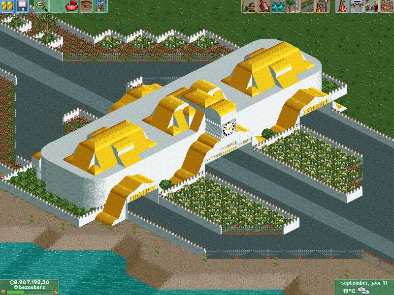
The Hotel. (Not sure if i'm going to chance it)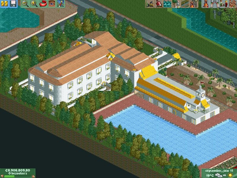
Here is the beach you will be giong through this as you enter the park.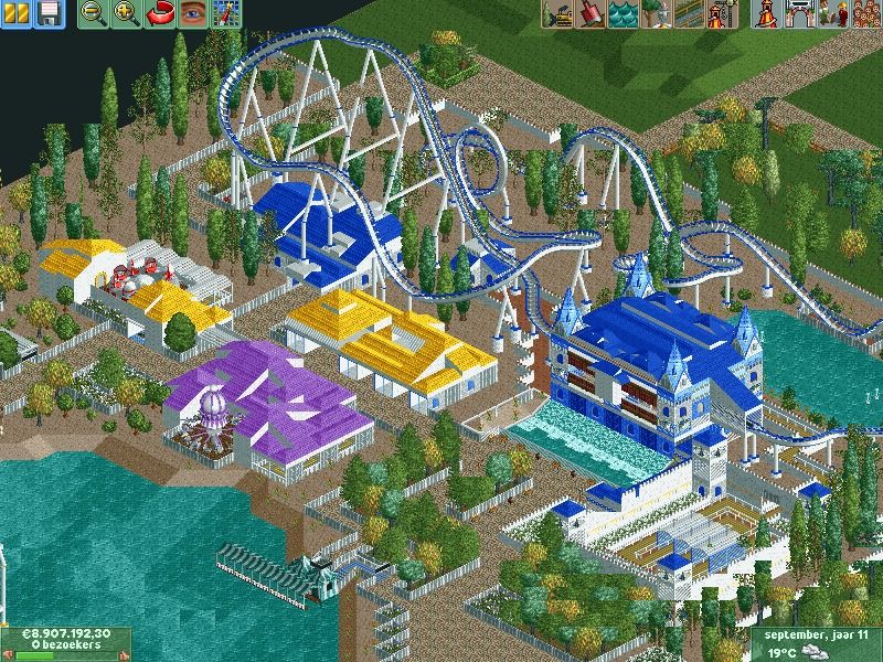
The same picture as before except for the lighthouse and the restaurant in the top right corner.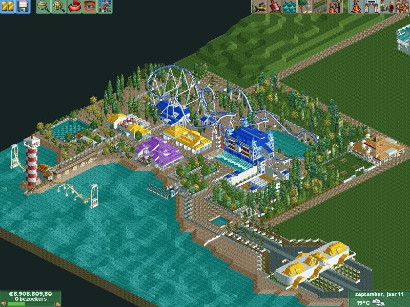
Wild West Part with the wooden rollercoasters.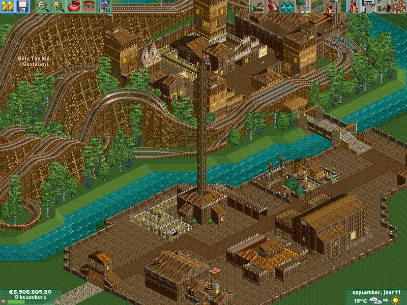
This picture has a story behind it because when i was young (which i still am) i drew alot of dragon-type worm thingy's.
And i recently found some of those drawings so i picked one out and started building it and later came the rollercoaster. (BTW i am not that happy with the roof of the station maybe i will change it)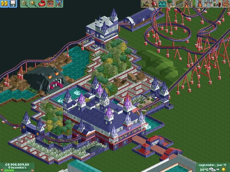
And last but not least a overview of the park. (so far)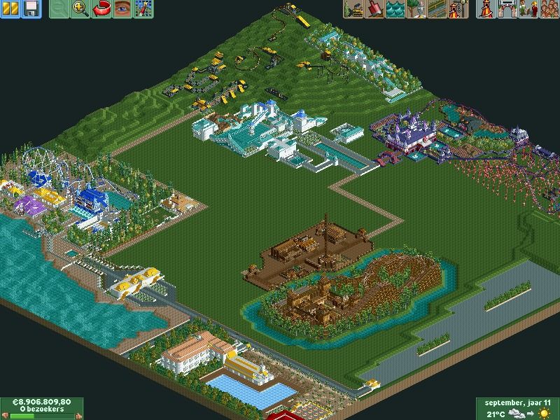
-
 Casimir
Offline
The screens: kind of a basic "maybe" (IF they were finished. Finish your stuff before you show it.)
Casimir
Offline
The screens: kind of a basic "maybe" (IF they were finished. Finish your stuff before you show it.)
The avatar: No. -
 Scoop
Offline
i like both the screens and the avatar it has a certain pop to it. the only screens I don't like are the first and the one with monster looking thing on it.
Scoop
Offline
i like both the screens and the avatar it has a certain pop to it. the only screens I don't like are the first and the one with monster looking thing on it. -
 BC(rct2)
Offline
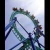
I like the screens, specially the one that have the wooden coaster.
BC(rct2)
Offline
I like the screens, specially the one that have the wooden coaster.
Don't care about the comments of the avatar, you use the avatar that you want, that's with you. -
 Ling
Offline
Your colors need some serious work. The brown area is literally nothing but brown. The other colors don't go together (namely red and purple). Your steel twister is over-supported. The entrance road... thing has some strange deco choices. You can't really tack any old steepness pieces together and call it good. The structure has no flow to it. You overused the "fantasy" spire roof piece. Your foliage could use better composition and better flower colors. Look at other examples of accolades on the site for references.
Ling
Offline
Your colors need some serious work. The brown area is literally nothing but brown. The other colors don't go together (namely red and purple). Your steel twister is over-supported. The entrance road... thing has some strange deco choices. You can't really tack any old steepness pieces together and call it good. The structure has no flow to it. You overused the "fantasy" spire roof piece. Your foliage could use better composition and better flower colors. Look at other examples of accolades on the site for references. -
 AK Koaster
Offline
Improvement very much noted. I like the screens, especially the hotel, don't know about the que line for dragon-worm-thingy coaster, but the rest of the screens really pop. Good wooden racing coaster too
AK Koaster
Offline
Improvement very much noted. I like the screens, especially the hotel, don't know about the que line for dragon-worm-thingy coaster, but the rest of the screens really pop. Good wooden racing coaster too -
-Piggynator-
Offline
Whats wrong with the avatarThe screens: kind of a basic "maybe" (IF they were finished. Finish your stuff before you show it.)
The avatar: No. -
 Arjan v l
Offline
The noob is back for some more lame pictures no one is even going to watch
Arjan v l
Offline
The noob is back for some more lame pictures no one is even going to watch
[/quote]
Well.. you're wrong.
-
 Fizzix
Offline
Why build a Dive machine without a dive? Why color all the ground dirt in the Western section? Why not give the entrance building some form and distinction from a round white brick?
Fizzix
Offline
Why build a Dive machine without a dive? Why color all the ground dirt in the Western section? Why not give the entrance building some form and distinction from a round white brick? -
-Piggynator-
Offline
New pics:
I added some trees: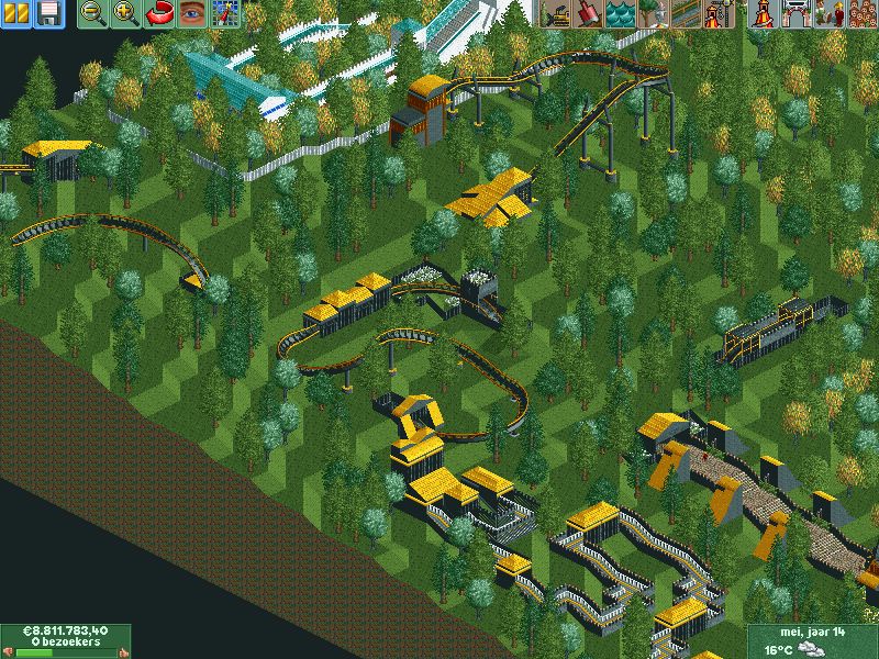
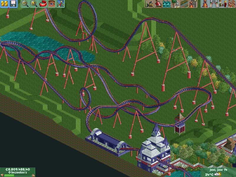
Removed the river around the wooden coaster, because i didn't like it: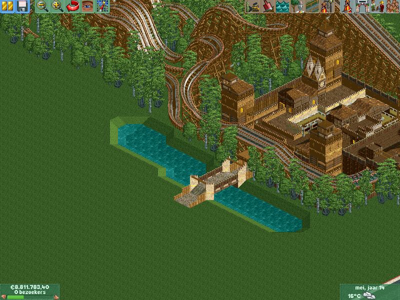
Added a new area don't know what to name it, any suggestions?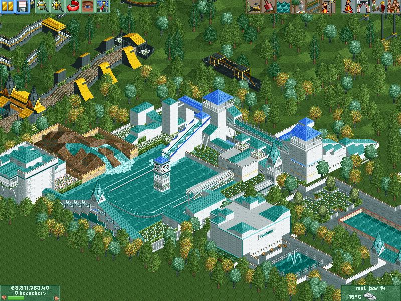
Full shot of the park: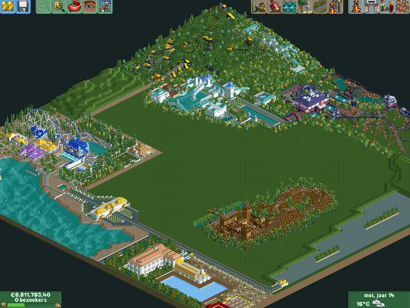
Color Changing will come! -
 Super G
Offline
I miss footers on much of the supports and the supports from the loop look ugly. Also, make your flanges the same color as the support and make the footers gray, becouse footers are made from concrete, wich is gray.
Super G
Offline
I miss footers on much of the supports and the supports from the loop look ugly. Also, make your flanges the same color as the support and make the footers gray, becouse footers are made from concrete, wich is gray. -
Ling
Offline
The colors are dreadful, and there appears to be something wrong with your alignment on the supports. The screenshots aren't zoomed in far enough for me to tell exactly what's up. The layout is also a bit meandering and doesn't have enough inversions in my opinion. As for foliage, I think your composition is alright, but some of the trees could use different colors, and you need to add underbrush beneath them.
-
 Ruben
Offline
Ruben
Offline
i can't believe nobody got my joke.
Or.... nobody cares for it, and your cry for attention makes it even worse. Just saying dude. 
I think you should call the new area: ''white-and-aqua block''. Then rename the other areas to ''brown block'', ''Purple 'n Red block'' and ''Yellow-white-shack-block''.
What I mean by this: There is nó natural flow in the park any whatsoever, it's all these véry distinct blocks that don't only have their own style, but their entirely own (fairly onedimensional) color schemes as well. This really keeps you from building a real park, and makes me feel like you're building a combination of some very distinct projects instead. -
 SchwarzRozen
Offline
Well right now an area that looks good is the wooden racer coaster. The colors of that area don't spark out as forced. For the black and yellow terrain coaster, I'd add a lot more to the area, either more foliage or more park~
SchwarzRozen
Offline
Well right now an area that looks good is the wooden racer coaster. The colors of that area don't spark out as forced. For the black and yellow terrain coaster, I'd add a lot more to the area, either more foliage or more park~


Tags
- No Tags