(Archive) Advertising District / Bellagio Adventures
-
 05-August 12
-

RMM Offline
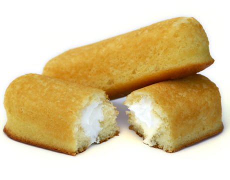
nobody cares cause nobody got it. it's a smashed twinkie people. a smashed twinkie.
i'll be here all week. -

 Hex
Offline
I thought it was pretty funny... Ruben you don't have to like the joke, but please don't attack RMM with nonsense.
Despite all of its brownness, that screen with the woody shows some improvement in my eyes. Keep at it. You can only get better.
-S.C. -

 Ruben
Offline
Hey, at least I don't call something the topic starter built a ''smashed twinkie'' right? That sounds more insulting/disrespectful to me than someone pointing out your joke isn't funny...
ontopic: Just noticed there are two bits that (quality-wise) stand out from the rest. These are the disk-o and it's direct surroundings in screen 4, and the sculpture in screen 6. Look at these two, and see how they differ from the rest of your park, that would help you a lot I guess. They are a lot more detailed, there's more eye for attention in these parts, the lighthouse in 4 is built to reflect one in real-life, which most of your buildings clearly aren't. It's looking at those kinds of differences that should/could make you conclude that to get more refined stuff you should just put a bit more time in building, use more detailed objects, have real-life inspiration etc. -

 Ruben
Offline
Wtf is a twinkie
The namegiver of twinks.
Also, a disgusting looking American type of candy. Never tried one, hopefully never will. -

 Midnight Aurora
Offline
In theory, but not in practice. With all the preservatives and the butter substitutes, they're fucking terrible, and worse for you.Never had one but they look tasty as fuck..
-

 Insanity
Offline
Now I want one of those bitches. Maybe even deep fried. Gotta love America.
Deep fried?
Twinkies are basically the collaboration between food companies and doctors trying to get rid of lipo-sucked fat. But they're delicious. -

 Ling
Offline
Deep-fried twinkies are just more expensive twinkies. Deep-Fried Oreos, on the other hand...
 -

RMM Offline
Hey, at least I don't call something the topic starter built a ''smashed twinkie'' right? That sounds more insulting/disrespectful to me than someone pointing out your joke isn't funny...
good thing you aren't the topic starter, douche. -
 -Piggynator-
Offline
Two new screens:
Thoughts on this restaurant: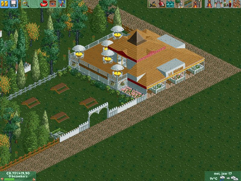
And i changed the supports/scenery/landscaping on ''Dragons Alley'''(coasters name)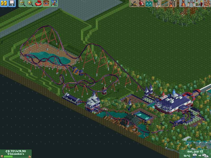
And what the entrance concerns i'm not changing it. -

 Ruben
Offline
good thing you aren't the topic starter, douche.
Geez, calm down bro. Just trying to point out that making fun of fellow forum members isn't funny.
@Piggynator: The restaurant has a lót of roof to it, and not a lot of wall. Maybe take a second to consider how this'd look in real life? There's nothing structurally wrong with it as it is, but it just seems very dark, roofy. There's some clear stylistic improvement though, especially in terms of color/materials etc. So keep up the good work.
For the coaster: Have you considered whý you put theming on certain places, and how that'd look? It feels very randomly placed. Also that quee, it looks like it goes on forever, maybe cut that short quite a bit? -
 Corey
Offline
Perhaps I'm the only one, but I think the line on the "dragon coaster" is far too long.
 Tags
Tags
- No Tags


