(Archive) Advertising District / NCSO park - csw - in progress
-
 24-April 13
-
 csw
Offline
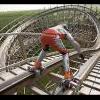
I am doing a fairly small NCSO park, here is a view of one of the coasters:
csw
Offline
I am doing a fairly small NCSO park, here is a view of one of the coasters: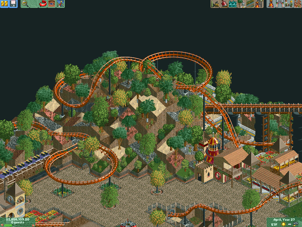
The park is far from finished, and once I do some more work I'll post more screens! Any suggestions? -
 Mattk48
Offline
I think you should drop the red rock landscape, fill it with grass. Also i think the hole in the path for the coaster tunnel is too big. But really nice screen, has a charm to it
Mattk48
Offline
I think you should drop the red rock landscape, fill it with grass. Also i think the hole in the path for the coaster tunnel is too big. But really nice screen, has a charm to it -
 MorganFan
Offline
I freaking love this. It's like a blast from the past with the charm of RoB and the like.
MorganFan
Offline
I freaking love this. It's like a blast from the past with the charm of RoB and the like.
I disagree with Matt, all this screen needs is bigger planters; just add some flowers/grass/foliage around those trees. Plus, you seem to know what you're doing. -
 inthemanual
Offline
I disagree about the red rock, I really like it. And it seems like an awkward angle, but that lift hill/catwalk looks like it could be really cool. I'm intrigued.
inthemanual
Offline
I disagree about the red rock, I really like it. And it seems like an awkward angle, but that lift hill/catwalk looks like it could be really cool. I'm intrigued. -
 nin
Offline
Old school landscaping! Love it! Don't change the textures to be more realistic, what you have makes it more original.
nin
Offline
Old school landscaping! Love it! Don't change the textures to be more realistic, what you have makes it more original. -
 gir
Offline
The jagged rocks are no good (shapes, not texture), but dude, the composition is lovely. Really excited to see what you can do with this!
gir
Offline
The jagged rocks are no good (shapes, not texture), but dude, the composition is lovely. Really excited to see what you can do with this! -
 posix
Offline
Looks good, yet perhaps a bit unorganised and loose? A clearer vision reflected by more determined design would be beneficial I think.
posix
Offline
Looks good, yet perhaps a bit unorganised and loose? A clearer vision reflected by more determined design would be beneficial I think. -
 ScOtLaNdS_FiNeSt
Offline
There is just something about it... Can't really pinpoint it but yeah, Good work.
ScOtLaNdS_FiNeSt
Offline
There is just something about it... Can't really pinpoint it but yeah, Good work. -
 Cocoa
Offline
i reckon its the random foliage that pulls the landscaping down. its scattered around randomly on random ground textures- rock,sand,martian, whatever, they all have trees on them. have some sort of contrast between bare and lush spaces maybe
Cocoa
Offline
i reckon its the random foliage that pulls the landscaping down. its scattered around randomly on random ground textures- rock,sand,martian, whatever, they all have trees on them. have some sort of contrast between bare and lush spaces maybe -
csw
Offline
Thanks for the feedback everyone, it really helps!
@Cocoa - I tried to keep certain shrubs to certain textures, such as cattails on brown dirt and the smallest bush on green. I really tried to make it more clumped and not as random, and to keep most plants off of the grey rock. So I did attempt to make it more 'diverse', I guess. Thank you for commenting on the foliage, though />/>
/>/>
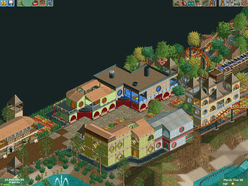
Here are a few shots of a small marketplace near the same coaster: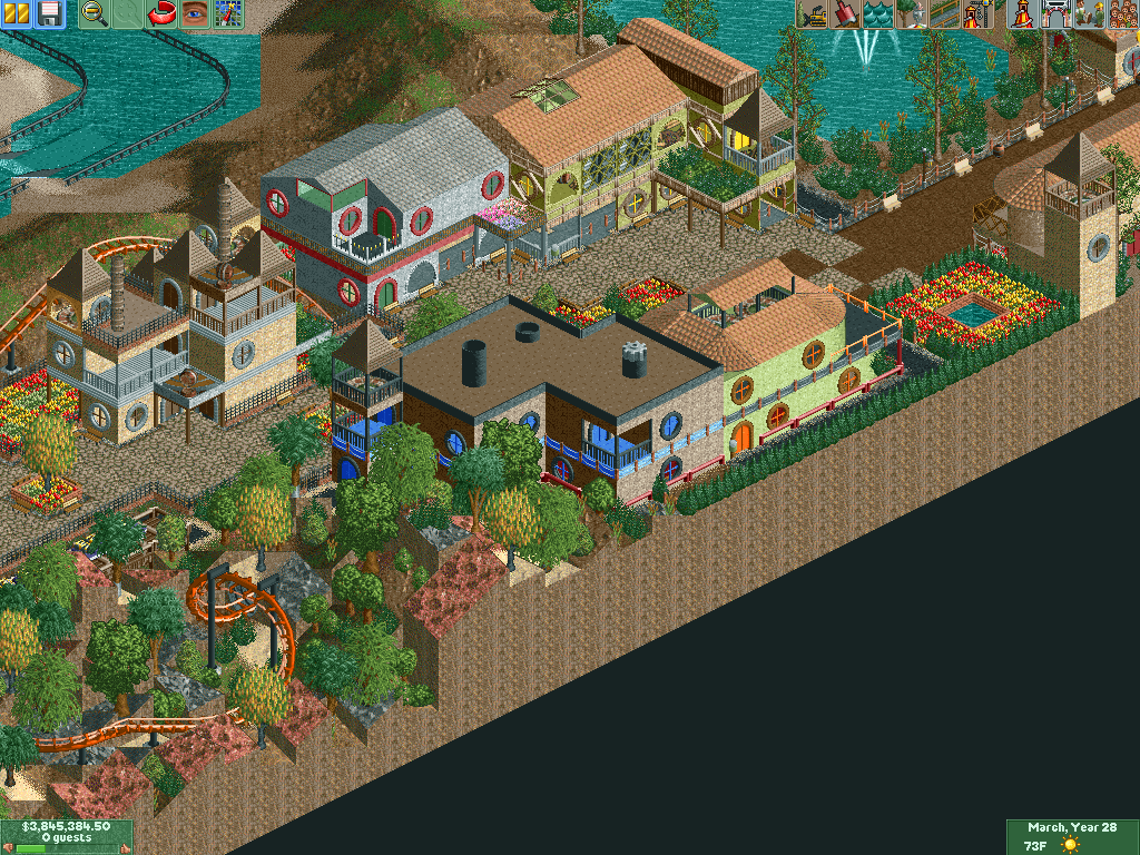
-
csw
Offline
^yeah, that was one of the first things I did and I've now realized that I want something else there. I was in love with those bushes when I began, but I've now realized that a wide variety of bushes and foliage works best. But I'd like to keep a primarily 'Western' theme/feel to the whole thing.
-
csw
Offline
Section next to the corkscrew coaster with a 'run-down castle' theme.
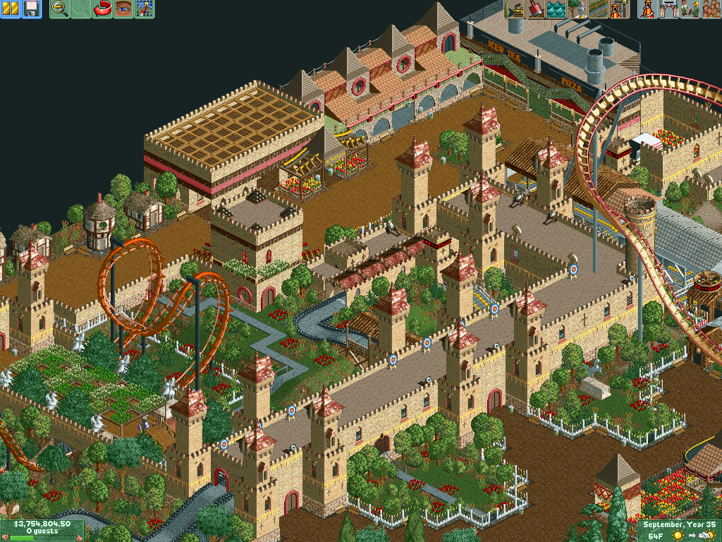
The park is nearing completion, I spent about 6 hours yesterday working on it and got a lot done />/> (It's a pretty small plot of land, too. Start small)
-
 Faas
Offline
Very cool. Love what you did with the bridge over the roller coaster. I'm not really into the rollercoaster's colours though, especially the one on the right.
Faas
Offline
Very cool. Love what you did with the bridge over the roller coaster. I'm not really into the rollercoaster's colours though, especially the one on the right. -
 Liampie
Offline
I love this. I suggest giving the surrounding buildings a clearer theme too. And some higher trees might add atmosphere as well.
Liampie
Offline
I love this. I suggest giving the surrounding buildings a clearer theme too. And some higher trees might add atmosphere as well.
Keep up the good work! -
 Maverick
Offline
I've always felt the big rides should stand out with brighter colors. Too much brown or grey will mute things a little too much.
Maverick
Offline
I've always felt the big rides should stand out with brighter colors. Too much brown or grey will mute things a little too much. -
csw
Offline
@Maverix - It doesn't have to be run-down if you don't see it, I particularly meant the shrubs/bushes in the courtyard.
@Liam - I'm thinking of re-doing the middle building, but I like the other two. They are meant to be shops that the amusement park company built next to the old castle that the company tried to make "castle-ey" but didn't do that well.
@Maverick - The trains on the hyper on the right are brighter, but I guess you're right. Maybe a blue or purple, haven't used blue too much.
Thanks for the feedback everyone!


Tags
- No Tags