RCT Discussion / Best Overviews
-
 29-October 15
-
 nin
Offline
Lately I've been building with a mindset geared towards the park overview rather than intense, up-close detailing (see: macro) in hoes of achieving great-looking overviews. What parks and designs do you guys think have the best overview/aerial?
nin
Offline
Lately I've been building with a mindset geared towards the park overview rather than intense, up-close detailing (see: macro) in hoes of achieving great-looking overviews. What parks and designs do you guys think have the best overview/aerial?
Artist was a master of this, many of his parks make my list (Busch Gardens Europe, IoE, etc) look great from a mile away. Nate's Disney's Forgotten Kingdom is a favorite as well. I'll update this post with more and provide examples once able. -
 Liampie
Offline
What a fun question! I think the key to a pretty overview is consistent density of detailing (this is why Highball's DisneySea looks like shit from above), consistent style (colours!), an organic park layout (not a grid) and at least a few recognizable structures (either a big building, landscaping feature or a fetus lake). That's what I can come up with now.
Liampie
Offline
What a fun question! I think the key to a pretty overview is consistent density of detailing (this is why Highball's DisneySea looks like shit from above), consistent style (colours!), an organic park layout (not a grid) and at least a few recognizable structures (either a big building, landscaping feature or a fetus lake). That's what I can come up with now.
Some pretty examples, in my opinion:
Shame about the empty corner, otherwise this overview is amazing. Consistent yet varied. Though I wish there were more tall structures that stood out. In that regard, maybe it's better that the corner is empty so at least the mountains stand out.
Another Fatha' masterpiece. You can tell from the overview how much effort went into each and every tile on the map.

That lake! So organic

No, Islands of Enchantment is nothing compared to the macro layout of The Aegean. And it's so consistent. So smooth!
The rounded corners were a great decision.

The fetus.

Very clear park layout, yet relatively adventurous. Features are recognizable, without being overpowering.
This park is different on every level. Micro and macro.
So smooth!


This might be one of my all time favourite aerials.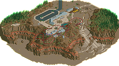
The way this coaster sits on the cliffs, and the angle of the overview, it's almost as if it's being served on a platter. This is an overview that says 'come check me out'. Marvelous.
And from my own catalogue:
Consistent density and (pastel) colours, recognizable features, and organic. http://www.nedesigns...aerialm2137.png]
-
 alex
Offline
alex
Offline
I'm not such a fan of the BGSS overview. It's just too dense to work well from a distance. There are no calmer areas to even it out or give it contrast.
-
 csw
Offline
csw
Offline
That's what makes it so exiciting to me, the fact that every inch is packed with details. So much so that he hit the object limit.
-
 Louis!
Offline
Louis!
Offline
Was just about to say Liam you ruined it.
But no, it's Alex that has ruined it all. So for that.....
The way the dome penetrates the space is perfect
The coaster looping round the dome is so organic
The paleness of the hotel contrasts the vibrancy of the dome
The way the map extends out and isn't square
The changes in parking texture that look so natural from afar
The circus text on the side of the building being so visible
How you can just see the interior through the translucency of the glass
How the colour of the cars add little speckles of fun throughout the map
How Louis tries to make a lot of his work into meme's
-
alex
Offline
I'm not such a fan of the Circus Circus overview. It's just too dense to work well from a distance. There are no calmer areas to even it out or give it contrast.
-
 G Force
Offline
G Force
Offline
I'm quite a fan of both Divinity Ridge and Rocky Mountain Mystique's overviews, the way the colors flow over the terrain is quite cool, something so natural about it.

New Fantasyland from H2H6 is also really appealing to me somehow, the shape of the map and the distinct areas just work really well together.

Also Westwinds of course
 .
.


Tags
- No Tags