H2H8 / H2H8 Round 1 Match 3 - UltraRealists vs Heaven's Gallery
-
 14-April 18
-
 turbin3
Offline
turbin3
Offline
https://www.youtube....=MNWju2przGU&t=
EDIT wrong link changed
Thank you for the video! Well done. As I don't have RCT installed, I atleast got the chance to see something

Congrats on the win, brilliant atmosphere from what I could see in the video.
-
![][ntamin22%s's Photo](https://www.nedesigns.com/uploads/profile/photo-thumb-221.png?_r=1520300638) ][ntamin22
Offline
I really appreciated the efforts in Wits End to build in the nice big vistas that are really impressive to viewers. I think that's super important to a memorable park. I also think it's hard to balance that kind of thing with making a park that looks good in other angles and in other places, and doubly so in a dense h2h build. Liamshire Posy had fewer spectacular views but really spread out the joy and discovery in ways that felt better as a viewer exploring the map; just about every little nugget of quaint village life was something you could spin around and appreciate in context from multiple angles and have it look really nicely composed in all of them.
][ntamin22
Offline
I really appreciated the efforts in Wits End to build in the nice big vistas that are really impressive to viewers. I think that's super important to a memorable park. I also think it's hard to balance that kind of thing with making a park that looks good in other angles and in other places, and doubly so in a dense h2h build. Liamshire Posy had fewer spectacular views but really spread out the joy and discovery in ways that felt better as a viewer exploring the map; just about every little nugget of quaint village life was something you could spin around and appreciate in context from multiple angles and have it look really nicely composed in all of them.
I found the architecture and areas comparatively directionless in Wits End. I'm not sure that's a wholly negative attribute for a park that's a little loose and more of a thematic exploration than the very grounded "Liam touches himself to Three Villages," but I struggled to get a cohesive sense of place from Wits End.
My vote went to God Save our Gracious Food Blog. -
 Scoop
Offline
Scoop
Offline
Ha I know you have to support your fellow GermansI'm glad we have MCI reviews this H2H! Yours was fun to watch too Scoop


-
 csw
Offline
csw
Offline
Why do the polls close so quickly?! My vote goes to Wit's End, unfortunately it seems it wouldn't have mattered. Great opening parks from both teams.
-
 In:Cities
Offline
^ I couldn't vote either. Not sure why the polls closed so soon, but it is what it is.
In:Cities
Offline
^ I couldn't vote either. Not sure why the polls closed so soon, but it is what it is. -
 CedarPoint6
Offline
CedarPoint6
Offline
Wit’s End
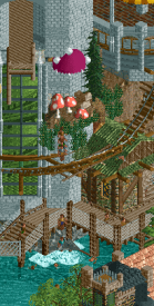
When I first opened this park I thought for sure we were going to lose. It’s detailed, immersive, and has some really cool tricks. I spent a lot of time viewing this park early on and while some of the detail ended up looking more messy than detailed, I still do like the map. I’m not sure I get the theme so much aside from “yay drugs”, but the dark browns accented with color is a look I’ve always enjoyed.
The black holes were where my eye was drawn right away. Not only is it a cool effect but it’s placed around the edge in a way that sort of softens that transition to nothing. The weird hacks are meant to be the star of the show I’m guessing and they have varying degrees of success. I do enjoy the reverse splash boats a lot. Watching the boat launch up the hill is fun. And the funnel may be my favorite thing on the map. I didn’t get much out of the invert, however. I’d have expected some more jumps and glitches throughout the whole layout or at least something more than just the one instance. The first section of the mine train where it hangs off the edge of the castle is excellent. One of my favorite parts for sure. I actually did like the little elevated tram ride with the reel cars. I was just missing some more thematics as part of it. Was expecting more to be seen from that ride.
Architecturally it started out really solid but then faded a little bit in my eyes. There were some buildings that were really strong like the one across from the invert batwing and then others that kind of seemed like you took a random wall, random roof, and random deco selection and tossed them together. It was missing a bit of cohesion, I think which seems sort of paradoxical based on my other comments perhaps. But more attention to the individual building cohesiveness may have helped things in a big way. The mushroom theme throughout was fine, but it got a little repetitive. I almost wish you’d have stuck with that motif in one area and then tried some other big elements elsewhere.
Here are the little things I liked:
The peeps falling out of the exit and into the whirlpool was super cool.
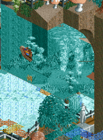
Not only is the funnel the best part of the water ride, it’s one of the best parts of the map. The glass works well for giving a good cross section of the underwater look and I like the detailing at the bottom.
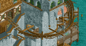
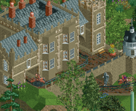
These supports cantilevering off the castle are excellent.
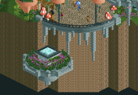
I like these floating islands and how they’re placed at an elevation that causes them to move around depending on how you angle the camera.
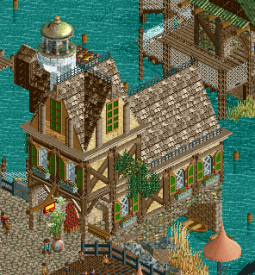
Best building on the map.
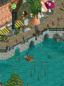
The posts are a little awkward but the 3 gates here with the boat using one is really nice. I like that a lot.
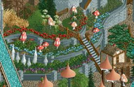
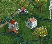
This planted with the various levels of offset monorail curves looks great. I know we’ve seen it before, but it’s always a favorite for me.
The park had a really nice overall look to it, but it almost seemed like it suffered to too narrow of a focus when I think you could have really gone for some more variety. It certainly has a lot of cool moments and clever sections, though. It’s a strong park.
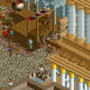
Durham, Knaresborough and Staithes
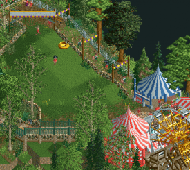
I was admittedly skeptical as we started this park. If there’s anything that viewing previous H2H matches has shown me- it’s content is key. So seeing all the open spaces had me a little nervous. But thankfully it turned out to be such a pleasant park and is full of so many little details that I could spend quite a while with it. Maybe it is because of the open space, but the map feels huge. Having three towns on the same map that all feel distinctly different yet complete is not an easy task. Yet they establish themselves well in their respective places—on the sea, on the hill, and in the countryside.
For being as big of a coaster as the wooden is, it doesn’t nominate the map. I like that it keeps pretty low and intertwines within the Knaresborough area. The diagonal double decker bridge is neat too. I remember we argued in the topic about the lift’s custom supports and they do still bother me a bit, but I will say they’ve grown on me. I didn’t get the hate for the single rail. The layout is sort of meandering, but I like the fact that they’re two distinct rides with different lift heights and ride paths and interactions. You don’t see these rides terribly often, so points for that. The sheep and shepherd ride is clever and the Sunday Drive cars give the map some movement while also being guest usable which I’d say is a big plus.
Liam has a small architecture style that I could never hope to replicate. But it works so well and really helps this map feel as big as it does. I love the character in the structures and all the little details in signs and trim and so forth. Texture-wise everything works rather well too. There are so many scenic moments that are crafted to allow you to explore the map and discover things. I like that you have to be facing a certain way to see specific details like the white cliffs or the money shot of the bridge and town. This was one of those maps that I had trouble wrapping my head around until it was a good ways through to completion, but I’m glad to have watched it develop.
Here are the little things:
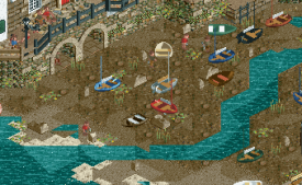
Beachcombers is a great use for the mini golfers. I like the beached boats and the sort of dirty sandbar sort of look.
Nicman the picnic man still makes me laugh. And it’s a fun little discovery thing.
The cheese rolling had us all amused in the build topic just because it’s a weird very British detail. And I do love those tents.
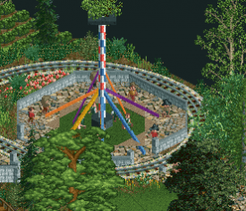
The one way pathwork here made the maypole work out great.
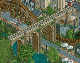
Not so much a little detail but the bridge is just so gorgeous. Very nice structure with the proper amount of aging that doesn’t look rundown but still shows age.
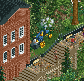
I like the movement on the steam engine display.
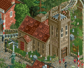
This is one of my favorite pieces of architecture on the map. Still sad we didn’t go with “Church Simulator” for the name.
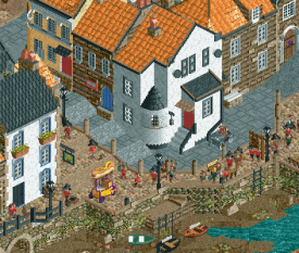
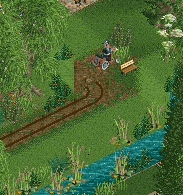
The space creation like this is something I aspire to. We have a functional road, functional path, multiple levels, a food cart, and thematic space all in this little area and all blended together really well. If nothing else, it just has a nice quaint feel to it.
I was a fan of the tight turns snuck in on the single rail. And how this interacted with the castle.
Bees!!!
I went from a skeptic to a huge fan of this park. It’s still been one of my favorite of the contest just for the pure level of detail in it. DKS is a park that I know I can come back to and just mouse around and enjoy. It’s relaxation and a breath of space in a contest where I often feel claustrophobic.
-
 Xeccah
Offline
Xeccah
Offline
" I’m not sure I get the theme so much aside from “yay drugs”"
I was naive when building this park that i really wouldn't have to sell people a concept, and rather they'd use the context clues and hints that were there to piece together what the park meant in their perspective. That's why there's no readme. I can see how that probably doesn't work in a community that sees itself more as model-making than actual creation as new element.
you are right to say that a lot of the archy here is sort of an afterthought and rushed through- because it is. none of this was meant to bring one seamless concept across which is why a lot of it seems worse and failed in my peers eyes, which to answer this:
" But more attention to the individual building cohesiveness may have helped things in a big way. The mushroom theme throughout was fine, but it got a little repetitive. I almost wish you’d have stuck with that motif in one area and then tried some other big elements elsewhere. "
a lot of this park was to intentionally challenge how people view rct. having a set of motives and repeating them is the quintessential parkmaking formula, because it's meant to allow the viewer to read a whole area at a time without interruption. that wasn't my goal here. it's a puzzle with holes in them, and pieces put in the wrong place and then asking the viewer to view it as a whole.
i love doing work that challenges perspectives with both viewer expectations and subverts parkmaking conventions... seeing people's responses to it makes it worth it for me. hopefully this becomes more evident with later stuff i do and release on the site.
-
 Camcorder22
Offline
Camcorder22
Offline
a lot of this park was to intentionally challenge how people view rct. having a set of motives and repeating them is the quintessential parkmaking formula, because it's meant to allow the viewer to read a whole area at a time without interruption. that wasn't my goal here. it's a puzzle with holes in them, and pieces put in the wrong place and then asking the viewer to view it as a whole.
i love doing work that challenges perspectives with both viewer expectations and subverts parkmaking conventions... seeing people's responses to it makes it worth it for me. hopefully this becomes more evident with later stuff i do and release on the site.
Very interesting concept and one that I think applies across multiple mediums of art. I used to play/listen to a lot of technical death metal which is basically squeezing as many ideas into a 3 minute (or unfortunately more) song, oftentimes without any sort of motifs or repeated ideas, or any sort of hand-holding for the listener. I think music such as late romantic/modern classic, and super technical electronic stuff like aphex twin follows a sort of similar idea. There's definitely something to be said for requiring the viewer to put in the effort to really get it, but you also have to accept that very few people are going to be up to that challenge. And I don't mean this pejoratively, but it ends up having a sort of elitist/gatekeepery effect in that you're really only making it for the most experienced/patient viewers and shutting everyone else out. Going back to music since its what I'm most familiar with, I think bands like Radiohead are regarded as genius because you can have no musical background, or be listening in a car or arena and still enjoy the music for its catchy melodies and easy to process song structures. But as a musician/producer, listening on headphones/on monitors with no distractions, you can really start hearing all the super intricate details, picking up on the unique textures, and realizing how weird all their rhythms are. Its a completely different experience depending on how much attention you give it and how much experience you have, but both ways are rewarding.
I think taking this approach and applying it to parkmaking would be interesting, as I do enjoy the variation in textures throughout, but think that if you tipped the balance just a tiny bit more towards cohesion, it would've taken this to the next level. At the same time maybe you did do that in a way, it did have an almost impressionistic feel in that the overview looked super cohesive and when you got down to the micro level you could see just how much variation there was. Idk just rambling now.
-
 Liampie
Offline
Rediscovering H2H8
Liampie
Offline
Rediscovering H2H8
It's been a while now. Time to re-view the H2H8 parks with a fresh eyes and not clouded with emotion. I'm going to view every H2H8 park and post one focused screenshot that stood out to me or that I think deserves more love.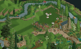
I wish it were bigger, but I'm quite happy with the open rural landscape in the park. I kind of wish the sheep/shepherd ride got more recognition, but it's not keeping me awake at night. The park won and that makes me happy.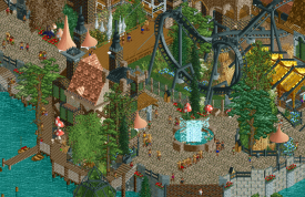
Rare easy to read area in the park with nice colour scheme. -
 FredD
Offline
FredD
Offline
I kind of wish the sheep/shepherd ride got more recognition, but it's not keeping me awake at night.
Pfoeh, I'm glad you can sleep well. Since the end of the contest I couldn't sleep well because I was thinking if Liam could live without the recognition for the sheep ride.

Tags
- No Tags