H2H8 / H2H8 Round 5 Match 1 - Strangelove vs Heaven's Gallery
-
 10-June 18
-
 In:Cities
Offline
Most unanticipated team 2018!
In:Cities
Offline
Most unanticipated team 2018!
Honestly though, I really loved metropolis. One of the most memorable parks for me in recent memory. -
 Liampie
Offline
Liampie
Offline
Will comment on Frontierland later, want to talk about Metropolis first.
The Park
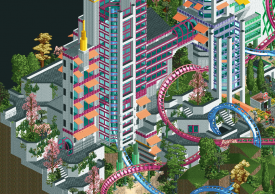
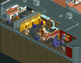
After it became clear we qualified for the playoffs, we decided to make something completely fresh for R5. It's an opportunity to be do something really creative and risky, without actual risk. Metropolis started with me building a shoestring coaster, which is something I'd been longing to see again in H2H after watching at some old H2H parks like Erwindale Forest. Definitely an intentional throwback there. PT bench was just a way to quickly replace the Sho Tour objects with objects more suitable for quickly building a park in a week; Metropolis was not an attempt to make a PT-styled park or build a park that could've been made fifteen years ago. I think that in some ways our park is definitely very modern, both in subject matter and RCT style. We talked about what kind of theming we could go with, and my experimenting resulted in some (now removed) modern looking glass skyscrapers. Steve then did the station area, and those two things kinda defined the style for the park. We had several ideas for the concept behind the shoestring, and we went with the concept of soulmates. A boy and a girl (Jen & Barry, did no one get this?) destined to each other, that even though they may split up, will end up together again. On a side note, I think it's really cool that people all had their own interpretations of what the park meant. Usually I like streamlined, clearly communicated narratives (which I think worked out really well for Billy Wonka), but due to time constraints and having no plan at all that wasn't really a feasible ambition.
Anyway, a love story in a modern urban setting. A story about a breakup, the boy Barry and the girl Jen going their own way for a while. Their communication channels go static, they avoid each other (symbolised by the (almost) synced reverser coaster) as they wanted to have some actual time apart.
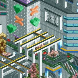
Jen goes on Tinder, where she encounters Barry, at first rejecting him (Jen's Left Swipe). They both have dates in the mean time, some 'succesful' (Barry's Unraveling), some less succesful (the abandoned picknick). Jen and Barry are enjoying their (sexual freedom), but their Liberation also leads to Deliberation (the merry-go-round that goes back and forth! Did anyone catch this?). The sexcapades and experimenting makes them realise they belong together. Jen finds Barry on Tinder again, and Swipes Right. They reunite with a kiss that's not only symbolised by the coaster interaction, but also the ornaments in the nearby buildings.
I considered having the park be devoid of peeps to emphasize how it's not an actual city, but a symbolic arena for Jen and Barry's personal journey. Let peeps in anyway, for competitive reasons. That, as well as some more storytelling details, would've made this park a conceptually stronger version of itself I think. I would not put the park full of references to dating culture though, nor would I want to spell out the entire story as I envisioned it. The ambiguity is cool I think. An example of this would be the crash. While designing the shoestring I realised the ride would operate differently with peeps on board. It turned out to be a crash on the second ride. Was it intended? No. Was it an oversight? No! I just wanted to have the main ride be peepable so I just accepted the crash. It's really cool that people gave their own spin on this crash, trying to assign a meaning to it. I didn't think of the crash as having a narrative function, but I can see it too now. Finding meaning in the blue and pink parts of the train overlapping is a bit too far fetched for me, but again, you can also apply this to the story if you want. In other words... The park is ambiguous and that's awesome.
The Inspiration
No one made the connection yet I think, but this Metropolis is accidentally a remake of the METROPOLIS area in Thoughts. It similarly features a boy and a girl as duelers in a surreal urban setting, with references to dating life. That park was a stream of consciousness with not much design behind it, but as far as it has meaning, it symbolises 'the dance' that two individuals on a date do. The flirting, the anticipating and the reacting. The similarities are actually coincidental, through similar decisions being made from a similar starting point with a similar attitude (stream of consciousness vs 'anything goes, we have two weeks to build a park').
As for the actual inspiration, I looked at lot at the Paris banlieues.

The Players
I've been saying 'I' a lot in this write-up... Although Steve and ultro accounted for half the park here, I think this was definitely a Liam park at least conceptually. Address me for that, but please give Steve and ultro credit for their awesome architectural work! I LOVED seeing Steve build something completely unlike his other work, and I was happy ultro could get a second park to work on. Last H2H there were too many people on my team that I wanted to build more, but this H2H everyone is getting enough room to shine including the very last pick of the draft. Here's who did what:
Yellow: me
Red: Steve
Blue: ultro
All three of us did more work that what ended up on the map.
Thanks for the reviews everyone! Hope there will be more of those.
-
 saxman1089
Offline
saxman1089
Offline
Great writeup Liam. I love stuff that makes you think about what you're looking at, and you certainly delivered on that. It felt like a Liam park for sure, but I didn't think you'd want to miss out on playoffs so I didn't guess that you were involved.
-
 Steve
Offline
I tried fooling all of you about me not building a park but I guess I can hide it no longer. While Liam is right in saying that this is very much a Liam park I still had a blast making what I did here. I know some of my taller skyscrapers werent well-received but I think theyre some of the best work Ive ever done and Im pretty proud of them. Liam and ultro, as alway, did excellent work here. Always a privilege to work with some great dudes. However, we were outmatched and Im fine with it. The better park won, in my eyes. Well done to Strangelove, but you can escape my wrath...
Steve
Offline
I tried fooling all of you about me not building a park but I guess I can hide it no longer. While Liam is right in saying that this is very much a Liam park I still had a blast making what I did here. I know some of my taller skyscrapers werent well-received but I think theyre some of the best work Ive ever done and Im pretty proud of them. Liam and ultro, as alway, did excellent work here. Always a privilege to work with some great dudes. However, we were outmatched and Im fine with it. The better park won, in my eyes. Well done to Strangelove, but you can escape my wrath...
Give me a moment to get into character...
...
A Disney park by Rusty. Jesus Christ, is there even a single grey path here? I dont have the map open. I actually dont really look at the parks, I have an unknown source send me .bmp screens of them and I make snap judgements. I am a busy man. Ill look at the park for you, Rusty, because you like a good beer just as much as me (just kidding, no one loves a beer more than me except for maybe my own growing midsection).
All right, its Classic-compatible. This is a good start, I think mawait, just crashed near the best architecture on the map. Some Spanish-looking stuff. The outskirts looked great though. Did you build this? Must be Stoksy, this is too good for Rusty work. Too much atmosphere. Actually, Im doubting you even did this at all. Look at all this texture. Are we sure this wasnt 70% Stoksy instead? Maybe not, since I feel like Im looking at a string of facades from your Wildfire B-Sides. Yet these are better. Oh well. Anyway.
This fort looks familiar. Wasnt this in Worlds of Fun? Its nice anyway. Very brown. Is Kumba on this team? Kumba verbally assaulted me recently for being mean. Not relevant but I am saying it anyway. The whole map is very brown actually. Its got a new brown though, so, I guess its also fresh? I dont know how to feel at this point.
Past the fort we see a lot of western type facades. Cool, I guess. More facades...some trees...nice rocks...oh, hey! Splash Mountain! I mean, I guess it is? Splash Hill? The pink rocks are nice. Is this like Splash Mountain and Big Thunder had a baby? I do not trust Rusty as a midwife.
Im crossing the river past this weird boat and see some waterfront buildings. Not bad, not great. I am indifferent to these. I do see Expedition Everest but its also...not? Didnt Stoksy build this already? These creator shares are bullshit. You cant pull a fast one on me, Rusty. Its cool looking though. Very brown again. Is there a Kumba entertainer around here? Thats really going to solidify my theories.
Oh wow, nin is on this team too? Loving this Port Orleans Riverside architecture, nin. Very cool waterwheel, and colors are nice. Cant believe this trade happened and I didnt know. Whos captaining the Replacements now? Wild stuff. Best stuff on the map because Rusty definitely didnt do it.
Looks like Ive come full circle to the part when my iPhone explodes. I can see its a Haunted Mansion. Whats this doing in Frontierland? Already have lost me (not like I wasnt already lost before, though). Is this meant to be like a Spanish mission? I dont know the storyline though cause I cant see it. Im sure whatever hack was done was stupid anyway. Also, did Rusty build this? The main facade is really good. Gotta be nin, again. Or Stoksy. He did have the 70% share.
Overall I remain unimpressed as a Disney fanatic but impressed as an RCT player (kinda). Well done to both teams, but mostly mine. And well done to all players, but mostly me. And nin too, I guess. What a trade. Cant believe were not talking about this and instead were all flipping out over Louis thing. Oh well. Anyway.
edit: goddamn I hate how the mobile site doesnt like punctuation. -
 Xeccah
Offline
WHY METROPOLIS IS GENIUS:-This was the first park i think I've ever seen that captures a narrative completely. "Show, not tell" is extremely hard to do with RCT, but all you need was that "KISS" sign and the ride name, and that was all the viewer needed to figure out the rest.-Everything in this park (i don't think i should be referring to it as "park", but i digress) was intentional. Every ounce of this park was crucial to the theme, as what Liam showed.-You've left the "park" ambiguous and for the player to discover what it is. I tried this with Wits End, but admittedly because i didn't do those first two bullet points right, I didn't have enough to sell it. You did, however, and I loved trying to make sense of it all.-The setting is left simple and doesn't clash with the theme. Again, something I've fucked up. There was no mistaking if this was a "modernist architecture park" or a "park about dating culture and two people finding romance". I think what people see as a flaw was actually an amazingly good design choice.The only downside i see in metropolis is its cartoony usage of RCT "things" to make the theme. The "right/left swipe" were okay, but Liberation and Deliberation read too much as a Ferris Wheel and a carousel at first glance; when i first viewed the park I thought they weren't as thematically important because of it."It's an opportunity to be do something really creative and risky, without actual risk."TBH it sucks that you felt that you couldn't do this for all 5 weeks, but again you are right that you'd probably lose all 5 weeks in the process. I love when a park doesn't "tell" you what it is and how to enjoy it, but suggests what it is to you. The last park that successfully did that, and even then they didn't do it to this level, was La Reve and Corsair Veredian. Ironically Liam and Steve were on one of those parks..."It's an opportunity to be do something really creative and risky, without actual risk."TBH it sucks that you felt that you couldn't do this for all 5 weeks, but again you are right that you'd probably lose all 5 weeks in the process. I love when a park doesn't "tell" you what it is and how to enjoy it, but suggests what it is to you. The last park that sucessfully did that, and even then they didn't do it to this level, was La Reve and Corsair Veredian. Ironically liam and steve were on one of those parks...
Xeccah
Offline
WHY METROPOLIS IS GENIUS:-This was the first park i think I've ever seen that captures a narrative completely. "Show, not tell" is extremely hard to do with RCT, but all you need was that "KISS" sign and the ride name, and that was all the viewer needed to figure out the rest.-Everything in this park (i don't think i should be referring to it as "park", but i digress) was intentional. Every ounce of this park was crucial to the theme, as what Liam showed.-You've left the "park" ambiguous and for the player to discover what it is. I tried this with Wits End, but admittedly because i didn't do those first two bullet points right, I didn't have enough to sell it. You did, however, and I loved trying to make sense of it all.-The setting is left simple and doesn't clash with the theme. Again, something I've fucked up. There was no mistaking if this was a "modernist architecture park" or a "park about dating culture and two people finding romance". I think what people see as a flaw was actually an amazingly good design choice.The only downside i see in metropolis is its cartoony usage of RCT "things" to make the theme. The "right/left swipe" were okay, but Liberation and Deliberation read too much as a Ferris Wheel and a carousel at first glance; when i first viewed the park I thought they weren't as thematically important because of it."It's an opportunity to be do something really creative and risky, without actual risk."TBH it sucks that you felt that you couldn't do this for all 5 weeks, but again you are right that you'd probably lose all 5 weeks in the process. I love when a park doesn't "tell" you what it is and how to enjoy it, but suggests what it is to you. The last park that successfully did that, and even then they didn't do it to this level, was La Reve and Corsair Veredian. Ironically Liam and Steve were on one of those parks..."It's an opportunity to be do something really creative and risky, without actual risk."TBH it sucks that you felt that you couldn't do this for all 5 weeks, but again you are right that you'd probably lose all 5 weeks in the process. I love when a park doesn't "tell" you what it is and how to enjoy it, but suggests what it is to you. The last park that sucessfully did that, and even then they didn't do it to this level, was La Reve and Corsair Veredian. Ironically liam and steve were on one of those parks... -
 Camcorder22
Offline
Camcorder22
Offline
I was def in the crowd that got a lot of enjoyment from Metropolis. In terms of the concept I basically agree with everything shogo said. To add to that, this was the biggest shift from the 2018 NE meta we've seen all contest, and I got a very nostalgic 2004-2006 H2H4/PT2 vibe from it. Its impressive to be able to completely detach yourself from what everyone else is building and build straight out of a different decade so convincingly.
Also love the parts that were up to interpretation such as the crash. My bipolar ass was in a very shitty place last week and was like "it shows how all love ends in failure and suffering etc etc". Idk i'm feeling a bit better this week and still interpret it that way so I don't know where I'm going with this. I just thought it was perfectly done how there are enough clues that you clearly understand the concept, but it leaves a lot open to the viewers perspective. Kind of inspired to build something like this myself now.
Frontierland was a competent park, with some great moments archy wise, but didn't hold my attention super long, and some rides like Splash Mountain were a bit disappointing to me. I would've liked to see a lot more from Expedition Denali to make it a truly immersive disney attraction as well, or maybe just a take on something like Thunder Mountain. Obviously time was an issue, but with two weeks to build, HG made the right move with their direction at least for my tastes, making something unique that can't be easily compared with the other parks in the contest.
Looking forward to whatever parks both teams pushed off to semis/finals

-
Xeccah
Offline
Frontierland to me felt fairly soulless to me. it's really well polished and a disney park of this calibre would surely earn spotlight, and I do like that it's just a part of a park without any catch or gimmick, but this in a way feels like "I need to fill in something for round 5" rather than having a need for it to exist. That sounds weird, perhaps, but beyond how nice it is, there's no boundary it pushes. PP and DAW stood out among disney and among H2H parks for really trying to execute something to its highest level. Sometimes it worked (DAW), others it didn't (PP for the most part), but this doesn't even attempt it. It in a way is like the rest of G Force's parkography of aesthetically safe work that doesn't really contribute to anything beyond what someone else has already done.
If the rating system were about "how much skill something takes" perfecting and polishing something to this level would deserve spotlight, but how good something is isn't just about virtuosity, it's about adding something to the narrative that wasn't there before. Any way if this park were less polished or less perfect I would have enjoyed it and rated it the same, and I think G Force is skilled enough to break out of this stylistic cocoon he's shelled himself in.
65%
-
 ottersalad
Offline
Shotguns, I think you are correct about needing to fill something for round 5. Definitely a safe park to build. I’m surprised no one pointed out Russ built an area that was archy from a resort, not a park. Kinda funny to see Port Orleans Riverside’s dining hall.
ottersalad
Offline
Shotguns, I think you are correct about needing to fill something for round 5. Definitely a safe park to build. I’m surprised no one pointed out Russ built an area that was archy from a resort, not a park. Kinda funny to see Port Orleans Riverside’s dining hall. -
 Cocoa
Offline
Cocoa
Offline
our park is sort of maybe my fault
I was originally on this but I decided I just didn't have the time for it, which was definitely the right decision for me tbh. Our original plan was essentially a recreation of paris's frontierland, which russ revised when I abandoned ship. But the whole original vibe was my idea because I thought it was a good idea which could be pulled off in a short amount of time, which turned out to have been true
We floated various concepts for a while before sort of settling down to this one, based mostly on a good ratio of ease-to-potential-quality.Its certainly not high on my list of h2h parks I thought I wanted to make, and probably not russel/stoksy/jappy either, but in terms of contest strategy you can't deny it was a bad idea... unless of course the crabs fuck us. In which case, uh nope this wasn't my fault
-
 FredD
Offline
FredD
Offline
Heavens Gallery
I don't know what to say about this park without coming across like a dick. I just really don't like it, archy too boring and too bland for me. Also not digging the color choices. Can't help this, this park is not my cup of tea at all.
The tinder profile wall with the swiping ship in front of it was funny, clever idea. I was also not liking the coaster(s) lay-out until I noticed they were one coaster that separates and comes back together... It did manage to amaze me. Really awesome touch here.
I'm sorry HG, it's just me. 65%
Strangelove
For some reason OpenRCT crashes every time when I try to open your park... I'll review it later.
-
 CedarPoint6
Offline
CedarPoint6
Offline
Metropolis
The standings coming into round 5 afforded us the ability to push Allegheny to the semis and give it more time to be completed. Liam, Steve, and ultro somehow managed to pull a completed park out of thin air almost overnight. The difficulty with these sorts of parks is that it’s challenging to finish the park in the first place, much less layer in the details.
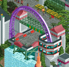
Where this park excels for me is the clever and off the wall storyline. I recall being incredulous when Liam first pitched this idea, but somehow it came together and worked out pretty well. The park doesn’t take itself too seriously but still manages a pretty darn cool coaster. Shoestrings that use the various parts of the train to affect the momentum at key spots are really interesting and we don’t see them terribly often. I appreciated the sections of this coaster where the first half of the train pushed the 2nd half through its loop using the momentum from another element. It’s a shame that the ride breaks on the 2nd run because it is a lot of fun to watch. I did reload the game a number of times just to watch it.
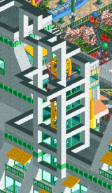
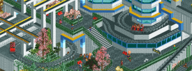
Architecturally the forms are reasonably simple, but have a pleasing level of detail and interest to them. I said in the build forum as well, but the clean white architecture punctuated by primary colors felt a lot like Mirror’s Edge. There are so pretty cool structures scattered throughout that have an 80s modern vibe to them. For essentially just building continually, the park is surprisingly cohesive. It all looks like it belongs. While I wouldn’t say this is my favorite map by any means, I’m still really impressed by how well it came out.
Here are some little things:
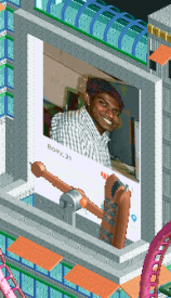
Using GW’s avatar was pretty funny. And the left and right swipe rides were clever.
I like the deco pieces wrapping all around the top of the launch tower here.
I like the reverser coaster in the way that we never really see them. It’s sort of all over the place, but the winding in and out of the buildings is neat.
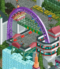
The kiss scene is the coolest part of the coaster and a great setting.
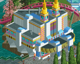
The Netflix and Chill ride has a really nice building for it. I like the neon lights and the deco trim for the pink and yellow trim.
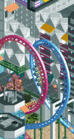
Half the coaster train pushing the other over and through the loop. I also really like the façade with the diagonal slopes behind it.
These terraces are cool.
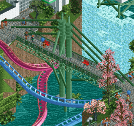
This cable stayed bridge is rather nice.
(Not pictured) All the staff with their name, age, and sex are amusing.
For a park cranked out in the time frame it was, this turned out rather nicely. More time would have been great to further overlay details onto the map and give some more depth. But well done for getting a completed and finished map submitted, especially when I wasn’t certain that was going to be the case.
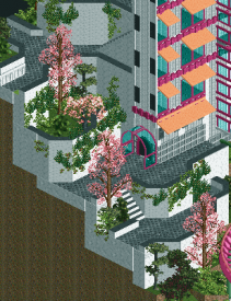
Disney’s Frontierland
I was a little surprised we went as far into the contest as we did without seeing a Disney park (Port Disney HK notwithstanding). With the H2H map size requirements, Disney Parks are essentially forced into a section of a larger park. This park does a reasonably good job of making this feel like a section of a whole while still complete on its own.
I like that the 3 main rides were essentially 3 different approaches to Disney attractions. Splash is based heavily on the real rides, Haunted Mansion is a new take on an existing ride, and Denali has some Everest in it, but is essentially a new ride. For Splash, it would have been great to see some cutaway interiors, but maybe there wasn’t time. The rockwork looks good with the mix of peach and the original WW scenery colors. I can’t quite tell if this is meant to be Song of the South themed or not—some outdoor theming or the briar patch would have great if it is meant to be that theme. Haunted Mansion is my favorite ride on the map… even though it’s only half of a ride. The building is great and the theming cutaway on the inside is excellent—very much reminding me of some Mystic Manor influences. I’m not a huge fan of Denali unfortunately. It doesn’t feel very Disney with the general lack of show scenes and reliance purely on track through the woods and mountain. I wish there was some work done with the block brakes so the nice long layout could have 2 trains running at the same time. It’s a shame the one train just has to sit and wait until the other clears the long brake run into the unload station. Seems like an oversight. The layout does, however, flow very nicely, especially after the launch.
Architecturally, there’s not a lot in the way of signature buildings, but what is here is very good. The string of western facades is rather nice, though the dockyards area is a bit nicer in my opinion. I wish there was a 2nd shade of brown to work with to give the fort up front a little more depth, but design-wise it does look great. The little shops and carts along the pathway are very nice and give the area some extra depth, though more is always better! The biggest thing I’m having trouble putting my finger on with this park is the Disney magic that really makes their parks special. The park is technically very good, but I feel like it’s almost lacking a bit of soul to really elevate it to the next level.
Here are the little things I enjoyed:
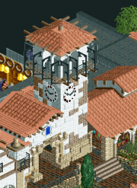
This façade is great, especially the tower here. Not sure how well it fits with the rest of the surroundings, but I really like it.
The interior is great. It’s got a bit of a Mystic Manor vibe.
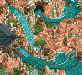
I like the way the start of the ride wraps around the main drop. The use of the black wall tiles for tunnels is an interesting choice too—I think I like it, though it does make some areas over by the Intamin feel a little dark.
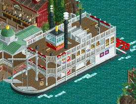
This steamship is excellent.
Nice fastpass distribution area.
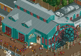
This reminds me a lot of Port Orleans at WDW. The way the waterwheel is framed with the path is very good.
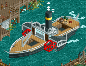
The sidewheeler looks good as well. Nice detailing.
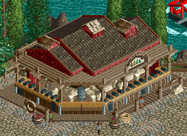
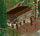
This shooting gallery has some good detail on it.
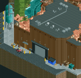
The back of house spaces across the entire park are great, but this is especially strong from the filtration to the large access door to the show scenes.
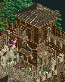
Even though it’s a lot of brown, I like the composition of the fort.
Disney parks are always tough to get just the right look to them. In general I think it’s achieved pretty well here though some further work on composition and detailing could do wonders. Good work, however—some really nice stuff here.
-
Liampie
Offline
Rediscovering H2H8
It's been a while now. Time to re-view the H2H8 parks with a fresh eyes and not clouded with emotion. I'm going to view every H2H8 park and post one focused screenshot that stood out to me or that I think deserves more love.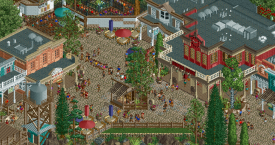
I love the western architecture in the park, on of the most overlooked bits in the contest I think.
Just an unusual angle for you to consider.


Tags
- No Tags