H2H8 / H2H8 Semifinals Match 1 - Strangelove vs Team Spacecrab
-
 02-July 18
-
 zxbiohazardzx
Offline
zxbiohazardzx
Offline
Though choice here. Both pretty solid parks, but i went with the more creative Mobray.
-
 Julow
Offline
Julow
Offline
Hey, here is my review :
i voted for fairytale kingdom because voting for mobrays is so mainstream
-
 Poke
Offline
Poke
Offline
I think both parks were incredibly excellent however the mood and atmosphere of Morbray's put it over the top for me. Highlight of that park had to be the dualing coasters which were such a spectacle to watch.
Great round, so much talent displayed by both teams!!
-
 Cocoa
Offline
Cocoa
Offline
does anyone care if i leave a premature review of mobray's before voting closes? I'm going away for a couple days so will miss end of voting. ok i'll do it anyway you flangbois
firstly, wonderful park. I told russel I would vote for it! Off the bat, love the vibes. like you turned the concept of "the prestige" into a park. theres a lot of juicy details to get yourself into. that theatre is wonderful, the factory with the hammer ride is superb. you use the ferris wheel object all over the place to such good effect, especially on those glass buildings- brilliant decision to not actually use any glass also! somehow it just works here. lots of awesome little scenes and details, from magicians, weird technology stuff, astrologers, a frankenstein-y castle, etc. the main layouts are pretty solid too, kudos on syncing them up well. can you get stations to release at the same time that aren't adjacent? anyway a really solid park that also feels very "crabs". I think in some places the palette may hide a bit of sloppiness, especially on some of the facades around the big theatre. But it doesn't damage my view of the park much to be honest. I'm more and more of a fan of just using whatever objects to add to archy and stuff to complete it even if it isn't the 'most detailed' way to approach it. it does seem like the community is heading back in that direction too, which is sort of nice to see.
-
 G Force
Offline
G Force
Offline
As much as I do like our park, I completely understand the way the votes going here. The nighttime palette works well in so many ways and makes the name of the park feel like it has multiple meanings here, lmao. Almost immediately I probably knew this is the way it would go, as any "non-park" or something truly different would probably easily persuade people away form our park and its relatively similar feel.
Though I don't really think its one of the stronger Crabs parks this season, mostly due to it being very rough around almost every edge and sort of being a bit empty in a few places, its a pretty solid semifinal park. Maybe at some point I'll leave a bit more detailed review for this (and just about every other park). Hope you guys can produce something even better next round and give us all good final match!
-
 saxman1089
Offline
saxman1089
Offline
can you get stations to release at the same time that aren't adjacent?
Thanks for the review Cocowah! I told myself I would review your team's park too as a way to get the discussion flowing, I just haven't found the time yet.
In answer to your question, yes, using the tile inspector. Once both coasters are built, you can copy the first tile of the station from each and paste it on the tile next to the first tile of the other station. That way, the game thinks they're "adjacent" and you can use the normal "sync adjacent stations" option. I believe this is how they did it in Feira, and how we tried to sync all four coasters in Winkelheim (although I don't recall if we got it to work properly).
-
Julow
Offline
An incredible round !
I truly fell in love with Fairytale Kingdom's aesthetics. Everything is so beautiful, smart, clean and full of details. The frozen castle is just omfgdnessly impressive, the coasters are top notch. Everything is top notch. I don't know who built this park but it's clear that it's probably the best players on this website, that's the result of long years of work and well earned experience. For me that park is now my reference for the ultimate Disney RCT park.
Loved the idea behind Mobray's Illusion. I couldn't truly enjoy the park because of that color filter (in the same way Tubiao was weird for me to look at). I can just admit that it has a truly unique and cool atmosphere but that filter... it ruined it in my opinion. I guess it was the best you could do to have a night park but I would have tried another idea instead. Also some of the archy, particularly those 2 big rectangular trackitecture roofed building, were not that good and particularly low quality compared to the rest of the map. Loved the teleportating roller coaster and the fortune teller ring.
My vote went for Disney without hesitation. It wasn't maybe the most risky choice but I couldn't find anything I didn't like, it was pure delight to look at it. Don't get me wrong, Mobray's is an excellent park too !
I would probably give 90% for Disney and 80% for Mobray's.
-
 Liampie
Offline
Liampie
Offline
Mobray's Illusions
Wow, that's an intense palette. As if it's actually night, it takes a while for my eyes to adjust. But what I get to see then is great. Let's start with the city outskirts... Incredible. Every building is so full of character, and you really nailed the dirty late 19th century look with the junk in the courtyards, the dirty gutters and the thick black smoke, without overdoing it. The horses and carriages also added a lot of life and credibility even if the legs weren't moving. Are the catacombs part of the city area? I think they are. Looks great, cool idea. Great detail here: the cart and the horse. I'm not going to post a screen, but look it up, people. Such attention to detail. The factory definitely stands out as the coolest thing on the map btw. Not just the already mentioned hammer and hot metal details, but also that little attic interior and the overall structure. All 10/10. Not the biggest fan of the ultra twister roof, and I think the theater facade looked out of place/was poorly integrated. Nitpicking, though.
Let's move on, to Mobray's Estate. First of all, brilliant entrance with those winding stairs and the central pond. Beautiful. Reminds of the UR's Park Guell a little (some other things too). I love how the Estate is like a fairy tale forest, but with magic tricks instead of fairy tales. Brilliant! It's kinda pointless to list all the different features, but I'm doing it anyway to let you know that I noticed them and loved them: the astronomer's tower (so simple, so beautiful), the glass house with the 4d track (works much better than the ultra twister one), sadly it looked awfully empty inside, the freak show is fantastic. Seems like a hydrophobic peep got on Walk on Water because not much is happening there but I appreciate the idea. Wizards Dance was a bit weird/unexpected here, but it looked cool.
Someone also compared the mansion to Frankenstein and I thought the same thing. Also different in enough ways though. Architecture is fantastic (look at how the roofs curve at the corners! Again, beautiful attention to detail). Coasters duel fairly well, look great, and have some very original elements/interactions/features. Then there's a few more good ideas here like the water tank and the transportation coaster.
All in all, there's a ton of atmosphere and attention to detail in this park. To me this is one of the clear highlights of the season. I also appreciate how spaced out everything was, made it very easy to read and unexhausting to explore. Especially with the palette this easily could've turned out differently. Great fucking job, Crabs.
Disney's Fairytale Kingdom
Another Disney park with all the usual things? Park seems as cliche as the average Disney movie at first. But let's not make this review about that. I just said it, so let's move on. Again, my eyes have to adjust after viewing Mobray. This is brighter than Atlantean Ark. The entrance area is well done. I appreciate that you included a bit of the entrance area outside the park, with the nice flower beds and the ticket booths. I don't recommend doing that more often in H2H, but it works well here I think. Looks not very special otherwise, despite some nice details like the benches. On the park side of the entrance, again it's the planters that look nice. Shame about the glitches, but decent trackitecture fences here. The curvy lights are cool. Epic boat for sure. I want to like the architecture in this area more than I do. It's just there. I'm more interested in the customized trees, nice work. Alladin area is ridiculously small and the flat doesn't seem to work as intended, but it's nice. There's the big restaurant with the two towers that's not very appealing at first sight, but full of brilliant detail when you look close up. This area here is fantastic, really.
Mulan's area is great, best area in the park. The coaster is good. Love how it wraps around the roto-drop. That diagonal wall and gate in the middle of the area is so good looking btw, and interesting idea with the mine train on top. All the buildings and places are unique and I appreciate that. There's an idea behind every feature, that's good parkmaking. Execution doesn't leave anything to be desired. The biggest building here was also the least interesting to look at though. Could've done more with that I think. Still, major props for this area.
You did Frozen better than the Icons. Brave choice to do Brave. Like someone else pointed out, this is the most themepark-y area in the park for some reason. Good idea for the coaster, good use of the palette, some nice little things like the tents. What the fuck is Pocahontas's canoe doing there? Fantasyland is interesting. Some buildings work great, some are just there. Lots of shit going on on the paths, a bit too much. Dark ride has some good interiors but most of it probably references shit I'm not familiar with so it doesn't really do much for me. The tree hanging over the pub is one of the best things in the park.
Overall: very creative object use, overall good execution, but not always memorable. Another thing that bothered me with this park, in a few places, is that it was hard to figure out what was higher or lower, and what was inside or outside (like the Frozen back facade, or around the dark ride with the cutaways). Readability could've been better. Definitely a great park, a semis-worthy one. Great job, Strangelove. -
 FK+Coastermind
Offline
FK+Coastermind
Offline
Amazing matchup and well deserving of a playoff match. Congrats to everyone involved, particularly given the state of things, in getting out some amazing work. That being said, I don't think it will turn any heads that my vote is going to Mobray's Illusions.
This matchup reminded me of New fantasyland vs. Siege of Jerusalem in many ways. By which I mean, one was expertly done, great parkmaking, but even though it had new ideas, nothing felt mind shattering so much as safe within the paradigm of NE. Meanwhile, the other park, while risky, was just so well done and such an interesting counterpoint, it felt way more unique. Perhaps a stretch, as Jerusalem was risky just because it was LL, but Mobray is risky because it is such a refreshing step outside the world of what NE thinks parkmaking is. It takes a ton of risks and for me, they all pay off.
I thought Fairytale Kingdom was extremely well done. It was dense but not disastrously. It had tons of content without feeling overwhelming. The castles and structures were very well done, and there are tons of clever references. Also, I love the freshness of many of the choices. These are not really commonly seen movies used for Disney parks, in real life or in rct, so it felt really new in a great way. And I say that even acknowledging the Arendelle park. That all being said, this park could not shake the shadow of NE parkmaking, and especially Frontierland, for me. It even had the same shape and general land pattern as Frontierland. What it came down to for me was, when facing a park so centralized on creativity and so challenging to NE's normal style, Fairytale Kingdom just felt safe, even if it really wasn't.
Then there is Mobray. If someone was trying to make an FK-friendly park, this would probably be the outcome. It has tons of fun, different, unique ideas. Tons of content, but fresh content that is interesting and different and fun to explore. I'll agree, the palette is intense, but I applaud the risk. It is the kind of choice that needs to be made, if only to push NE into a new way of addressing parks and exploring moods. And for all the complaints about the palette, I think there were plenty of clever uses of common pieces here that was made possible and positively contributed to atmosphere because of the palette. One example that struck me was a sign being used to create a wall pattern on one side of the factory. I won't say the park was flawless, but i've always made it clear that ideas and creativity are my thing, and this felt rewarding in that respect and thus I want to reward it. So my vote went to Mobray's Illusions.
Again, congrats to everyone and good luck in the finals.
P.S. I adore the cruelty of making peeps canoe through a dark ride. Bravo!
-
 inthemanual
Offline
inthemanual
Offline
Voting Closed

Team Spacecrab beats Strangelove!
Team Spacecrab vote count: 33 (75.00%)
Strangelove vote count: 11 (25.00%)
Mobray's Illusions was made by Tolsimir(45%), Fisch (30%), camcorder22(20%) and Saxman1089 (5%).
Disney's Fairytale Kingdom was made by Stoksy (61%), In:Cities (25%), Ziscor(13%) and ottersalad (1%). -
Liampie
Offline
Congratulations on making the final, Spacecrab. Looking at your season, I'd say it's deserved. Same for Strangelove. Congrats on making it this far, while fewer of your parks stood out as much, you've been so consistent. Forgotten Mekong was the one GREAT park you had, now you arguably have two. I guess we'll call this 3rd place, which I think is deserved. Great job on your season!
I almost guessed all builders correctly, even though it wasn't too obvious aside from two people. I considered guessing In:Cities in CC9's guessing game, but I didn't directly recognize any of the park as his work, so I went with roygbiv instead. I could see him blend in better. The whole park could've been made by one person though, it was super consistent. Mobray obviously had some Fisch touches, and although it's hard to define his style, I was pretty sure Tolsimir was involved too. After Haystack I could see Cam blend in as well, and saxman is a no-brainer. Again, the park was quite consistent, so good job.
-
 Turtle
Offline
Turtle
Offline
I wasn't totally sold on the Prestige park, there were a few things i'd have done differently, but overall I felt that it pushed the envelope slightly further than the Disney park. The Disney park was REALLY nice though. Not quite enough WOW factor though for a semi final in H2H. I want to see something i've never seen before... which is what Mobray's gave me.
I'm a little sad though, as I think Strangelove have been my favorite overall team so far, and i'm sure their final park would have been ridiculously awesome. Please finish and release it!
-
 Tolsimir
Offline
Tolsimir
Offline
Woah, before the voting I didn't expect it to be that clear, neither that we would win it at all! As I said, I thought that Strangelove's park was extremely good while from the builder's perspective of our park Mobray's is very rough in places and was just an extremely rushed park and we had to do some choices that put adding content back for having actually something finished. I'd like to give some inside perspective now for people who might be interested. I'll do it in a way that I also will respond to some of the comments made on the park. So I totally have to agree with Gforce:
Though I don't really think its one of the stronger Crabs parks this season, mostly due to it being very rough around almost every edge and sort of being a bit empty in a few places
I think the way the park was built was not the way we planned it to. So the whole concept of it and initial building was done by Fisch. He started with it somewhere after R2, I think during R3 or something. From my perspective after Ghibli he wanted to prove himself and do something highly detailed but spread out taking the critisism on Ghibli seriously (sorry that I write that Fisch
 ) so he went on a building spree and in one or two days did the first archy which is the streetside on the other side of the factory. He also build the factory halls, but his interior stuff sucked really.
 One example that struck me was a sign being used to create a wall pattern on one side of the factory.
I did not know how he came to this idea but I liked it a lot too. That's why I later put this stuff also on the main building of the factory.
What was really a debate and unclear thing in the beginning of the building process was the actual concept of the park that Fisch had thought of. So it was clear that he wanted the park to be set in 19th century London and heavily inspired by The Prestige. So there was the idea of having an overgrown estate garden in the city of some old magician who is trying to help the poor people in the city by offering them pleasure in the gardens where there are lots of magic tricks and stuff. Initially we planed to have some two version thingy or two layer. First there would be the view, how the estate would appear from the outside viewer: Overgrown, dark, abandoned. Then there would be the "inside" view: so all the stages/tricks there, colours and life. But we couldn't think of how to do this effectively in one map and trav at that time forbid to have two different maps altered that much. So we had to stick with only doing it on the map. The problem with Fisch's concept was, that he didn't want to have any rides or something but only really magic tricks stuff. So nothing like the dueling coasters there now, because he wanted to do a real "realism" approach on it: everything on the map should be a real visual thing. So with brainstorming we collected some magic tricks but in now way we could thing of how to convert them in Fisch's sense onto the map.
So long story short: during a large portion of the building process we just concentrated on the city part, because we didn't know how to fill the park which resulted in:
The Mobray estate itself, however, was lackluster in comparison and while not bad, did not have the same level of quality imo.
Now to the palette aka "I can't see shit": Fisch intially was building his archy all the time in ORCT's included night mode and wanted to have a night palette eventually from the beginning on. As I have proven my palette making skills in H2H7 already I volounteered to do the palette. And it was a fucking nightmare literally! I don't know how much time I put into this palette, there were like 20-30 versions of it. The challenge was, that the natural colors like from the grass, land blocks etc have be darkened and still to have enough light colors to actually do interior stuff or illuminated stuff on the estate later. So I had to find a good darkening first, and that was really a hard task. The reason is that my RCT PC's screen is very bright by default. So whenever I found a good luminosity so that for me it looks like actual night all my time just said "I can't see shit it's way too dark." And when it's too dark you don't see details etc. I was all the time just responding
As if it's actually night, it takes a while for my eyes to adjust.
Also to find the right amount of colour mixing was quite challenging as at night time blue color should be way more dominant. Here some screens from the making process, note that some colours changed position later so that in the screens there might be some off colors (I took the screenshots from the final version)
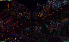
Way too dark.
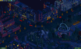
I actually liked the blueness in this one as it resembles the night really well, team didn't approve though, too dark still.
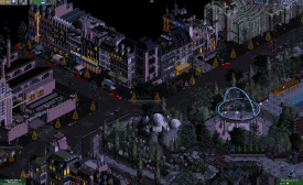
Getting closer to final version
Killing a little more red, just before final.
Another problem was, that some objects had strange pixels that were from one of the bright colors so they were of no use and we had to kill these pixels manually in the object editor (looking at you Liam for your urban brick).
After the palette was somewhat finished I also stepped into building. So for most of the time it was Fisch and me. First thing I built was the factory interior and I'm glad people liked it so much. I tried to play with lighting here from the molting iron and it worked out quite well imo. Fisch meanwhile continued on the archy. He had stuff planned what goes where etc. but progress was going slowly. So final week was approaching and we had like done most of the street archy aside from the market hall and the corner with the train bridge and on the left side of the theater. So Fisch had to leave for vacation and we had this 20% finished map in front of us. Coupon tried to help but he couldn't work with the palette and archy so he had to pass it. Fortunately there was Cam. He volounteered to help and I was really happy that he did! The thing is, like an artist's master Fisch just made all the facades and nothing else of the buildings and left the rest to finish to his students
so we had the houses there, but only half finished! Luckily Cam could turn on shutguns mode and did a perfect job in copying Fisch's archy. He also finished the last bit's of archy on the left side of the theatre. If you look closely you'll see that any of these buildings there already exist elsewhere on the map just slightly altered. But nonetheless Cam really did an awesome job with finishing all the archy because it's the kind of stuff that I wouldn't be bothered to do at all! In the meanwhile I built the market hall (decided to take heatline coaster because I was lazy to build a roof with objects, I actually like it) and the top corner around the train bridge.So final weekend was approaching and the outskirts looked good and were somewhat finished but when looking to the estate... Well there was not a lot to look at, aside from the main gate and the cool carousel. Parts of our team were doubting if this was finished in time. With Fisch gone we the decided to step away from his intial concept and wanted to build cool stuff. So Cam came up with theses damn cool duelers in one building session. Now we had our main attraction in place and you would agree that the park without them would be missing a mayor part. Having them in place I started on the mansion, which took me fucking two days but I think it paid off as it is the best archy I have done in my opinion. Cam and Sax (who jumped in now and then to help out a bit) continued on finishing stuff. And in some great final team effort on the deadline weekend with lots of working hours we achieved to bring the park to a finished state. But still due to the time pressure there are clearly some parts that are quite lacking in content. For example the area around the water tank escape was the least one done and it really is quite bland (also the stairways from the bridge in front). But you all know by yourself that sometimes you have to step back quality wise just to finish something in time. Eventually coming back to how to implement tricks stuff we just looked at our list of magic tricks and thought of how to implement them into an RCT ride.
In the end I am really proud of the final outcome, especially with having the building process. Fisch did an awesome job on the archy, Cam and Sax both did great jobs on helping out, with cam also making the badass layouts. Here is a quick who did what map:
Attached Thumbnails
-
-
 Sulakke
Offline
Sulakke
Offline
Still had to write a review for Mobray, so here it is:
Mobray's Illusions
Awesome park. Didn't really enjoy The Prestige, but I absolutely love the theme here. In terms of originality and creativity, this park is clearly the winner of this match.
+ The oracle is the highlight of the map for me. Really cool idea there and brilliant execution!
+ I love all the other elements found in the estate gardens too. The freakshow, the small fortune teller tower, levitation, all great ideas and executed well.
+ The theatre and factory buildings were fantastic. Really awesome interiors too. The hammer and the iron casting! Some of the coolest details of the season for sure. Classic Tolsimir.
+ I really like the use of the ferris wheel object throughout the map to create bridges and roofs. Especially for the oracle it is a really cool object choice!
+ The streetscape was awesome. The hansom cabs really added a lot to the atmosphere.
+ I liked the architecture of the mansion building itself. Why is there coming purple smoke out of one of the chimneys though?
+ The teleporter coaster was cool. I liked it's position too.
- I didn't really like the palette at first sight, but it is starting to grow on me. I still think it's a little bit too dark, but I don't know if there would be another way to capture the atmosphere you were going for.
- It was not that distracting, but some of the city's architecture looks too whimsical, with too many ornaments, towers, etc. It didn't really capture the gritty architecture you were going for I think, although it did match well with the magic theme.
- Not sure what to think of the dueling coasters. Not a fan of the layouts, nor the invisible track pieces. I didn't like the lift hill supports either. The other support work isn't great either and the bright support colours are an eye sore. I would have gone for darker support colours.
I get that you wanted to include some major rides though.
- I didn't like the twister coaster roof. The 4D coaster roof is better looking.
- The Hall of Hypnosis looked kind of empty.
- The landscaping on one side of the fountain pond seems rushed or even unfinished.
- The catacombs were cool, but some objects were missing. Kind of ruined that scene for me.
- The walk on water ride was not working for me?
-
saxman1089
Offline
- The walk on water ride was not working for me?
I think you and Liam both said this, so I'll comment.
Yep, I dropped the ball on this one. When I changed the track type to make it invisible, I also had the "disable vehicle limits" cheat enabled, so having more than 1 "car" per "train", it did something weird where it's waiting for more people to enter the ride, even though more people won't ever enter. So the poor guy stands there forever. Unfortunately, I didn't notice until after the match was posted. It's just a simple mini-golf track made invisible, so the peeps go down the stairs, walk around on the lake, and come back up the other side. -
saxman1089
Offline
Just what we need, dissension among the spacecrab ranks for the finals!
No dissension, just joking! We're solid as a rock and coming to take that title from the Heaven's brand!


Tags
- No Tags