Micro Madness 2019 / MM3 R1 Group L - Steve and Maverix win
-
 08-April 19
-
 Tolsimir
Offline
Tolsimir
Offline
BBT:
Concept+Realization: This indeed looks like Taron inspired speaking of the coaster (and looking at the name it underlines it). And unlike most other stuff that coaster I have actually ridden! I like the layout, fast and sharp curves it is the best thing of your micro. I cannot make a theme out of the sorrounding, though. And even less the theme represents my associations with the name of the micro. In the future you should maybe focus a little more on what theme/atmosphere you want to convey.
Visuals: Clearly CSO inspired the archy is very basic. You can place windows on the mapedge side of buildings, too! Also I don't think the white works very well with the rest of the tone. Foliage needs improvement, too. Work more with patches of foliage, trees and bushes. Btw, I hope that brown bush has its color by accident

Credibility: It's a pity that the rapid rides is almost entirely underground. Moreover, I'm not a fan of trees growing directly above tunnels. Other than that there is not much to comment here, as this park is clearly a semi realistic approach.
Nice entry, you have got potential! The ride design is well done if you work more on your framing and clearness in concept surely something good will follow soon!
Gustav Goblin:
C+R: Now this is very minimalistic. The idea is nice actually, however you could have done so much more with it! For example the main feature of the micro is the subway and you cover it almost entirely! Give it more space so people can see your ideas. You don't have to come up with thousands of ideas for details but some simple additions can easily increase the immersion (ticket booth, revisor, lights hanging from ceiling etc).
Visuals: The palette is appropiate, sets nicely the tone of the time. Also the buggies are nice and help to add a different kind of movement to the street. However, the street scene is super barren! No shops, street salesman, advertisements, stuff, rubbish. A little more variation the textures of the buildings combined with a little more details like pipes, fire ladders would have helped to break up the bareness, too. Maybe take a look at Mobray's to see how we tried to solve this. From what is there I like the entrance buildings to the subway station.
Credibility: Due the lack of realistic details this comes a little short to be believable.
The concept was there. If you had invested a little more work I'm sure it would have been a contender for a second place!
Maverix:
C+R: Well a city "park". Not the first time we see it in Micro Madness. I think the map is missing one or two more park features (a small restaurant, some games, maybe another flat) to keep up the viewer's interest. Can't say I'm liking the coaster's layout consisting entirely of right turns (at least theres an overbank to the left). Overall you can see it's clearly rushed.
Visuals: I like the facade of the grey tower. Unfortunately there is nothing behind and it looks like made out of cardboard. For the other building applies the same, but that one doesn't even have a nice look. I like the park bit with the elevated path and the train bridge going through. Due to the rushedness it's very bare in some places though.
Credibility: The empty cardboard houses kill a lot of the viewing experience for me. I mean noone would love to have a coaster just going through his living room so I can understand why that house is empty, maybe it's not so odd
This entry was ok. I think you know by yourself that you can do better, and I hope to see this in further entries!
Steve:
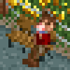
C+R: A landscaping micro is normally a risky move, unless you are Steve. Every piece of foliage and rock is placed perfectly. I like the pathway in the national park style. Overall the quaint atmosphere is incredible. The detailing at the house is also super well done (axe, laundry etc.)
Visuals: This micro has one downside. From the starting angle it looks absolutely perfect and well composed from the other angles it's a lot worse, especially due to the LOTR rock sitting on the raised land walls (and those not smoothed out). Moreover, the rocks cover a big part of the map.
Credibility: Who wants to have a park viewpoint directly onto his garden?
Steve quality. This time you played it safe, I can see that in the next round you might have it more difficult.
All in all 1st place Steve and 2nd place vote to Maverix, although that one is really close.
-
 Jappy
Offline
Jappy
Offline
Audubon: Dang it Steve, why you're so good at this! Very atmospheric, great foliage and I love the fact you can discover all the little elements one by one.
Tokyo Dome: If there's one country where making things small and microscopic is an important part of culture, I'd say it's Japan. So setting a micro seems fitting here! Well made and great play with levels. But it could have used a bit more colour through for instance signs and stuff.
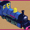
Fantasyland: Taron is a favorite of mine and the fact you tried to build something alike on this surface is very ambitious! It's even more impressive you managed to also add a rapids. But compared with the previous entries, I think it's a shame it lacked a bit of refinement.
Sub-Rosa Subway: This could've been such a great entry! It's a shame you rushed it. As it stands, I just think this one was a lost opportunity as you clearly did have the ideas and inspiration for it.
-
 posix
Offline
posix
Offline
Well done Steve. Bit too much foliage, but still nice.
Also Maverix, great effort. Very good map organisation to fit all that content into a well comprehensible micro.
-
 alex
Offline
alex
Offline
1. Fantasyland - I was really impressed here. You fit a great layout in and it was exciting watching it interact with the rapids and scenery. Architecture is a bit rudimentary but the forms are solid. In general very nicely composed. I hope you get through!
2.Audubon Society - Really cute scene and the foliage is so nice. The back view with the jagged land and rocks was a shame, for a simplistic entry it's still nice to have some presentational polish.
3. Tokyo Dome - I liked the multi-level city vibe. However for the style you were going for (realism), it lacked a level of detail. I think if you're not doing interiors - which is absolutely fair enough - don't make buildings transparent and paper-thin.
4. Sub-Rosa Subway - Strange and eerie, somehow the palette and the lack of detail made this look like a different game altogether, like a very old rpg or something
-
 Chocotopian
Offline
Chocotopian
Offline
#1 Steve - Audubon Soceity's Field Guide Series I - Black Bear
Very tranquil, and I think the mountain is lovely. Nice foliage, and the little bits of movement throughout. Getting peeps to stay on the platform is a great touch, as it prevents the focus area becoming cluttered, and the photographer is a well-chosen and placed character too. Charming all round.
#2 BBT - Fantasyland
I'm impressed with the coaster here, and think it has good flow and interaction with the landscape and scenery. Getting a second tracked ride to interact with the landscape too is great, and I like the areas where the two overlap. The semi NCSO comes across a bit odd, I must admit, and I think some of the buildings look a little flat as a result. But overall, the ins and outs of the rides won me over, giving this my second vote.
#3 Maverix - Tokyo Dome
While I'm sure this mimics reality, it comes across as a bit too grey for me. I do however enjoy the different levels of walkway, and the foliage you've included in this urban environment. Nice support work, and though the coaster is all right turns, it does keep its pace well.
#4 Gustav Goblin - Sub-Rosa Subway
An interesting presentational choice, making good use of combined palette and ride vehicles, but I feel that the buildings could be more developed. A little additional business on the street would provide more to look at, and help to set the scene further. I appreciate your use of visible underground sections, but again, more could be included there to enhance that area too. Certainly a neat idea to have a period piece, but I think its simplicity holds it back a bit.
-
 Liampie
Offline
Liampie
Offline
 Group L - Results
__________________________________________________________
Winners
Steve: 46 + 13/2 = 52,5 points
Maverix: 12 + 39/2 = 31,5 points
Eliminated
BBT: 4 + 7/2 = 7,5 points
Gustav Goblin: 2 + 5/2 = 4,5 points
__________________________________________________________
Steve and Maverix proceed to Round 2.
BBT is eligible as a replacement for Round 2.
Congratulations to the winners! -
 Steve
Offline
Hey thanks y’all. Definitely didn’t expect an overwhelming win; the other contenders here did great!
Steve
Offline
Hey thanks y’all. Definitely didn’t expect an overwhelming win; the other contenders here did great!
I set out exactly what I wanted to do with my map, regardless of it being well received or not. I wanted something quaint and tranquil with a fun but small narrative to accompany it. I’ve always been a nature guy, and my love of my home state/area is well known. It just seemed like the perfect time to test those waters and I’m pleased with the results. I didn’t really care if I won or lost, because I built true to myself in what I wanted. I’m glad some of you really liked it, but I’m also not surprised it was underwhelming for others.
In another small way, I was looking for it be underwhelming. I was apprehensive to enter the contest but when I was finally won over, I set out to make something low-key. I know all too well that in past contests we have seen the uber-tall micros with wild ideas and I wanted to show that you could do the opposite with rewarding results. I know I’m on the losing side of this battle, but taller micros seem like an easy out. Of course anyone would think to build up since you can’t build out. In some instances it’s merited but mostly I remain unimpressed. It’s more interesting and impressive to me for someone to build a more relaxed micro than an insane one. Let the debate begin I guess!
Again well done to the others. I really enjoyed looking through them! -
 KaiBueno
Offline
KaiBueno
Offline
Brief comments from KaiBueno! (Disclaimer - I'm renewing myself to the community and know very little of you, your parks, styles, etc. My views are framed from what I see as I open it, with a twisted 2005 perspective of wazzup.)
Fantasyland - Not the color scheme you'd associate with this, but I just love the coaster, kinda reminds me of the speedy newish Snow White Dwarves mine train in Orlando. The buildings are classically simple, and I love the sneaking in of a water ride.
Audubon - The Black Bears are a neat trick, the mountain and falls picturesque, and the brook/house a nice midheight balance for the bottom part of the map. Doesn't work well from all sides, but that's mountains for ya.Tokyo - Whale is a nice coaster for a small canvas. I'm missing the Dome part of this though...otherwise a lot of pavement and an urban building. Streets of Tokyo maybe?
Sub - I'm not sure how you achieved the monochrome look, so that was neat, but everything else was a bit blocky and...dull? Didn't do anything for me sorry. -
KaiBueno
Offline
Brief comments from KaiBueno! (Disclaimer - I'm renewing myself to the community and know very little of you, your parks, styles, etc. My views are framed from what I see as I open it, with a twisted 2005 perspective of wazzup.)
Fantasyland - Not the color scheme I'd associate with this, but I just love the coaster, kinda reminds me of the speedy newish Snow White Dwarves mine train in Orlando. The buildings are classically simple, and I love the sneaking in of a water ride.
Audubon - The Black Bears are a neat trick, the mountain and falls picturesque, and the brook/house a nice midheight balance for the bottom part of the map. Doesn't work well from all sides, but that's mountains for ya.Tokyo - Whale is a nice coaster for a small canvas. I'm missing the Dome part of this though...otherwise a lot of pavement and an urban building. Streets of Tokyo maybe?
Sub - I'm not sure how you achieved the monochrome look, so that was neat, but everything else was a bit blocky and...dull? Didn't do anything for me sorry. -
 CHE
Offline
CHE
Offline
Highlights
Audubon Soceity's Field Guide Series I - Black Bear: staff names
Tokyo Dome: storm shark
Sub-Rosa Subway: palette
Fantasyland: coaster-rapids interaction

Tags
- No Tags