H2H9 / H2H9: Round Robin - R2M3 - Cereal Killers vs Scream Queens
-
 13-May 21
-
 G Force
Offline
G Force
Offline
Esoterra had some cool bits, the chariot water ride was a cool hack, appreciate the bold aesthetic too. Not often we see stuff like this in H2H, so unique and risky. Felt pretty light on content however, which might have been intentional but also feels like there was a bit of a rushed development here.
Unfortunately I've never heard of Tarot cards before this moment so the whole point(?) of the park was lost on me.
-
 In:Cities
Offline
In:Cities
Offline
Didn't think i'd stay awake long enough to review these parks, but screw it, its Friday.
What a round. Both of these parks have amazing first impressions, and really enticed me to further explore. Hats off to both teams for two more amazing, completed maps. I love that they're vastly different concepts and styles as well.
Cereal Killers
The sheer movement from all of the planes is just so great. Going through the hoop, twirling through the air, circling the lighthouse. The speed at which they fly is just chaotic and perfect. The air show with the multi colors. The stunt plane. So cool. Macro wise, this map is fantastic. I love the overall landscape formation. The stands being embedded into the rocks is perfect. Commendable attempt at custom scenery boats and planes. Some are great - some miss the mark a bit. Doesn't matter much though - the map as a whole comes together so nicely. Color choices are spot on.
Some things I loved / noticed:
Wow liam, how could you let this immaturity fly. I will be contacting your HR department
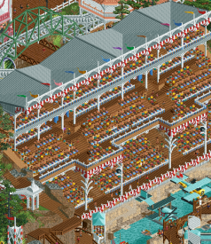
So I essentially hand you a brand spanking new colorable/animated peep stadium object a couple weeks ago, and you still use my tired old static one. Looks like half the peeps are naked for some reason. Nice. Smart move mixing in some of the diagonals to get some different pops of colors in there. Stadium itself is constructed nicely! Roof in particular is great. And those pillars are a nice touch.
Florida Panda
How do I report this to the police

Is he painting? I love it.
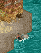
Accurate. Also, I love the little cave.
Such a fun scene. The chefs with all the food and cake are brilliant.
Dirty Queens
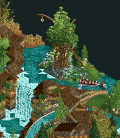
Alright - finally time to review this beauty. God I love this park. Screw the haters. It's gorgeous and probably my favorite of the round. I appreciate how you all stuck to your concept and executed it fully. Is it unconventional? Absolutely. Is that an issue? It shouldn't be. Coming from someone who likes making excessive and dumb readmes, I appreciate that there wasn't an overly hand-holding readme for this park. As soon as I saw the zip with the tarot names, I understood the concept immediately. Truthfully, idgaf about Tarot stuff irl. It's in the same vein as horoscopes and crystals and granola bars. Cool stuff - not for me. Though I do love poking around the Earthbound Trading Company stores in the mall sometimes. This park had that vibe for me - and I absolutely dig it. Without speculating too much, i'm predicting this park was built by the coven of sass queens that dirt has drafted. Maybe with the big baldsmith on landscaping duty, but I feel like this was a ladies affair for some reason. I love it. Macro wise - I think its absolutely on point. Who needs paths to guide you - the sloped spiral pattern of those sexy black rocks draws me in immediately. Interaction of the coaster with the waterfall and rocks and terraces is just too good. The landblock layering is spectacular. I appreciate the risk and the fresh approach. Might not work for some - but in the context of this park, it's an incredible choice. Props to you guys for committing to this theme and pushing content out at this high of a caliber. You should be proud. I am, and I didn't even build it.
Things I loved / noticed:
What a gorgeous little scene. The other view with the waterfalls might be more "spectacular", but this angle really shows how it works well with the unique rock work. Grass paths are a win.
The map is just filled with breathtaking examples of landscaping mastery throughout. Not everything needs to be blended land textures, palette trickery, and 1J/LOTR/Krypton rock spam. This is stellar.
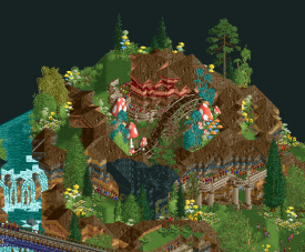
Oh come on - this queue is simply masterful. The interaction, the balance of colors, the framing behind the black rocks and tall trees, the pops of color up top, the tall trees, the elevated path with the pillars with the grass path below it. This is executed SO well.
This scene is just beautiful. Seems to be a recurring theme in this park - a collection of well framed scenes of serenity and subtlety.
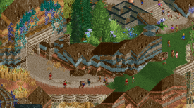
The striations along the rock face as you walk into this archway is just so good. Love the transition from grass to clay/dirt.
Somebody call the ombezi gamekeepers
This is so cool haha. Love my boy pat. And how its framed so nicely with the rocks and grass.
I feel like I could go on and on. The interactions and sheer beauty of this map definitely sucked me in after spending some time in it.
I really hope that others can take more than 10 minutes out of their days to look at these parks a little more in depth before rushing to a vote. It's disrespectful and dismissive of the hours of work that goes into it. Personal preferences are one thing, but simple common courtesy is another. I've had my mind changed many times over the course of spending more time trying to appreciate what goes into individual parks, and I appreciate when the builders not only create something they're clearly passionate about - but something that challenges my preconceived notions of what this game is capable of. Embrace the innovation and creativity
-
 chorkiel
Offline
chorkiel
Offline
After reading a lot of negativity about these parks, I'll just mention some positives.
A day at the races: The theme was nice and the nostalgic execution was a fitting choice. It was a bold move for h2h. All the flying airplanes were a nice touch that made the map feel very alive.
Esoterra: A lot of bold choices made in your landscaping, which I applaud. Some paid of better than others. The custom tree near the entrance and the area around the chariot were some of my favorite bits.
Both parks took a risk and I suppose they came out lucky against each other. It was a difficult decision. Voted for Esoterra in the end. Good matchup. Thank you to both teams!
-
 Version1
Offline
Version1
Offline
Liam said I should have more faith in the community, so let's see how this goes...
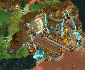
Esoterra
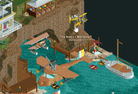
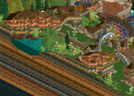
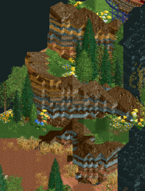
I know nothing about Tarot cards. I think that's a big problem straight away. I don't know how they work, and when I google them they look mostly totally different to what is presented in this park, so I guess the creators are basically creating their own Tarot deck. My problem is that I have 0 idea what the cards mean or how important it is for them to have the "correct" picture, so the theme of the park is ultimately lost on me. The reality is, I like elegance in arts. No matter if it's about movies, music or RCT. Elegance is pretty high on my list when it comes down to how I rate parks. This park has little elegance. The entire thing is a visual mess, partly because of the color pops, partly because of the layers (which don't look as good as the team probably hoped) and partly because the park is full of bare earth diretly bordering bare grass. Is this part of the theme? I don't know but it doesn't look good. Black cliffs look cool but again, no idea what they mean. Some of the tarot cards, like the Wheel of Fortune, look tacky. Kinda sad that the drop of the splash is hidden behind a building. Main coaster is good, but the BBS doesn't work.The World tree and the bridge next to it are probably the highlights.
A Day At The Races
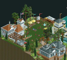
First of all: Great Queen reference, intended or not. Not exactly sure what the time preiod is for this (20s?) but it looks very fitting. Love the big mainstand. The old school automobiles are great. Also all the airplanes of course. Absolutely love the Aeroplane Unboxing, it's like something you'd see on a themed ride in a real park...I think this should be done more often. Little animated scenes that reset themselves quickly. Pleasent landscaping and foliage. Architecture is overall solid. Obviously love the boardwalk feel with the old attractions. Actually surprised this doesn't get a more positive reaction, I like it a lot.
Vote for A Day At The Races
-
 Faas
Offline
Faas
Offline
Races
Nice park, but I'm not really convinced by the architecture/textures. The fact that half of the map is water doesn't help either.
Esoterra
I like the rock layering, but I would have liked to see the layers to be more varied in thickness, to sell the sedimentary rock vibe more. No idea what the Tarot stuff is about.
Voted for Esoterra. -
 Xtreme97
Offline
Xtreme97
Offline
I enjoyed both parks quite a bit in this matchup, more so than I was expecting upon first viewing. I think they grew on me in different ways and offered a number of exploratory elements to keep me interested beyond the immediate impression, and I've sat with my thoughts for a bit on them both before making judgements.
A Day At The Races:
Love the concept behind this one, the early 20th century air race setting is great and allows you to get really lively with the chaotic nature of that period. The first thing I was drawn to were the aerial acrobatics in the sky. The variety of usage is great to see, the wing walker standing out as my favourite idea of the bunch but I also loved how biplanes raced and the red/white/blue smoke planes were a surprise. The side friction coaster is a great use of those less popular ride types and fits the setting perfectly, fantastic use of the elevation for that final drop and turnaround. The spiral airship ride is another highlight of the ride design, don't think I've seen anything like that attempted before. Greatly enjoyed the west coast boardwalk vibes from the landscaping and architecture too, as well as the little viewing tents scattered about. The miniatures were another great part of the map for me, though I think the wooden plank object was relied on a bit too much for a lot of them causing some to look samey. There were some wonderful designs to them though, and small details that I noticed on subsequent viewing such as the backgroundless sign used for little numbering or the unboxing aeroplane.
Esoterra:
This was definitely the hardest park for me to get into the mindset for so far, but after a while of exploring and getting used to the landscaping style I found myself enamoured by the design of it. The broad strokes are fantastic, and big features like the black rocks make for a brilliant opening set piece. The landscaping is definitely a controversial move, and I'm not sure I fully dig the layered rock style in places but some of the shapes created with the land and ground textures are gorgeous. Love the delineation between the red sand and grass ground types and the way you framed the grass with the brown rocks. I also really like some of the exotic foliage choices, with a lovely variety of colours and objects. I'm not familiar with Tarot but I think the idea of setting up the scenes worked well and the vignettes all feel unique and purposeful. The mine train flows beautifully too, lovely use of diagonals. I also want to point out that the music really elevated the mystical atmosphere for me, and made me want to keep exploring and digging deeper into the details. All in all a solid park that took risks, some of which paid off and some of which didn't.
I think between the two I see Esoterra as the more intriguing park, but Day at the Races was better executed. Tough choice, but I think I'll throw my vote behind Esoterra. -
 WhosLeon
Offline
WhosLeon
Offline
I decided to null vote, as i just couldn't pick between these two.
A day at the races was light hearted, fun and brimming with atmosphere. Several highlights for me were the cliffside villa, the airship coaster and the last big drop of the wooden coaster along the cliffside. Some of the plane designs were good, some gave me a good laugh. Also enjoyed the different H2H teams working on their planes. I don't think this park was executed at the highest level, and some landscaping and architecture left a bit to be desired, but it managed to charm me regardless of that.
Esoterra was hard to get into for me at first, mainly because i did not know about tarot cards. The card deck in the readme didn't really help me further either, so i decided to look up the meaning if the cards myself and after doing that i started enjoying the park. I had a blast nosing through it finding new cards and they were all interpreted in such a clever and beautiful way, really awesome stuff. The landscaping was hit-or-miss for me, highlights being the waterfalls and the circular rock formations. What I found a bit rough were the map edges, as i found them to be more distracting than complimentary to the rest of the map. All in all a really cool park, and i always appreciate it when builders try to come up with a new and fresh aesthetic in this game.
Maybe quality wise this was not my favourite matchup, but i had a great time exploring both of the parks. As I kept going back and forth between the two, I felt like a null vote was appropriate rather than forcing myself to like one of the parks better than the other.
-
 AvanineCommuter
Offline
AvanineCommuter
Offline
A Day at the Races - Cereal Killers
- I like the theme, does have a novelty and pleasant charm.
- overall impression is that the map is pleasant, but seems to lack some refinement around the edges. There are moments where the park feels complete and more breathing space is intentional, then in others it just looks like time was an issue and it wasn't able to be refined. In particular, there are some bare walls under the buildings, small supports, or missing fencing throughout the buildings overlooking the cliffs that could be improved significantly with just a little more detailing / texturing so it doesn't stand out so much as the same repetitive texture.
- the planes were hit or miss - the tri-color show is a great setpiece that was really well done, but some of the stationary planes are pretty underdetailed and didn't fully capture the true look for some of the aeroplanes. Some more care placed on the focus of the airplanes would have been great as they are the core elements of this theme!
- I did enjoy some of the architecture, specifically the larger white building and some of the areas by the fairgrounds. Nothing particularly spectacular but the atmosphere is really pleasant.
- the main coaster has a nice flowing layout, I enjoyed watching it!
- The grandstands is very nicely done, but definitely could have used the animated peeps from Tokyo dome to help make it livelier.
- Some missed naming elements makes me think there was a lack of time involved. The black-n-white ring is a great piece of trackitecture that is immediately familiar and looks great, but then it's named "single rail coaster 3"...
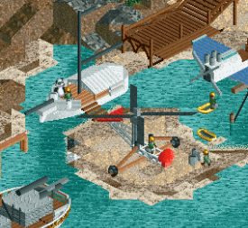
- Bisby's Airship is the highlight of the park for me, what a great little unique ride that is beautiful to look at to boot. Lovely!
- Love the detail of the "Press stand" with all the newspapers, great eye of detail there.
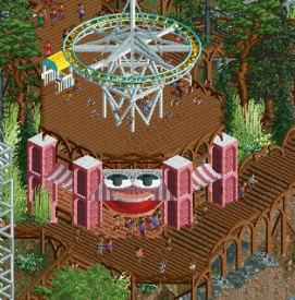
- Furby is creepy and I liked it.
Esoterra - Scream Queens
- I personally love the theme. It's unique and ripe for content. I'm not sure the park fully sold it as well as it could have, but it was still enjoyable to view.
- Overall the macro impression is quite wonderful, with the two-ringed black rocks carving their way through the map's landscape and the multiple waterfalls. The striated rocks have a unique look that I neither hate nor like, but it does give the park a unique vibe which is I think overall successful.
- The Fool is a great ride, wonderful layout and unique double-diagonal on the map that really works beautifully. It is the better coaster of the matchup and I enjoyed the unusual take on the mine train.
- The grass pathing could have taken more care to crunch up the edges, it's a little bare and gives an unfinished look even though I'm assuming it's intentional. Some detailing and textures added to the edges with foliage would help immensely there.
- As with the other park, I'm assuming time is an issue here as there are some really rough patches where the landscaping just looks unfinished or unrefined. The missed naming of staff too.
- flower colors throughout the park were a strange choice for me. White and red just didn't work aesthetically, neither did blue and yellow, and they popped out a little too much against the bare ground textures. Again, some more attention to detail around the paths would have elevated this; going bare paths is a bold choice that may work for the theme, but that's not an excuse to forget to detail them.
- there are some really lovely areas with the waterfalls and the drop of Last Judgement especially, and I do like how some rides are half-buried into the landscape.
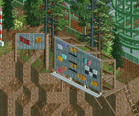
- I really enjoyed the little individual tarot cards, it was fun to try to spot them throughout the park. The overall park and concept could have really used a *little* bit more explanation or backstory for clarity's sake though. It wasn't the most cleanly sold concept and there were so many more things you could've done with a cool concept like tarot cards / bizarre mystical oddities (is that the theme? I don't even know for sure).
Overall this match was a slight disappointment in terms of quality, as they both seem to have some really rough edges and lacked refinement. I am going with Esoterra simply due to the unique theme and the lovely atmosphere, but both parks could have used a lot more attention to detail to elevate their concepts.
-
 posix
Offline
posix
Offline
Match Conclusion

The poll is now closed.
The Cereal Killers have won this match with a score of 40–25 .
Creators
The Scream Queens"Esoterra"
dr dirt
Camcorder22
Lilith
PhoenixWing101 (F)
Cereal Killers"A Day at the Races"
mamarillas
Coaster-GEOFF
IonZer0
Coasterbill (F)
-
In:Cities
Offline
Congrats cereal boys. Sad to see Esoterra lose. Definitely will be revisiting that map quite a bit in the future!
Nice to see some h2h newcomers on CK slay the game
-
 dr dirt
Offline
We ran out of time to trim down on the map edges. All of the other negative comments I disagree with.
dr dirt
Offline
We ran out of time to trim down on the map edges. All of the other negative comments I disagree with. -
 Coasterbill
Offline
I enjoyed Esoterra quite a bit. The boat ride and queue gave me some Navi River Journey vibes. Great park, guys!
Coasterbill
Offline
I enjoyed Esoterra quite a bit. The boat ride and queue gave me some Navi River Journey vibes. Great park, guys!
As for A Day at the Races, it was a lot of fun building on this. 99% of what I built was in the last two days during crunch time which is my favorite part of H2H (the only other thing that I built was the spiral airship). Blame me for most of the immature Easter eggs on the map. My bad, I’ll absolutely let it happen again.
mamarillas, Coaster-GEOFF and Ion all stepped up big on this. Great work, guys! -
 Cocoa
Offline
Cocoa
Offline
All of the other negative comments I disagree with.
fuck yeah. let's get more spicy memorable NE quotes. love a good bit of attitude (also helps I loved the park lol)
-
 wheres_walto
Offline
Mrs walto reviews r2m3
wheres_walto
Offline
Mrs walto reviews r2m3
Esoterra
"Hmmm it feels a little empty"
"Uh.. where are the pathways? Why are they just out in this meadow"
"I like that mushroom forest"
"Little panda on an island hi buddy"
"Ehhh it doesn't wow me, I don't understand what they're going for. What is it?"
"Kinda empty, kinda sad"
"Roman pillars, random maze, and a glitching tree: piece du resistance"
"What is this roller coaster? Straight up, straight down, straight to the side"
"An empty brown field, what's that for?"
"Fire pit of doom it looks like"
"I don't like that everyone is walking around in circles, I don't like no paths, it disturbs me"
"I've seen better waterfalls"
Races
"My initial thought is Bioshock infinite, it's like a boardwalk carnival"
"Oh this is clever"
"Little planes with flags! Look at the coordination"
"I love the stands, it feels like we're looking into a little dollhouse"
"The coaster is much better executed with the diagonal"
"I like that they made planes with objects, that's cool"
"Overall this one is cleaner, I know what it is"
I spent some additional time with the parks after reading more of the discussion. Came to like races more for the sheer spectacle, the believability of the show was a definite highlight, again really nicely done. I still don't love the look of esoterra as released, with more time to iterate and refine, this park could have been a masterclass in subtlety. The small details are worth a second look for anyone who hasn't explored the map. Great job everyone involved, can't wait to see what's next -
 Scoop
Offline
Scoop
Offline
We ran out of time to trim down on the map edges. All of the other negative comments I disagree with.
Allllllllll of them? There's quite a few.


Tags
- No Tags