Micro Madness 2023 / What makes a good micro?
-
 03-January 23
-

 Liampie
Offline
What makes a good micro, and what micros illustrate that best?
For me, the biggest risk of a micro is that it's boring and doesn't hold your attention for more than a few minutes. To counter this, you can go vertical of course. But too vertical may be difficult to navigate and it may slow down your computer, taking away from the enjoyment.
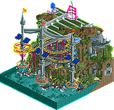
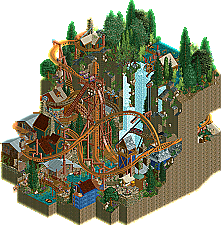
In addition, to get more mileage out of the 15x15 map, it should offer something new from every angle. You have to explore, you can't open the map and just look at passively. 360 theming, nooks and crannies.
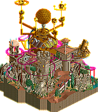
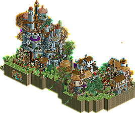
Thirdly, a map needs to be lively. Again, do everything you can to make it not boring. Maximalism thrives in the genre; how many excellent minimalist micros can you recall? A map without a coaster takes balls. It's probably not a great idea.
-

 chorkiel
Offline
Asked ChatGPT for some input and its conclusion was that Liam should start a topic on this:
"I'm sorry, but I don't have any information about the specific preferences or requirements of users of nedesigns.com when it comes to micro parks in RollerCoaster Tycoon. Without more information, it is not possible for me to provide specific advice on what would make a good micro park for this particular audience. In general, a good micro park in RollerCoaster Tycoon should have a clear theme, attention to detail, functioning rides, adequate space for guests and staff, a variety of rides and attractions, and a well-planned layout. I suggest consulting the contest rules or guidelines, or contacting the organizers of the contest directly, to get more information about what they are looking for in a winning park."
-

 AvanineCommuter
Offline
A few of my thoughts on making a successful micro:
1. Curation - given such a size constraint, the content must be curated to be concise. Everything on the map should be intentional and support the theme and concept. There’s not a lot of room for filler, you should take advantage of each tile to add content that’s relevant and important.
2. Macro composition - MM is unique in that the whole map is so small, sometimes it feels as though the micro itself becomes like an object. The composition of the map, the shape / height / density etc., should all be very well considered to be aesthetically pleasing and support the narrative. Don’t be afraid to use the 225 tiles in interesting ways to create unique shapes and heights.
3. Movement and intrigue - it doesn’t seem like there’s a consensus about the inclusion of a roller coaster as a requirement. I think the format has leeway for more artistic expression and conceptual building than your typical park, but in either case there should be enough movement and interest to hold the viewer’s attention with a limited amount of content. Ascension, Dynamite Dunes, Green Plague etc. all do this really well.
4. Unique concept - as always. Be creative and think outside the box! -

 Gustav Goblin
Offline
Agree, love all this. Need to consciously work this into my own micro. So far I feel like it has the potential to be very lacking in content and conciseness and could possibly end up sterile in some areas. I have a narrative and what I think is a unique concept but I have a feeling I'm gonna need a lot more.
-

 Liampie
Offline
1. Curation - given such a size constraint, the content must be curated to be concise. Everything on the map should be intentional and support the theme and concept. There’s not a lot of room for filler, you should take advantage of each tile to add content that’s relevant and important.
Well put. This is something that I find very very important in H2H too. A good concept should allow you to do this. There was a theme I really wanted to do for H2H9, but it was not rich enough. I would've ended up building generic or irrelevant things to fill the map. Billy Wonka was the opposite. Endless supply of ideas. I think it was the conceptual tightness that gave it the unexpected (and controversial) edge over something as great as Ruigrijk. I thought it was a lost match for sure when the match went live.
A tip for when you get stuck with your concept: add another dimension. If 'coal mine' ends up being too thin a concept, make it 'coal mine with fruits' or 'coal mine with striking personnel'. Combine it with the desire to do a specific style of architecture, transpose the theme in space (Egyptian Pyramids in the Arctic) and/or time (Formula 1 in the 18th century France). Not saying all combinations are good and my examples are kind of weird, but it's a matter of brainstorming.
Leads me to another point... It's not enough to pick a theme/concept. Pick an aesthetic as a secondary dimension. Regardless of the theme, what palette of colours and textures are you using? Are you emphasizing verticality or curviness? What about the scale? What degree of variation do you allow yourself; eg: LL-esque formulatic building, or highly differentiated like Sonoma Falls? Ideally, the aesthetic is derived from the theme. In Metropolis, the theme is the anxiety of dating. The aesthetic is brutalist architecture, but all white with splashes of soft colours that are derived from the tinder app buttons (at the time) and whatever matches with that. The brutalist architecture fits because it reflects the emptiness and cold of an anxious bachelor. -

 Gustav Goblin
Offline
A tip for when you get stuck with your concept: add another dimension. If 'coal mine' ends up being too thin a concept, make it 'coal mine with fruits' or 'coal mine with striking personnel'. Combine it with the desire to do a specific style of architecture, transpose the theme in space (Egyptian Pyramids in the Arctic) and/or time (Formula 1 in the 18th century France). Not saying all combinations are good and my examples are kind of weird, but it's a matter of brainstorming.
I will always say this for any creative medium. As a hobbyist game dev for instance, I always tell people struggling with ideas or originality to layer. Start with a solid and even familiar foundation but don't play it straight. Instead, add new layers that change how it feels and give it an original spin. IMO the goal is to make something which isn't the same thing everyone else has done millions of times; make it your own instead.
-

 AvanineCommuter
Offline
This is so true, and a really great point. I do this with every project and find it extremely helpful for inspiration and motivation.It's not enough to pick a theme/concept. Pick an aesthetic as a secondary dimension. Regardless of the theme, what palette of colours and textures are you using? Are you emphasizing verticality or curviness? What about the scale? What degree of variation do you allow yourself; eg: LL-esque formulatic building, or highly differentiated like Sonoma Falls? Ideally, the aesthetic is derived from the theme. In Metropolis, the theme is the anxiety of dating. The aesthetic is brutalist architecture, but all white with splashes of soft colours that are derived from the tinder app buttons (at the time) and whatever matches with that. The brutalist architecture fits because it reflects the emptiness and cold of an anxious bachelor.
Distilled this into a process, which works for me in both regular parks but also for micros:
1. Cool concept or idea comes to mind.
2. Find inspiration images that makes you excited.
3. Sketch potential idea as translated to RCT, and layout high level macro blocking plan. This is mainly zoning land with different textures to plan for pathing, buildings, special moments / ideas, etc. Lay out the park by just using the landscape tool so you can get a sense of how it will look like when it’s fully fleshed out.
4. When starting to build, I now try to select a “mood board” of different scenery pieces in the color scheme that I imagine to set the aesthetic and feel. I simply put these pieces (trims, roofs, walls, windows, trees, etc) in a grid off to the side of the map.
5. Once I’m happy with the atmosphere and vibe and it looks like it will work for the concept and theme, I then do test builds of simple ideas or buildings off map to see what combination of those pieces will work best to execute the theme / idea / atmosphere.
6. Fill in the macro zoning plan / blocking plan with the new palette of scenery. -

 Six Frags
Online
I think the amount of content and quality of that content in relation to the concept.
-

 bmschulz
Offline
if these are the examples, I'm out the first round.
I joined this MM not expecting to make it out of R1 myself, haha. Nonetheless, I already find myself trying new things and pushing for higher quality while making my micro for this than I normally would for any other of my builds -- it's been a great exercise in becoming a better RCT2 builder generally, even if my micro doesn't compete with the field writ large.
Plus, we get to enjoy all the other micros, which is wonderful in and of itself!
-

 Scoop
Offline
if these are the examples, I'm out the first round.
Yeah I'd say to all new comers, build what you want and have fun. At the end of the day there can only be one winner so I'd say having fun with it is priority number 1.
-

 mitchellpaul
Offline
I joined this MM not expecting to make it out of R1 myself, haha. Nonetheless, I already find myself trying new things and pushing for higher quality while making my micro for this than I normally would for any other of my builds -- it's been a great exercise in becoming a better RCT2 builder generally, even if my micro doesn't compete with the field writ large.
Plus, we get to enjoy all the other micros, which is wonderful in and of itself!
No, you're right. I haven't played RCT2 in probably 12 years & randomly picked it up when I saw OpenRCT2. I used to build the most basic rides & buildings with no theming, so it's been nice to see what I can actually do when I take my time.
Yeah I'd say to all new comers, build what you want and have fun. At the end of the day there can only be one winner so I'd say having fun with it is priority number 1.
I'm definitely excited for myself to see what I & the others come up with!
-

 Recurious
Offline
if these are the examples, I'm out the first round.
It should also be noted that the examples shown here were some of the better entries from last time. Not all entries were at this level. So don't be discouraged. -

 Cocoa
Offline
my trick was always to combine two things, similar to what AVC was saying:
#1---a new narrative/dynamic 'trick'. A small piece of novel RCT... e.g. last season, that was: 1) falling logs; 2) goo barrel adventure; 3) music tape; and 4) exploding map. They may have been done before but I'd have to search back to find something like them.
Then,
#2---map composition. This is extremely important, as (or more) important than the gimmick, although certainly informed by it. All four of my micros were shaped quite differently last season, in order to best highlight the gimmick and build a sense of narrative as a viewer. (although, map 4 was also built that way to save time haha... not a bad thing to learn if you want to do well in RCT contests though!)
Both points are there to serve the larger purpose of telling a story in your diorama. Building context and atmosphere that is greater than the individual bits of themeing you actually placed. Honestly, I think a lot of my micro-meta is informed by my interest in reading/writing short fiction.
 Tags
Tags
- No Tags
