Head-2-Head-X / H2HX: Round Robin - R1M3 - Lonely Hearts Club vs Soda Jerks
-
 02-May 24
-
 Tolsimir
Offline
Tolsimir
Offline
LHC:
This park is pretty much a big brother to my orrery micro. Hence the theme is right up my alley as someone who has a degree in astronomy (kind of). The eclipse was an awesome effect and worked smoothly, good job on that. All the astronomy related gadgets and structures are well done, maybe random at times but they look good and sell the vibe. Also a bit of a pity that you reused some of those props several times on the map. My problem was more the arrangement of them on the map. For example the navigator thing (the one made from the swinger). It looks super cool with all the movement and then it's put there on the edge with nothing around and apart from the name I don't see what in universe it's purpose is. While we are there, the abundant use of the curved stairs in that floaty manner was not a success in my opinion. The main building is wonderful, I'm a big fan of those painted walls in the windows! The interiors were very, especially the library (good new objects too!), although just having rectangular cut outs without respecting the rest of the architectural structure always puts me off a bit. Apart from the observation tower nothing else of the architecture particularly stood out and I agree with AVC that the macro was rather strange/unbalanced. My personal nitpick is that one strangely saturated brown that always sticks out like a sore thumb.
Overall great park, a compelling theme with a successful presentation with the plugin.
Jerks:
I'm sorry to say but I didn't enjoy viewing this park. You could say it succeeded in its premise making it hell for the viewer lol. I felt like I had to turn off the music, the contrasty palette is hard on the eyes. Of course this doesn't mean that there isn't anything on map I liked. For starters, the macro is awesome. Love the bridges radiating outwards. Also the bridges itself, especially the half diagonal ones are very well done. Good design on these. The chains all around are very cool, too. They create a nice visual guidance and were one of the few things in the park not super contrasty. I think the archy/buildings are a bit messy with too much different textures and trimwork while the structures themselves fit the theme well. Probably my favourite detail is the spine look of the coaster, good useage of the invisible color!
In total for sure good craftsmanship showcased but absolutely not my cup of tea, sorry!
-
 Maverix
Offline
Maverix
Offline
Is it time to bitch and moan about being beaten by a plug-in? Not quite, I don't think it was the plug-in that beat us

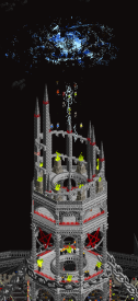
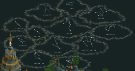
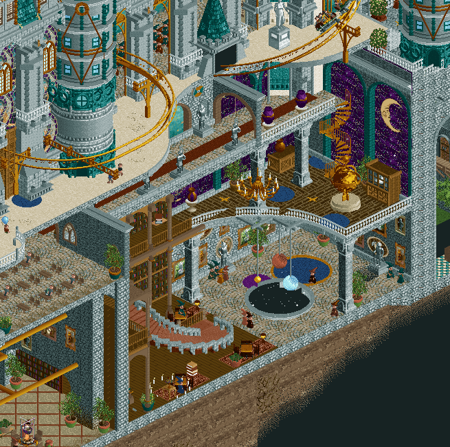
Constellations:
- I can't not mention the plug-in, and maybe it's because it's so topical with the eclipse happening recently and I was lucky enough to be in the path of totality, but this is just fantastic. If you're gonna take the risk of having a stand-alone plug-in it better deliver, and this absolutely did. It feels like you were able to sneak two parks on the same map, which I can only commend you for.
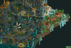
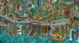
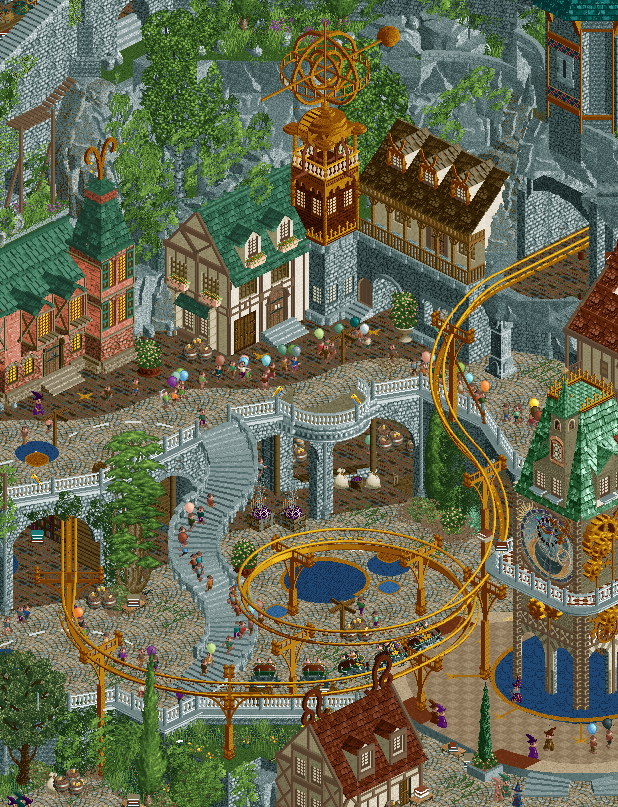
- The main town/village portion of the map is beautifully layered and constructed. What I wouldn't give to be a peep strolling the seaside enjoying a glass of wine and staring at the stars.
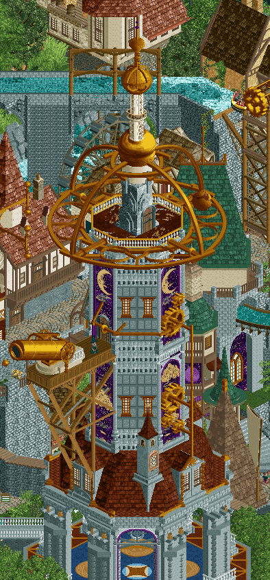
- Speaking of beautifully constructed, the observatory is stunning, and integrated into the surroundings well so it both feels imposing and not dominating.
- Zodiac is the far better coaster for me here of the two. Great color choices and a fun layout.
- Stargazer I wish did more than just pop in and out of the buildings and surroundings at oppotune times for interactions. Now the interactions are great, but it would have felt better if it did a bit more and felt like it had more purpose as it traveled it's layout. I do find it funny we both made a coaster with some part of the track invisible too
Overall a fantastic park with a cool theme and gimmick that actually pays off. It's always a bummer to lose, but it's easier to take when it's to something like this. Well done!
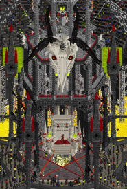
HELL
Not gonna review my own park, but will give some insight into the making of!
This was an absolute blast to build. I'm obviously not a fantasy builder, but Josh came out swinging with a fun concept, and Mulpje got us going with the central tower it was easy enough to jump in and just have fun with it. Both of you were amazing to work with!
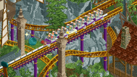
I, probably not surprisingly, did the majority of the rides in the park. I think everything but the dark ride I built/hacked. I'm most proud of the two 'coasters' Spinal Tap and Fire & Brimstone. Spinal Tap was essentially meant to be a "what coaster would be hell to thoosie's? An RMC with no real airtime of course!" so it focused heavily on inversions. The spine track came as a suggestion, and away we go. The water coaster is very action park-y, but mainly inspired by an infamous ride in Kansas City that no longer exists.
I also did a decent amount of rockwork around the base of the water coaster, the more boney architecture for the coaster station and waterslides nearby, and did some of the overall pathing infurstructure around the park. Basically I just saw what Josh and Mulpje were doing and tried my best to copy them
Again this was an absolute blast to build with two awesome team mates and I'm super proud of what we made, especially given the always fun round 1 time constraint. Great job to Josh and Mulpje, and thanks to all the other Soda Jerks for the constructive feedback along the way! I may have to try this fantasy thing more often.
-
 wheres_walto
Offline
wheres_walto
Offline
Constellations -
This park has grown on me as I've come to appreciate how many little things are actually happening. It's impossible for me not to start with the plug-in. As I've de-constructed it and read more of the conversation, it's actually insane that you had both the vision and ability to get this out in Round 1. I think we will look back at this park in the same way that we remember Frankenstein (H2H6) as one of the first parks to use a palette to significantly alter the game. To me, it's the smaller functions hidden within that make me excited about what will be possible in the future. Truly game-changing stuff, I'm sorry I didn't appreciate it enough upon release.
As far as the park itself, my main criticism is the generic feel. Indistinct fantasy is a tired theme for me, even though the skill here is obvious. I couldn't escape the feeling that this was a park being marketed to the viewer, built on focus group responses rather than the builders' personalities. Maybe that sounds silly, here's a simpler critique: it's gray af and it didn't make me feel good.
All in all, this is a memorable park and is deserving of both the win and its high panel score. Great job, I'm grateful we don't have to face you guys again
-
 Gustav Goblin
Offline
Gustav Goblin
Offline
Constellations: Taking a lil building break so it's finally time to review our team's arch nemesis. I love this park, definitely a top 2 park so far along with Castello. IDK why the other teams love putting their absolute best work against us, I think it's collusion.
+++ The elephant in the room; THE PLUGIN. Cannot describe the simultaneous awe and terror of watching the eclipse slowly happen in real time and the constellations reveal themselves. That's not including the change in music, the peeps applauding and putting on sunglasses, so many little touches throughout. Point to where we hurt you, deano.
+ It may be generic fantasy but I like generic fantasy. Almost reminds me of a mid aughts park with modern CSO. Makes me wish J K were with us on Endswell during H2H Classic, half so he wouldn't have had to body us with this bastard.
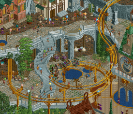
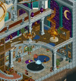
+ I'm a huge fan of layered arcades and Constellations has them in ar-spades. Love the detailed interiors that make them feel like genuine peeks into this world.
+ The moving parts everywhere give it so much motion and life. Shoutout to the Ethan moving blocks on top of the gear on Navigator in particular.
+ Love all the intricate gold bits everywhere, and the zodiac signs as part of the archi totally elevates it. Such a damn good idea.
+ BEAUTIFUL path detailing.
+ Love the new objects, especially the decorative walls by AmusementParker.
+ ORIGINAL MUSIC!!!!! Awesome seeing Sammy take a stab at it. Almost has an early '00s CRPG feel to it. Sounds a little corny but just corny enough to be charming.
+ I just want to take a moment to shout out the screen Alex posted. It may have some of the best composition I've ever seen in any park. FANTASTIC layout, a little short and kind of a one-angle wonder but so so flowy. thought it was Hex or Jens but completely forgot about Sammy's British flow. The way it spins the giant zodiac circle as it passes by is such a cool touch. Completely forgot about it when name dropping my top 3 layouts earlier but Zodiac is up there with them.
+- The castle has some inconsistencies but man what a statement piece. Again, love the zodiac pieces throughout. Was convinced Mamarillas was on this; it reminded me of his take on Antwerpen-Centraal in our unfinished Grand Tour park.
+- Stargazer's invisible track trick and supports are gorgeous. Stargazer itself? Eeehhhh. The first drop over the plaza is amazing and then all that momentum gets killed by a lift hill. Then there are boosters after drops a la Falcon's Flight and a 60 mph kamikaze dive that goes right into the station. I know most of the layout is underground but it does feel like it was tacked on last-second and quite a few of the interactions feel forced.
+- CHE's chill corner with Meteor Showers has some real Ghibli vibes, but it does feel a tad disconnected from the rest of the park. What would have taken Meteor Showers above and beyond was adding a third station with no entrance or exit and syncing it with the lift so it carries up the raft every time. Also I kinda wish that diagonal drop weren't covered up.- The gray is a little overwhelming when zoomed all the way out. Incorporating a dominant second color into the Fisch rocks or Liam rock walls rather than just flecks in both may have helped it stand out more.
- Unfortunately this park beat us so I hate it now.
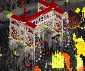
Hell: YUMMY YUMMY YUMMY YUMMY YUMMY YUMMY YUMMY YUMMY -
 Hex
Offline
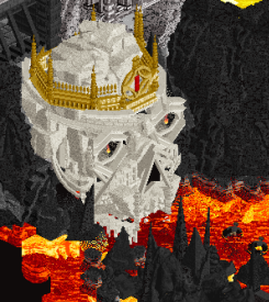
HellNow this is pod racing! I- uh... I mean: H2H!I love that you were able to create a fairly cohesive, layered map with four prominent colors (Yes, I know there's some red there but the majority of the map is black, orange, yellow, and white.) That's a feat in itself.All the little sculptures, some friendly banter and jabs at other teams and previous parks, the goofiness that is The Wiggles and Imagine Dragons playing what I assume is the real Coachella... Mosh pits, falling peeps, I love it.I feel like some of your neat scenes are hidden behind the giant five-way walkway at the top, which is a bit unfortunate, because there's some neat stuff under there!I especially love the skull with the golden crown.Great music, wonderful atmosphere."Hell looks too intense for me."
Hex
Offline
HellNow this is pod racing! I- uh... I mean: H2H!I love that you were able to create a fairly cohesive, layered map with four prominent colors (Yes, I know there's some red there but the majority of the map is black, orange, yellow, and white.) That's a feat in itself.All the little sculptures, some friendly banter and jabs at other teams and previous parks, the goofiness that is The Wiggles and Imagine Dragons playing what I assume is the real Coachella... Mosh pits, falling peeps, I love it.I feel like some of your neat scenes are hidden behind the giant five-way walkway at the top, which is a bit unfortunate, because there's some neat stuff under there!I especially love the skull with the golden crown.Great music, wonderful atmosphere."Hell looks too intense for me." -
 Mr.Brightside711
Offline
Mr.Brightside711
Offline
Hell: This was a very fun/funny park. It was kinda hard to read because of how much verticality and the palette, but some areas don't suffer from that. There are tons of great scenes and jokes. It is all done in a very unique style as well which is nice to see. Here are my favorite things:
The opening scene
The build up (more like build down) as yyou move down the central tower, it just gets better as you go down.
 ))
))
Spinal Tap is like 2/3s a great layout especially the first half. It gets a bit wonky when it hits the helix at the bottom of the drop. Gets slightly better again towards the end. Looks awesome.
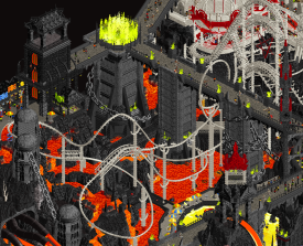
This is a fantastic custom ride and the scenery with it is bad ass.
Probably the coolest sculpture on the map. He had a bad death.
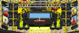
I don't love the stage but I feel it is a good representation of the soundtrack. The music is my favorite thing from the park. Set the mood and tone. Hilarious. Fucking rocks. Just a good time.
Overall, you had a park I really enjoyed but I'm not sure how often I will come back to it. It is unforgettable though, in a good way, just unfortunate you didn't win with it. Good job ya jerks!
-
Mr.Brightside711
Offline
Const: This park was really nice. The first time I watched the eclipse my mind was blown, though the repeated viewings didn't have the same affect on me, and eventually were more of a bother, but still a cool feature. If anything, it countered the negative point of the music, which was fine however, extremely repetitive. This park is very good though and I think it is perfect for the spirit of h2h. Here's the stuff I loved:
The first time watching this was great. Learning to do this in fast forward makes it better imo. I just wish it didn't harass me when I open the park.
This was a fun reveal.
Zodiac's launch electricity and color changing was so cool! But please never use these trains again.
The whole layout is awesome. One of the top 5 in the first 2 rounds. I love the interaction with the surroundings too. The interaction with the signs wheel is also so well do. (but seriously never use these trains)
Cool look on Star Gazer... especially in the main plaza
The towers here are cool, but I love having the signs on the windows around the tower.
The castle interiors are awesome but this side in particular is great.
Overall, love the park. It is not without some flaws but still did what it came to do... win. The Lonely Hearts Club wasn't so lonely after making this piece of art. Nice job.
-
 Scoop
Offline
Scoop
Offline
It's time to catch up on these before I get waaayyy too behind.
Constellations: Man... I hate you guys for this I can't seem to not be on a team that goes up against the best park of round 1 lol. But in all seriousness, what a fantastic map. The architecture while a little dated has the right kind of whimsy to sell the concept. The castle structure in the back of the park is so great, and while the launched coaster is most everyone's favorite coaster, but I honestly prefer spinning coaster more. It's such a creative use of the invisible color. Not to mention, the awesome spin dial and changing colors on the launched coaster. I'm really glad that this park is great without the plugin, because as cool as the effect is I do think it's a bit sluggish and distracting. I think just speeding up and maybe making the plugin a part of the map's presentation rather than getting viewers to interact with a text box, might have made the plugin resonate with more people. That doesn't mean I don't want to see plugins because I think they can do things to the game that elevate it more than ever before. Just some slight adjustments for future attempts.
Some cool bits:
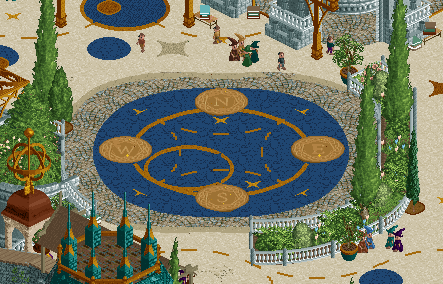
Such a cool compass on the path.
I love this tower
What a cool interior
I also love the interaction of the spinner right here.
-
 Ethan
Offline
Ethan
Offline
Constellations
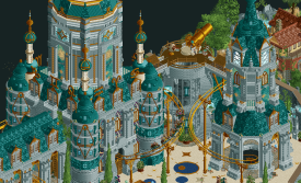
The park is a beautiful macro presentation. It reminds me of the large-scale forms of minas tirith with the momentous centrepiece. The colors are balanced gorgeously and the gold roller coaster ribbons the park excellently. The incorporation of the coaster into the large structure is particularly well done and the first inversion is nothing short of elegant.
I really enjoy the whimsicality of the plugin and the animated features like the rapidly spinning constellation table. The cutaways are another excellent well-composed feature. Lots of cool scenery pieces and nicknacks that bring this map to life as a complete branded package.
Hell
A great opening concept for the contest, I really enjoyed the inclusion of various liquids. Lots of great integrations of color in general when considering this kind of theme. The over-the-top character depictions and stuff like the frozen pond as an allusion to Inferno is funny when considering how absurd that book kind of is. Such an epic scale and the pentagon motif, chains knotting everything together. Very good scope and scale to get this out for the first round. Very proud of the team.
-
 Jappy
Offline
Jappy
Offline
Hell:
As mentioned by others, that opening is fantastic and the music score fits perfectly. While initially I must admit did think the park was overwhelming and blended together too much, there def are some cool scenes and ideas here. It looks like a death metal album cover. Brilliant.
Constellations.
A plugin eh? Well, what does that do.... Okay, that's cool! I must say I am impressed by it. The rest of the map also is beautiful. I do have to admit that I'm kinda agreeing with Cocoa here, that there seems to be missing one extra piece of the narrative puzzle to link the celestial story with the town below. But that does not ruin the map for me, far from. It feels like a classic H2H map, and that's something I can def enjoy.
-
 CedarPoint6
Offline
CedarPoint6
Offline
Here are the video reviews for these parks:
Hell:
Constellations:
Two great parks that were very different from one another. I went for Constellations in the end-- great composition and some really neat plugin tricks as well.
Tags
- No Tags