Head-2-Head-X / H2HX: Round Robin - R1M3 - Lonely Hearts Club vs Soda Jerks
-
 02-May 24
-
 deanosrs
Offline
Sodas, I absolutely loved your park. Design wise the macro is so commanding. The way you guys setup the start so we're looking at the top of the tower and then scroll down and see this awesome structure with the arches coming out of it was a fantastic moment.
deanosrs
Offline
Sodas, I absolutely loved your park. Design wise the macro is so commanding. The way you guys setup the start so we're looking at the top of the tower and then scroll down and see this awesome structure with the arches coming out of it was a fantastic moment.
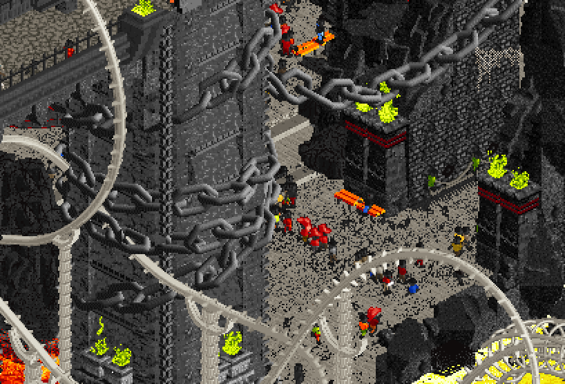
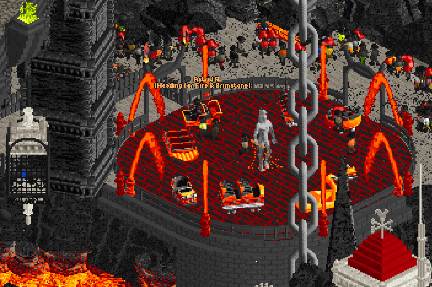
The use of chains throughout was just right - any more and it would have felt overdone, but they added to the atmosphere and "broke" the isometric view so well. My favourite was this one wrapped around one of the columns. Great use of the invisible colour to get a nice track as well!
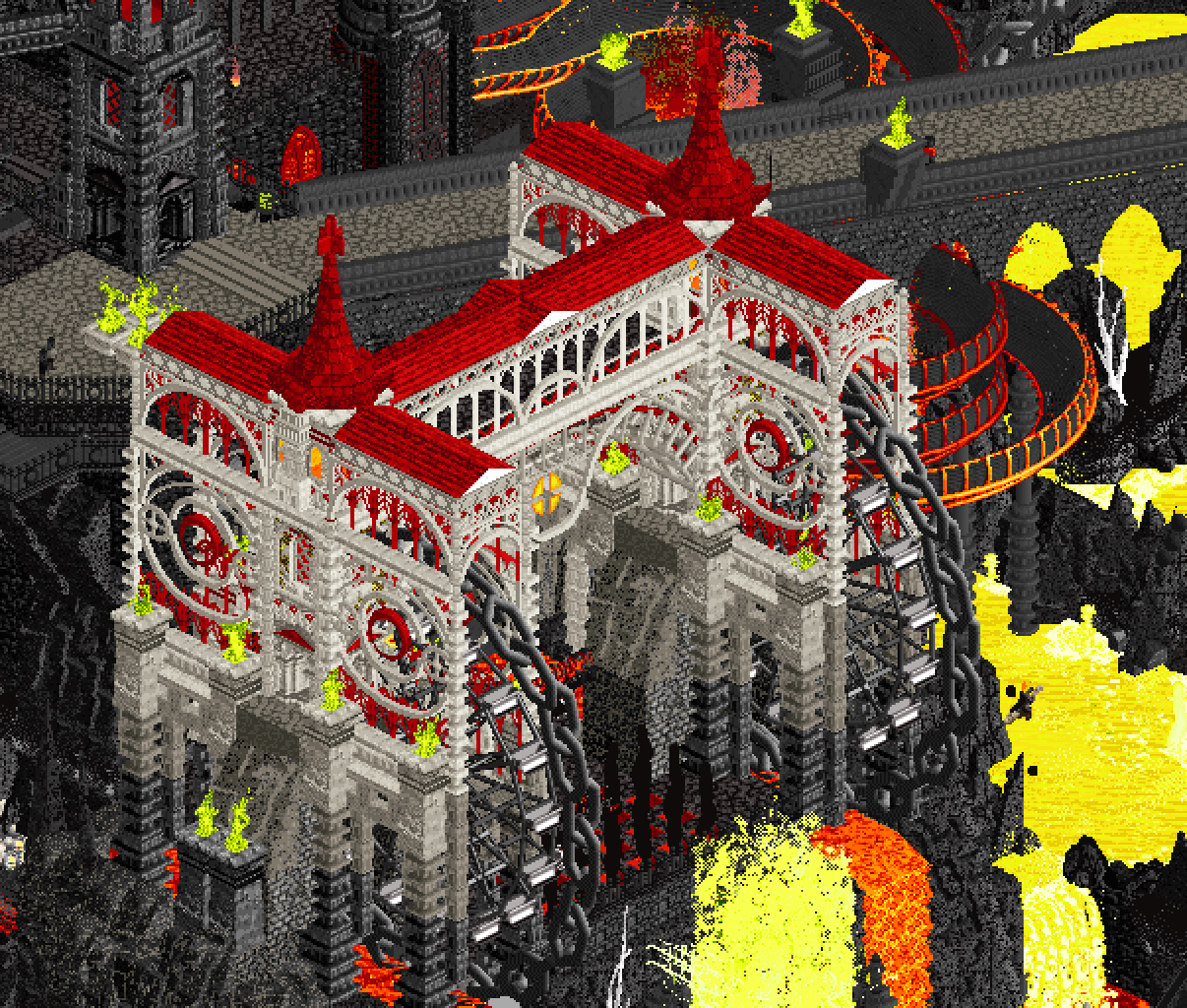
More chain usage on this really cool building. The eye shapes into the side and the curve trim in waves between the two ends of the building again do a really good job perched atop the landscaping of not really appearing to have the standard shapes and constraints of an RCT structure while also looking like a great piece of RCT parkmaking.
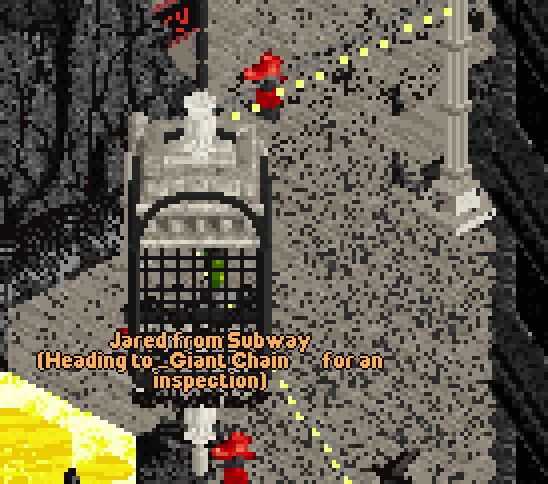
Looking through all the staff names was really fun, I had to pick out two of my favourites. If Jared from Subway is a cultural reference, I didn't get it, but I like to imagine that one of you guys goes to subway and Jared constantly screws up your order, so much that that's where one of you immediately wanted to go when naming staff!
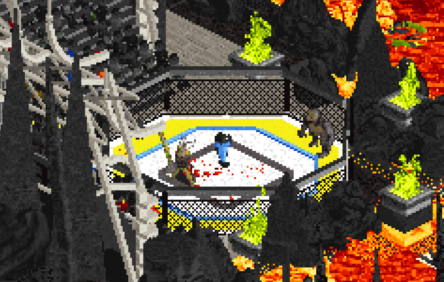
This Joe Rogan as the gorilla scene in an octagon was just perfect. Are his eyes green because he has just chugged a gallon of AG1?!
The different ride vehicles on this carousel gave a really nice effect too. Those little cages like the one Jared is in and the one on the left of this screen introduced a lovely tortured pirate vibe.
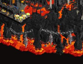
Shout out to the landscaping. Landscaping in our park was a real drag and we had to really work hard to stop the whole map turning into a sea of gray. Here you guys really used it as a feature and it was a key part of selling the theme. Black charcoal almost turd like rocks, flowing into super bright lava, and then a heavy dousing of mtn dew on top. I can't possibly imagine a better way to represent Hell in the game!
Before H2H started as a team we looked at all the park overviews that lost in H2H9 and all the ones that won. You guys' park definitely belongs in the latter category and right at the top of it too. I was bricking it when I first saw your park.
--------
Thanks to JK, Sammmy and CHE for being such awesome co-builders. Really enjoyed working with you all! Iretont for the CTRs, AmusementParker for some great objects, nin for the meticulous feedback and the whole team for pushing us over the line. I'm sure I forgot something someone did that was super important please forgive me! -
 spacek531
Offline
spacek531
Offline
I don't think the plugin and the stardust planet are the same. Yes, they are both specific, but they are different in how reusable they are. Anyone who needs a large pink planet can plop the objects down, like Walto did in MM4: https://www.nedesign...67/the-citadel/
The number one issue regarding the plugin is that the data is in Data_Model_EclipseAnimation and not in parkStorage.
If all that data was in parkStorage and not in the plugin code, the potential for reuse is there. Just like the stardust planet, the plugin has a very specific use and feel to it, but with the objects hardcoded there is zero potential to use the plugin in future parks. -
 Scoop
Offline
Scoop
Offline
I don't think we should be turning this into an argument. Need to keep this space as a place to celebrate the parks and critique in a review format. Speaking of which I still need to write a review for JK and the boys, will be coming in the next few days.
-
 roygbiv
Offline
roygbiv
Offline
Ended up voting constellations here could not figure out how to open the hell park.
The Lonely hearts park - This had a ton of content was amazed for how much was done in 30 days. Had the nicest coaster layouts of any of the park submitted so far. The path details were really cool and intricate. I hate the big dumb windmill already. Some peep path was missing at the top other than that pretty good submission.
Hell Park - Could not figure out how to open, maybe include a txt document with instructions or something, park came with 2 jpgs. The jpgs were nice to look at but didnt help. (other park came with a guide and the file, didnt need to use it to open anyways). From screens it looked nice but the presentation lost me.
-
 Mr.Brightside711
Offline
Mr.Brightside711
Offline
Ended up voting constellations here could not figure out how to open the hell park.
Hell Park - Could not figure out how to open, maybe include a txt document with instructions or something, park came with 2 jpgs. The jpgs were nice to look at but didnt help. (other park came with a guide and the file, didnt need to use it to open anyways). From screens it looked nice but the presentation lost me.
"Do not vote unless you have viewed both parks in-game" It's one of the rules of voting. Not really fair to the Soda Jerks.
-
Scoop
Offline
"Do not vote unless you have viewed both parks in-game" It's one of the rules of voting. Not really fair to the Soda Jerks.
I have a feeling he's trolling for some reason. lol
-
 AvanineCommuter
Offline
I’m mad that I missed the voting period for this match, was busy with my partner’s Bday party this weekend and didn’t realize I hadn’t voted yet. Both teams did an excellent job and y’all deserve all the praise.
AvanineCommuter
Offline
I’m mad that I missed the voting period for this match, was busy with my partner’s Bday party this weekend and didn’t realize I hadn’t voted yet. Both teams did an excellent job and y’all deserve all the praise.
For Constellations, some standouts:
1. The plugin effect was SPECTACULAR. The concept + execution was flawless, and done within a R1 park is insane to me.
2. Zodiac’s layout (Sssuper Sssammy coded and I loved how it flowed) was super smoooooth, and the area by Zodiac was my favorite zone by far, as it felt fully realized and featured the best interaction between a great layout, great theming and great landscape. Amazing!
3. The little hacks like the glitching lights and the spinning zodiac, the detailing for the astronomical / celestial devices, and the overall grandeur of the park.
4. The pathing detail work was quite nice and really helped set a unique atmosphere
5. The celestial objects and devices were the best parts of the map to me in terms of architecture. I loved the creative use of objects.
Some detractors for me:
1. The overall macro did leave something to be desired, as it does feel it was built with one-view in mind. I would have loved to see a fully radial pattern on a round map, which would have been conceptually fitting for the eclipse and also give you full sightlines across four views with a central tower. The half-diagonal layer cake situation is still quite nice, but does have a “NE aesthetic” vibe to it that doesn’t read as elegantly as I thought it would. Maybe it’s a question of finessing the half diagonals to read more smoothly? Not sure.
2. Some buildings felt bulky and overall placement also felt clunky. Not a huge detractor but they could have been finessed in terms of where they are placed in relation to each other, to create a smoother macro.
3. Stargazer had a great use of invisible color, but the layout was not great.
Still, this is astounding that you were able to complete this park in one month, to this level of detail and cleanliness. I applaud you and can’t wait to see what else the LHC hits us with!
Hell: This is a Soda Jerk concept through and through and man was it fun! Where I felt Constellations suffered in terms of macro, this park excelled.
Standout moments:
1. The overall macro. Beautiful. Well composed. Perfect sightlines despite huge elevation changes. The diagonal concert setup is amazingly done. The peek throughs of the bridge and the interactivity is amazing.
2. The funny jokes and details kept me engaged for quite a while trying to find everything.
3. The Spinal Tap coaster was really clever and looked amazing, loving how creative it was and it really did look like bones.
4. The chains were PERFECTLY executed, I especially loved how it wrapped around the bridge supports.
5. The color scheme was unique and made the park stand out.
6. The introduction to the park was creative and unique, seeing the peeps raining down into hell is so perfect. Banshee demons around the portal also perfect!
Detractors:
1. Spinal Tap should have taken a much more central spot in the park, this was the only macro-decision I disagreed with. I would have loved to see a giant bone coaster envelope the pentagon shaped map.
2. Some of the water slides felt undercooked, could it be a time constraint?
3. I would have loved more attention to the actual architecture. This was the main detractor for me, as most of the actual buildings were pretty blocky and not as refined as the rest of the park IMO. A nicely detailed cathedral made of bones for Spinal tap’s station is a real missed opportunity.
I didn’t get a chance to vote, but I would’ve have voted for Constellations but by just a slight margin - the plugin was such a sick move and the park itself was great even without it. I think if Hell had better architecture to match the landscaping and larger structures, it would’ve taken my vote. Congrats to LHC on the win, and to both teams for an incredible match! -
 Babar Tapie
Offline
Babar Tapie
Offline
I didn't have time to vote on this match, I couldn't make a choice, but anyway my final decision was a null vote.
My heart was caught between the perfection and poetry of Constellation and the fun concept of Hell.
It's a bit more messy on Hell, but it's a happy mess here. It was a lot of fun discovering this park, some of the sculptures are stunning (this skull <3), there's a lot to explore and discover. It's generous and full, I love that.
Concerning Constellation, it's a pure gem, so beautiful and peaceful, full of little scenes here and there, I won't even mention this magic trick, which is just the wow effect of the park. There's nothing really radical in the architecture in a way, but the park reaches an incredible degree of balance, everything is well placed, everything is well considered, everything fits together in a precise and perfect mechanism. To summarize, this park is a high-quality Swiss watch.
-
 Jens J.
Offline
Jens J.
Offline
Hell
What a fantastic intro! Love the fitting music (later edit: and the horns lmfaooo) and the very hectic looking opening scene with all the swarming demons. First thing that catches my eyes when I move down is the glowing eyes on the middle sculpture, so spooky. I love the way you guys did the lava map edges and how the lava is actually see-through in comparison to real life. The combination of the chain vehicles with the custom cages is genius!
Such a nice contrast having an icy section as a cutaway scene (with a goofy looking sculpture as well!).
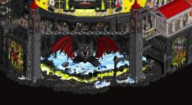
This would've totally been a park I would've loved to work on! Bold concept with some good execution and lotssssss of rockwork. This gave Josh vibes right away, but really awesome to see Mulpje and Maverix get some big shares in too! Hats off on finishing this park in such a tight deadline.
And darn you guys for rickrolling me... you got me there. Signing off, Jennifers J. <3
-
 Lurker
Offline
Lurker
Offline
Constellations:
This feels like a finals park, some amazing elevation changes, multiple layers and grand centerpieces. Love how the theme was implemented, and some of the hacks were really cool, like the zodaic platform being spun by the caster. The plugin effect, while the plugin is one use and an extra step to install (Nowhere near as annoying as the old custom music IMO), it was impressive and fun to watch. (Also, the guests jumping for joy as it happned was such a cool touch). Overall though, I think this park would've won me over even without the plugin effect, it's a stunning map and a style I really enjoy.
Hell:
More action park style fun. Really strong opening sequence, and dramatic elevation and architecture used to great effect with some great rockwork and lava to make an impressive hellscape. Fun main coaster with the themed track and supports, and the references throughout had me laughing. (Also, can't think of a better soundtrack choice than Doom music for this.) -
deanosrs
Offline
I just wanted to thank JK, Ssammy and CHE too because about 10 days out from the deadline, bored of it having seen it run hundreds of times, I argued strongly that we should remove the eclipse, that it would be seen as a gimmick. Thank you guys for talking sense into me!
@Splitvision, @spacek, for Constellations, I would suggest the plugin issue is irrelevant because I was a builder on the map. So whether or not the plugin counts as creative input doesn't really matter. Moving forwards, any plugins we consider using as a team will be generalized and a builder (not me) will program into the save file the specific actions for the park. I hope this means we can keep these park threads focused on the parks and the hard work of builders!
-
 Sephiroth
Offline
Sephiroth
Offline
Interesting discussion on the eclipse effect. It think it’s impressive, and to say otherwise is rather dismissive. Under the hood it might be straightforward and just “sequencing objects to change color.” But the effect is beautiful, fun to watch, and achieved its goals. Great job and congratulations on the win. Would’ve been nice to break up the wall of grey, and maybe help the levels of path feel more vertically offset, or at least be easier to visually read the verticality. Right now it all kind of blends and it’s not always obvious when path is on a separate level. Minor complaint though.
EDIT Scoop, sorry your team’s park lost. I ended up not voting in this match just like R1M2 because Hell is just that good. The defeats this season have all be quite painful to see, and that’s a credit to everyone involved in making these fantastic parks. I seem to be in the minority but I would’ve loved to see you guys go hog wild into more chains, bone structures, hanging cages, etc. But that’s a very minor personal preference. -
 J K
Offline
J K
Offline
Yeah just to weigh in on the plugin debate, from a UX standpoint the plugin itself does a few things, in terms of the eclipse;
• It makes everything dark to represent an eclipse happening
• There's new music timed with it to signify something is happening
• It recentres the camera so the user doesn't miss the main orientation of the effect happening
• Star constellations and the zodiac appear (or are set to visible) when the shade change happens
• Peeps put their sunglasses on to react to the eclipse
• Some objects aren't colourable on the map so Deano has coded to switch some of the objects out to colourable versions and coloured them black e.g. the original cobblestone path
All of these components happen to make the eclipse action in the context of our park. Because of this we simply can't make this a plugin open to all yet. With deadlines and such my response as a captain was 'deal with this park first, then look to a global release after the competition'.
As a team, our first rule is that the plugin should support, just like a new CTR or object does, it should never be the reason for the park, so it makes me really happy to hear that people thought the park may not need the eclipse effect. But this is H2H, we want to put on a show right.
Looking forward to seeing more of these plugins help push the innovation to the next level.
Also just to say a thank to Sammy for the music, Iretont for the new CTRs, Amusement Parker, CHE and Mamarillas for the new objects, myself for the logo of the park, nin for the unreal feedback taking this up a notch. All of this is equal to the plugin effect created by Deano.
-
 MorganFan
Offline
MorganFan
Offline
Hell
Opening screen is amazing. On a whole this map is visually impressive, and still easy to read from the macro. Love the use of bright yellow and orange against the black rockwork and dark gothic archy. I kept finding details like the various skull faces, hanging cages, and all the skeletons. Be proud of this, it's a sick park and it got my vote.
Constellations
What a great park with a surprising surprise! The plugin's effect changes the atmosphere greatly and I think it works. I absolutely love the river rapids ride, and the use of verticality on the left side of the map. The giant telescope tower in the center is another highlight, as it opens up to the plaza on top of the hill.
This was a close decision for me, as it was a tough matchup between two impressive parks, and ultimately the one that won me over didn't win. Congrats to Lonely Hearts Club, and tough break for Soda Jerks, but that's the way H2H go. -
 posix
Offline
posix
Offline
Since roygbiv's vote violated the rules, in it's lovely blatant way, I've nulled it.
As I was tending to it I briefly reopened the poll for 30sec, and sure enough AVC instantly voted despite the match already having been concluded. So his vote is nulled too.
The new official score is now 37–17. inb4 why do you give a shit for 1 single vote difference: It can have effect when number crunching stats as tiebreakers for who makes it into the playoffs for teams placed 4th and 5th after RR.
-
 alex
Offline
alex
Offline
Constellations
The eclipse effect is such a creative idea and it’s executed wonderfully - great job! Doesn’t feel like a gimmick either - fits with the theme and the park stands up well in it’s own right - it’s beautifully put together. Highlight for me is the ride design - cool rapids ride, a spinning coaster with rails that make it look like some kind of ball contraption, and then the main coaster which I think this is my second favourite from R1 (guess which is first lol) - it’s so flowy, especially this section: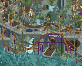
Hell
At first glance I thought this was maybe the weaker of the two, mostly because the jarring contrasts aren’t usually my cup of tea but after spending more time with both parks I began to appreciate the style of this park a bit more than Constellations which is aesthetically quite safe. I like the bold simplicity of it - in the colours, the composition, and the clarity of the concept. Love all this boney business over here: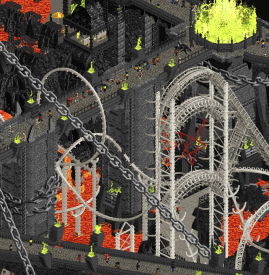
-
 Congoy
Offline
Unfortunately I was unable to access RCT during the voting period of this matchup. I caught some screenshots and streams, but I wanted to obey the rules and not vote unless I was able to open both parks, which I have done now...ConstellationsCongratulations on the victory, well deserved. If someone asked me about the RCT meta, I would show them this park. Interesting original story, nice blend of realism and fantasy, expert craftsmanship, and game-changing tricks. I enjoyed the plugin and agree with the sentiment that it was the "icing on the cake" of an already spectacular map. Awesome, awesome job!HellTough loss. The more time I spent viewing this map, the more I grew to appreciate it. The park itself is good enough to stand on its own but the music takes it to the next level. All of the whacky rides and cameos had me laughing. This will be remembered for quite some time because of it's ability to just have some fun while maintaining a high level of build quality. Great work, mad respect. Yummy yummy, yummy yummy, fruit sal-AaaAaaAD!
Congoy
Offline
Unfortunately I was unable to access RCT during the voting period of this matchup. I caught some screenshots and streams, but I wanted to obey the rules and not vote unless I was able to open both parks, which I have done now...ConstellationsCongratulations on the victory, well deserved. If someone asked me about the RCT meta, I would show them this park. Interesting original story, nice blend of realism and fantasy, expert craftsmanship, and game-changing tricks. I enjoyed the plugin and agree with the sentiment that it was the "icing on the cake" of an already spectacular map. Awesome, awesome job!HellTough loss. The more time I spent viewing this map, the more I grew to appreciate it. The park itself is good enough to stand on its own but the music takes it to the next level. All of the whacky rides and cameos had me laughing. This will be remembered for quite some time because of it's ability to just have some fun while maintaining a high level of build quality. Great work, mad respect. Yummy yummy, yummy yummy, fruit sal-AaaAaaAD! -
 Steve
Offline
Steve
Offline
Man, I am already losing steam on these things. I just started a whole long, convoluted, and drawn out run-on sentence as an opening line and then I deleted it because it just wasn't cutting the mustard, guys (well, hey check it out: that was a long, convoluted, run-on sentence anyway!). Also, what even is that saying? "Cut the mustard?" Do the Europeans know what that is? Do the Americans? Is it strictly a Massachusetts thing? Listen to me, talking about condiments in a H2H review. I mean, I do enjoy mustard. Any horseradish fans out there? Dudes, so good. Give it a whirl if you haven't yet, like, for real. Anyway.
I usually don't do these after the builders have been revealed but guess what? I was lazy. Is this to say the Soda Jerks and Lonely Hearts Club don't deserve my time? Yes. Yes, that is exactly what I'm saying. Just kidding, kinda. At least, I think one of you deserve my time. Which one? The one I voted for! Nah, just kidding again, kinda.
Anywhoozle, if it's any constellation, I thought Consolations was star-studded (how were those jokes? Was waiting this whole time to use them!). I think before we get into any of the park content, I have to go against my good-boy instincts and adult tendencies and pick on you guys (pos, I'm sorry!!): is this Plug-In Tycoon? Knock it off, weirdos. OK, I'm done now. Wait, one more: J K if you spent as much time working on plug-in's for parks as you did for making good RCT maybe you guys woulda won. Wait, hold on... oh. Whatever. Taylor Swift just came on so I might just stay down bad. The park has a good coaster, at least. Very swoopy and damn, if I don't love a good swoopy coaster (I do, in fact). If I had to be a total asshole and nitpick, though: I'd say the map is overly gray. If you made the brick structures gray because the rocks are gray and logic dictates that's where the stonework comes from then... fine, but, in a fantasy world like this I would have taken the artistic liberty of separating the colors. Especially when the roofs of the bigger structures are basically the same color of the waterways. It's like making a coaster in a forest and painting it green. What I'm saying is: give me some contrast, homies. Good/solid/nice (pick your adjective of choice! I love giving people options!) work, LHC.
All right, time for Hell. Don't love that I have to go to a map about Hell when my life is hell enough (just kidding, I love my life. Although I don't recommend toddlers if you value any privacy or personal time). Know what I do love though? Finally getting to rag on a Soda Jerks map! I started early in my other reviews but now the time has come! And the bonus of it being a Josh map too?! Score! No prisoners in this review, baby! Nah, just kidding. I'll be nice because last time I reviewed a park Scoop had any stake in he got really bummed about it and I'm turning over a new(ish) leaf! The seasons are changing and thus, so is Steve. Look at me, talking in the third person. Should I keep it up? Let's see: "Steve thought Josh worked on this park because Steve remembered Josh talking in the AI-chat about doing a Hell waterpark with lava slides and Steve thought Josh was being silly but knew Josh would totally do it because he's silly." That wasn't confusing at all. Anyways, this idea was a good one and ripe for H2H so nice going. Was it an assault on literally every sense? Yes. As much as I can't stand the AI custom music, I do admit this one was pretty funny. The whole map is classic Josh, which unfortunately has pulled a Steve marketing-wise turning himself into a one hit wonder of making everything into an Action Park, the same way I make everything a beige-ridden and tree-lined mess. Not a bad thing, but not a good thing either. Is it a neutral? Sure, let's go with that. Regardless of whatever bullshit I'm throwing your way, Jerkfaces, the park was hot (HA, oh man, had to go back and mention this one as a real zinger. Totally off-the-cuff, too, guys, like sincerely). I'm eagerly awaiting Heaven Action Park next, so there's that, at least.
-
spacek531
Offline
Constellations:
+ Cool fantasy village. Is Renaissancepunk a thing? This would definitely qualify.
+ Cool castle.
- A bit same-y colorwise with a lot of gray. Path shapes and building placements felt a bit random and unrefined.- There weren't any scenes to tell me about the lives of any of these people.
Summary: 7 Liberal Arts meets the Renaissance period. Almost no story elements.
He'll:
+ Hellfire and brimstone to the max.
+ Great sculptures.
- A bit difficult to see what's going on with the numerous tall spires. Too many rocks and not enough water rides.
- Sadly I do not know who it is. There have been too many vehicular manslaughters.
Summary: 7 Liberal Arts meets Gauntlegrym. Cool idea, good execution, but not my cuppa.
Constellations resonated with me more than Hell; +1 Lonely Hearts Club. -
 dr dirt
Offline
dr dirt
Offline
Constellations:
Path levels, looks like cake layers, lights on/off great, fun... concept feels open, should it be more concise? Could have more aesthetic clarity to narrow it down. Wheel spinning's great. Didn't install the plugin. Good call on interiors, pretty fleshed out...lots done in what? Four weeks? Impressive. Big. Lots going on. Some disconnect in my mind of an ethereal theme but then backed with stuff but, hey, it's your park, fill it up. I enjoyed it. Is it my favorite sort of approach to a park? Probably not exactly, but still fun and very H2H-ish. Good.
Hell (our park):
Glad you guys went with pentagon look. Is this one my sort of park? Also, probably not. Subtlety's out the window. Garish... but you wanted that. Fun stuff in here: people in cages, Wiggles, cat head... lots of stuff. Scale ended up large for my taste. And the music... Jesus, the music. So aggressive. Anyway, it's a great park idea, lots of great ideas... a bit all fit together without concern for scale or spacing, though. But cool, very cool. McDonald's colors a bit harsh. Architecture is well done. Seemed fun to build.
Tags
- No Tags