(Archive) Advertising District / Temptation resort [online]
-
 09-March 04
-
 justdavy
Offline
Hi i'm new here
justdavy
Offline
Hi i'm new here
I'm from holland so my english writhing can be bad sometimes
But i'll do my best!
I think that this is one of the best site's I've ever seen !
With also the best parks I've ever seen so you guys are used to very good theming in parks!
So be easy on me
Justdavy presents Temptation resort!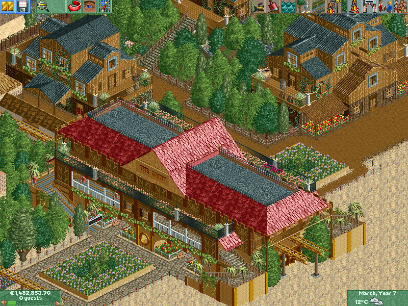
-
 gir
Offline
Ooooooo...
gir
Offline
Ooooooo...
I love that station! I think it's a bit too symmetrical though, and the rooves look weird, but I could live with them. The buildings next to the station are perfect IMO. I usually don't take strong likings to RCT2, but for some reason I like the way this is looking. Keep it up!
-
 JKay
Offline
Holy shit!....I wish I was this good when I first came here....very nice work!....I'm honored to welcome you to NE, you make a good first impression. Even that park logo kicks ass. There are some minor issues I have with the screens tho
JKay
Offline
Holy shit!....I wish I was this good when I first came here....very nice work!....I'm honored to welcome you to NE, you make a good first impression. Even that park logo kicks ass. There are some minor issues I have with the screens tho
-those vines on the dark wood walls dont look right
-I dont think those palm tree que TV things look good here
-your bldgs dominate the screens, I would try widening your paths.
but, overall quite nice...
-
Leighx
Offline
welcome to NE.
it is good start, the station looks good (no complaints there).
but add some more colour in the bulidngs around the station and vaery the flowers around the path more.
but nice start.
and the logo isnt to bad.

-
justdavy
Offline
I want to thank you for the comments
It's my second online park...
I know It's not bad but I'm stil very much in the learning progress
About the comments ....I dont wanna sound rude, But I will change some few things but Not everything ...I like it the way it is
No park is perfect...because not everybody likes everything te same way
Tomorrow I will show some more screens
-
 Jacko Shanty
Offline
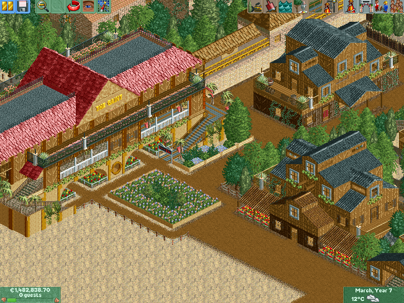
Looks very nice!
Jacko Shanty
Offline
Looks very nice!
But you might want to correct the spelling of "The Giant" on that sign.
-
 cBass
Offline
cBass
Offline
Hehe, I just figured "Gaint" was some Dutch word that I don't understand.But you might want to correct the spelling of "The Giant" on that sign.
Keep building, Davy! -

Richie Offline
The station looks really good, i like the roof I have a good feeling about those racing giga coasters too, i wanna see more... more...... MORE!!!
-
Corkscrewed Offline
Wow, very nice. I'm liking you already! Aside from what the others have said, I'd take away some of the trees right next to the path and maybe replace them with shrubs and/or flowers. That's not too much of a big deal in this case, though. The architecture is very good for a person on his second park ever, and you're definitely showing some nice talent. -
justdavy
Offline
//Update\\
Thanks fore all the compliments...it's really nice to see people like you're work
I will show you some more screens of the western village
The name wasn't the gaint but [Gladiators] I just totally forgot the change the name bords
More details about the coaster wil come at the end when al the scenery is shown
For know you will have to do with these screens
If my progress goes well more screens wil follow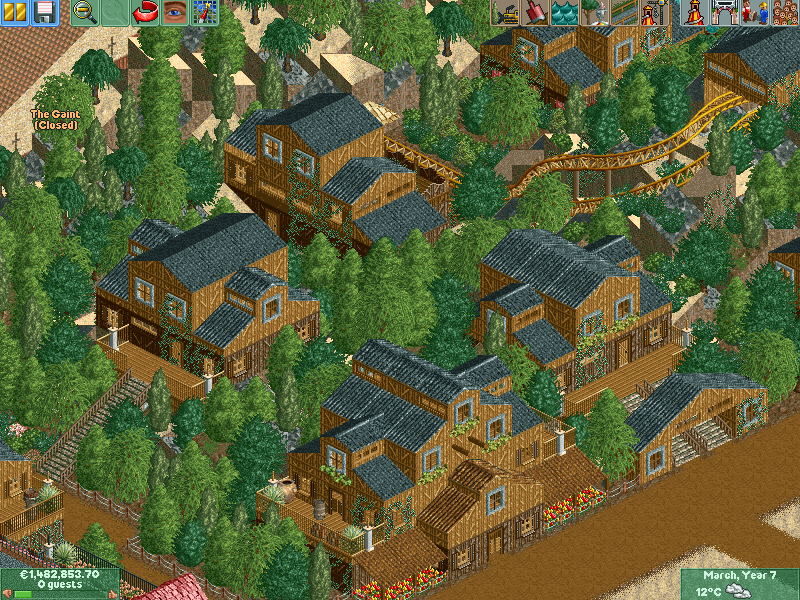
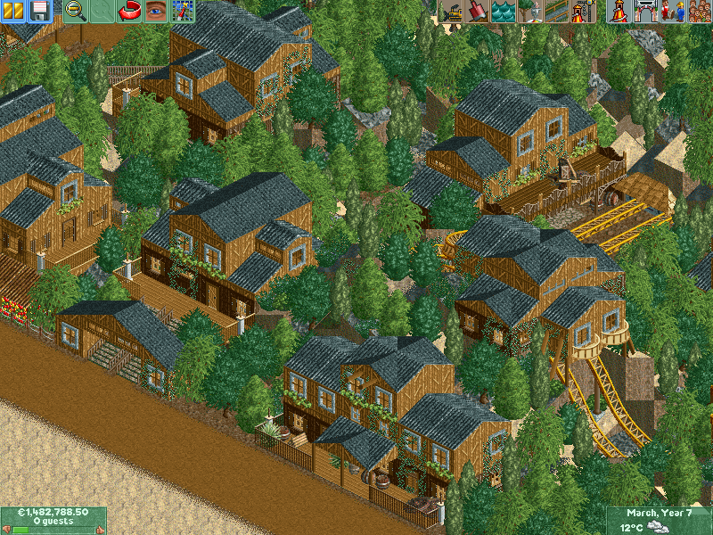
I've notised that the screens are at slow rate so the screens wil be converted to JPG files from now on
-
Richie Offline
Try changing the roof colour on a couple of the buildings, maybe the pale red? It looks great so far, i really love your work.
-
Leighx
Offline
your bulidings are good but all the same really maybe if your gonna keep the same roof colour add differnt wall colours.
keep it up.
-
justdavy
Offline
I always have trouble finding the right colorsyour bulidings are good but all the same really maybe if your gonna keep the same roof colour add differnt wall colours.
But I'll see what I can do
Tough this was already the end of the western village only one more little building
But these screens are always under progress....when I totally finished my park,
Then I will look at the smaller things and work them out.
Is kinda my way of completing it -
Richie Offline
Can i advise you to not show the whole park, leave some suprises for when you put it up for download
-
 Tech Artist
Offline
Wow for your 2nd park this is really good. In your western section add in a couple more colors so your buildings don't have the tendencey to look the same.
Tech Artist
Offline
Wow for your 2nd park this is really good. In your western section add in a couple more colors so your buildings don't have the tendencey to look the same.
Cut down on the trees near the path, maybe add some more flowers and shrubs and maybe use 1 more type of tree in your tree mix cause the seem to blend to well.
I look forward to more screens and congrats at a nice 1st impression.
-
justdavy
Offline
Im very bad a keeping secrets of my parkCan i advise you to not show the whole park, leave some suprises for when you put it up for download
So I don't know If I can give you my word on you're advise
I'm going to bed now (yes I'm 6 ours ahead of you)
its already past 12
I hope i can show another update tomorrow
-
Richie Offline
Sweet dreams, and i order you to dream up more ideas for this park
Another peice of advice, i think you need more variety in the flowers colours, it looks odd all yellow + red. -
justdavy
Offline

I tought it would be nice for starters to change the colors of the roofs
Into defferent types
I hope U consider this also as an improvement...if not ...well i'd change them back in a second
So please let me know what you think about it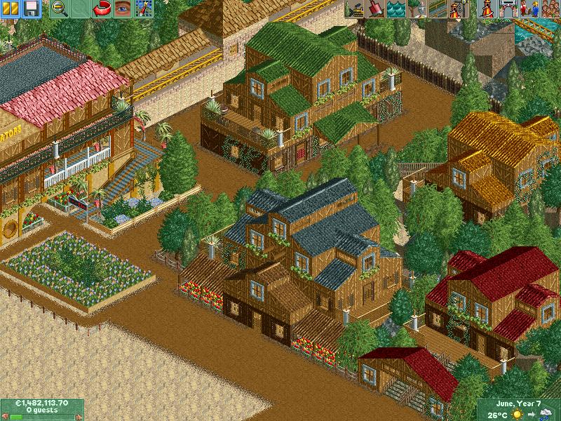
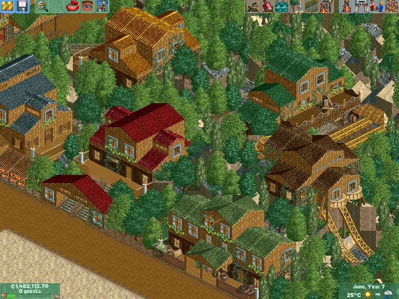

Screens are converted to JPG so the quality fades a little -
JKay
Offline
I dont know what it is, but I liked the all black roofs better. I think it made all your architecture look like it should belong together, but with the colored roofs, each structure looks isolated. I also think the black color really fit with the wall / coaster colors. Maybe instead of changing the roof colors you could add an accent color(s) elsewhere on the bldgs, again, I would keep the accent color uniform throughout the bldgs. Anywho, keep it how you want it since its your park. It really is nice work though....

-
 Raven-SDI
Offline
Hello.
Raven-SDI
Offline
Hello.
Looking good thus far.
I only have 2 suggestions...
1. Tree variation.
2. Those turns on the coaster look really horrible.
Yeah...
Plat
§Æ§
Tags
- No Tags