(Archive) Advertising District / Leviticus
-
 03-October 04
-
 X250
Offline
X250
Offline

My new park, Leviticus. It is a side project to Tranquil Bay and i expect to finish it in a month or maybe two. In the screens you can see the 'Golden Temple' entrance complex. It is a very detailed area with bright colours to put the guests in a good mood when they enter the park!
The rest of the park will be mostly made up of the castle walls and i aim it to be a similar style to Rivers Of Babylon by SAcoasterfreak, my fav park btw.
I have always wanted to build a park like that, and now i am attempting it!
Enjoy the screens and feel free to leave any comments or suggestions you may have: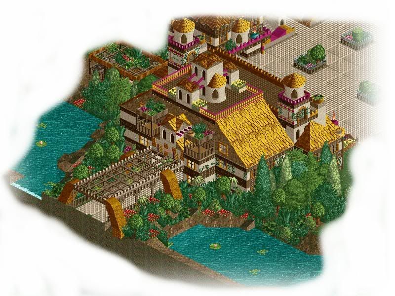
The main entrance structure, complete with toilets for those who have had a long journey, a small food outlet (burger king) and a park info kiosk.
---------------------------------------------------------------------------
The shopping village, the building on the left is 'candy corner'. Next to it is the well renowned 'Colombus Coffee' which sells coffee in many different variations. To the right you can see the 'wishing well'. A small pond that if you throw a penny in and make a wish- your wish might come true! (yeah right).
---------------------------------------------------------------------------
A teaser screen of the Leviticus Carousel- the oldest ride in the park. Themed in a desert theme.
Next update probs next week- but knowing me, probably tommorow!
Thanks.
(thanks to Spitfire for the logo)
-X-
-
 jon
Offline
It's very nice. As algeestar said, the purple and gold make a great combination. Those little trees in the path in the second screen are nice too. Well done on that. The dark green bushes in the first screen however, there are too many in IMO. Apart from that, it's very nice.
jon
Offline
It's very nice. As algeestar said, the purple and gold make a great combination. Those little trees in the path in the second screen are nice too. Well done on that. The dark green bushes in the first screen however, there are too many in IMO. Apart from that, it's very nice. -
 sacoasterfreak
Offline
If you're trying to be like me, you failed when you started using 1/4 tile theming.
sacoasterfreak
Offline
If you're trying to be like me, you failed when you started using 1/4 tile theming.
Seriously though, this looks very nice. I'd like to see more. There's not enough here to say too many things, but what you have looks very nice. Remember, RoB took nearly a year to produce. Don't ever set a deadline for creativity. -
Disney Freak
Offline
Exactly.Don't ever set a deadline for creativity.
You show lots of potential and creativity but I still get the feeling I've already seen some of this from you. I think if you use less gold and try more color schemes you're off to a great start!
Good luck!
-
DarkRideExpert
Offline
There's a thin line between tottaly eye-candy/crack to being so overloaded you don't know how he's gonna jam rides in there.
This is on the good side, after the carosuel pic, I was relieved it wasn't just an eye-candy mosaic with no rides.
Keep at it. -
 JKay
Offline
I'm obviously not the only one who works lightning fast
JKay
Offline
I'm obviously not the only one who works lightning fast . The dark pink / gold colorscheme is very reminsisant of UH; those two colors work very well here. You obviously have a good ability to put facade on your building sides to just the right extent as to keep them un-cluttered. I'm not keen on the Roman fences on the top of the building in screen 1, they look too artificial, otherwise beautiful. The other two screens are very nice and my only suggestion is to maybe throw in some other roof textures, all I see are Spanish roofs.
-
 gir
Offline
I'm really sick of all these golds and yellows I see in nearly EVERY RCT2 PARK. GO OUT ON A LIMB.
gir
Offline
I'm really sick of all these golds and yellows I see in nearly EVERY RCT2 PARK. GO OUT ON A LIMB.
(I'm not saying that there are parks that are more adventurous as far as colors go, but I mean c'mon. I bet over half of all RCT2 parks have gold as the most prominant color) -
X250
Offline
Thats because it so damn easy to work with probably. It goes with most other colours.
I have started a new section with a new coaster and it does have a different colour scheme so it is not the same crap... Screen(s) of the inverted coaster coming Saturday.
Thanks for the comments! Much apprecieated...
-X- -
X250
Offline
Update 2:- Dragos: The Return
As promised, two new screens. Working flat out on this thing now... Still a lot of work to go though!
First screen:
Dragos: The Return is a coaster that twists and turns itself around the huge, fiery mountain that the beast (leviticus) inhabits. Featuring five inversions along its thrilling 4,500ft course. It starts off much like Nemesis at Alton Towers and then branches into a new, original design after fleeing the mountain... Dragos is not for the faint hearted...
Leviticus, a huge beast that roams the deep, underground caves of the park. Occasionally pops his head out of caves in the ground to say 'hi' to the peeps around him. Not really, he is a fiery, bad tempered monster who feeds upon anything that crosses its path. Guests can fire hobo-chunks at the dragon and watch it feed... Until it gets back into its cave.. But if it is not fed, well... Lets just hope the victim has life-insurance...
Presenting, the dragon who has a park named after him... Leviticus!
lol... enjoy, and don't forget to comment!
-X- -
super rich
Offline
Im not too sure on the coster supports but the second screen the buildings are good and i love the dragon.
-
Disney Freak
Offline
That's one beautiful dragon you've got there! I'm not sure about the lift hill supports. Maybe make it more similar to the rest of the supports? The rest is simply beautiful! Great job!
-
 Steve
Offline
It'd be really cool to have the coaster come barreling out of the it's mouth. It's cool though, don't get me wrong. And work on your theming. Just trees? :/
Steve
Offline
It'd be really cool to have the coaster come barreling out of the it's mouth. It's cool though, don't get me wrong. And work on your theming. Just trees? :/ -

PBJ Offline
^ W T F
first screen: the supports are super! but the sopports on the lift hill aren´t my type! maybe you can make them the same as the "normal" suports!
Second screen: the head is just WOW! -
Panic
Offline
Please, PLEASE smooth out the landscaping on the left side of the first screen. Hills are not formed from blocks.
Rest looks good. -
 SirSpinster
Offline
Dude. That dragon rocks. I'm seeing a lot of detail in all of these screens. It's looking very awesome, and keep using that arsenal of colors you got there.
SirSpinster
Offline
Dude. That dragon rocks. I'm seeing a lot of detail in all of these screens. It's looking very awesome, and keep using that arsenal of colors you got there.


Tags
- No Tags