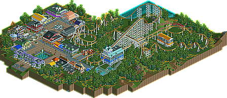
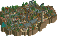
Park / Inferno
-
 06-October 10
- Views 4,417
- Downloads 708
- Fans 2
- Comments 36
-
 56.92%(required: 65%)
Design Submission
56.92%(required: 65%)
Design Submission
SSSammy 80% RCTCA 70% robbie92 70% CedarPoint6 65% K0NG 65% BelgianGuy 60% John 60% RCTNW 60% turbin3 60% geewhzz 55% 5dave 50% Liampie 45% nin 40% Wicksteed 40% RMM 35% 56.92% -
2 fans Fans of this park
-
Download Park
708
-
Objects
243
-
Tags
Oh, question: Does the points-for-submitting thing not happen for designs? It doesn't seem fair that we (read: Fizzix - I don't care about my own standing) wouldn't get any points for this submission. I guess I'm just thinking about how a submitted Spotlight that scores 25% can get points but something that has a lot of effort put into it doesn't get any...
Fizzix, You have the ability to play this game well imo, but for a design, you have to embrace the word "design" into the equation, and I found things (from a design worthy view) lacking that 'wow' factor we can find.
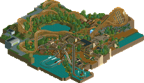
Have a look at all of these designs that win, and the clear thing you can see in most cases is the coaster itself is the main focus, and this I found to be the main issue.Your archy IMO is some of the best I like because of all the colors and diffrent textures on the buildings.
Some of these points I think may have affected the score:
-For an Arrow setup, I think you did well, but the date you chose for this urks me because Arrow Dynamics was just on the verge of bankruptcy at the time this coaster would be finished I assumed.
-As for the coaster as a whole, like I said earlier, no coaster I have seen you enter and exit from the same side, besides maybe kiddy rides.
-The coaster was shrouded behind all the buildings and such that it never could be quite intimidating looking, but I also love how it is secluded a bit so the overall ride expierence was hidden untill riding the coaster. That, I liked about it.
-The overall layout of the "park" makes it look like this is the only area of the park, which then makes the park seem very small as a whole.
-The first turn on Inferno seemed a tad slow, but this was not an issue.
-I think making the Entrance/ exit huts would have still improved the area a bit more.
Overall, I still love this design submission, but I can see how some people did not enjoy it. Still, though, Don't let this be the end of the potential I see, because I know an accolade is close, and in reach.
EDIT: Coasterfreak101 Your support work was excellent Imo and Dmaxsba, I'd like to thank you for your generous contributions over at TPR.
One more thing too, fizzix, Your little gift shop I guess sells Vortex items still.
This was extremely fun to create, and I had a blast. I'm not too bummed about not winning, but hopefully my next will win. I respect each and everyone's opinion, but I would like to know the reason for the lower votes, as well. Thanks to coasterfreak101 and dmaxsba for all the help on this. Also a big thanks to everyone who took a look at this and voted, and everyone who helped get it released. It was an awesome experience, and you'll definitely be seeing more of me around here.
Wicksteed Offline
The architecture seemed to be rather uninspired and random in some places. Also, the foliage didn't really "flow", it seemed like you just used it for filling the gaps. And using many colours and making it look good is always a hard thing. Everything was so colourful, one didn't really know where to look first. Try using colour, but also the shape of your buildings and the foliage, to accentuate whats important, what you want us to look at.
RMM Offline
funny, because i was curious to where the 70-80% votes came from for something that is worthy of a 35-40% in other people's eyes. if everybody voted the same, we might as well go back to a yes/no vote.
there were two parts to this design... the coaster and the paths/architecture. the coaster itself was beautiful, no doubt. and the pathing/architecture was also decent. but the two didn't complement each other for me. they seemed too distant and that's why it doesn't have a 'full' atmosphere. i can't 'feel' it as a whole.
i refuse to give this a 70-80%. it's saying that its only like 10% away from kumba's kumba and it clearly isn't.
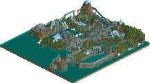
Major thing as i have pointed out i think. Is that helix part. It has a view of the dumpster. That's not what i look forward to when i ride a coaster.
I understand this is an arrow coaster but you almost have NO interaction with the park it self. The coaster is just completely concealed in trees and buildings. If there were just places for the peeps "to take photos" i would've been satisfied.
I thought it had a lively atmosphere but no clear theme. There was NO theme. But from a realistic point of view that could've been pushed off.
Like i said earlier I think.. The layout is great and everything else. Just a few minor errors.
not hard to do, nothing to hold my attention
im with the 40% on this one
tdub96 Offline
It is a very boring Arrow Coaster with generic architecture and foliage and all 3 are just like they would be in real life. So I guess real life rates about 40% for ^you^ also?
A lot of time and skill went into making this coaster what it is and it is one of the best looking Arrow Coasters ever to be made in RCT2. It has all the jerks, bumps and bad pacing that every Arrow has while maintaining a very realistic layout.
Is it exciting? Not really, should it be? Not really. Should it have been judged down for being boring when boring is what it was supposed to be? Not really. An Arrow Coaster is just that, an Arrow Coaster. Just how much attention holding would one expect?
It was submitted as a design, not a park. So why should the buildings and trees have anything to do with it anyway. The track is the "design" and it was designed perfectly. The rest is just fluff and really should have no barring on it's score. That is unless you all want to change the name of this category to "Mini Park". Then I guess judging it on it's scenery (or lack there of) would make since.
Sadly the accolade panel doesn't rate on a 0-100% accuracy scale.
Not much. That's why an Arrow coaster this generic and uninspired is a bad pick if you want to win a NE Design.
Context. Kumba's Kumba would suck and get a 0% rating from me if it were a bare layout only.
No it wasn't.
In other words:
- The coaster was realistic, but boring as well. I didn't like the supports, the colours were as bland as they could get and there was pretty much no interaction either.
- There was no concept, no ideas, nothing. It's just so generic!
- I didn't like the architecture, it looked too random. Both the 'details' and the colours.
- I didn't like how the coaster was seperated from the path/architecture. There was no 'connection' between the two areas.
- I didn't like the foliage.
I know I sound harsh but I just can't stand your attitude, sorry. I guess it's your TPR roots.
So yeah if i build a arrow would you give me 70% if everything else was crap?
I never knew your bronze accolade came with the certificate to be a fag. Like the only person here would be a fag on atari forums just because you have "superior" skills in rct2. Well in life you get a F- from me.
This had no theme because the park was realistic and no small realistic family-type park has a theme that i've heard of.
While dmaxsba's comment was a bit exaggerated. Liam also came out a little harsh but provided valuebable points.
If this was a park continued with this amount of effort and detail and had themed areas. So basically a few of the "no skill designs" that is displayed above and put into a park size. In my eyes it would've surpassed your park to me.
I'm beginning to understand why all of TPR and Atari hate you. You're one of those "elitist bastards" that bring down the NE community. Because everybody else here except a few are very nice and offer constructive criticism.
"most people here seem to think that layouts+supports=job done. Throw in some foliage and hey i have a design"
you do know that this had more buildings than usual designs?
The foliage was not the best in my eyes too many flowers. I would've liked it better if you at least replaced half of it with either grass or shrub objects.
And Liam about our "TPR" roots. Dmaxsba is actually real nice. If you would read any of his posts on TPR he's actually the nicest guy you can find in either NE or TPR. He gives everybody help, offers constructive criticism, and do a lot of work for us to make the forums better that he doesn't even have time to build for himself anymore.
And Goliath. Now everytime you release something, I'll be sure to act like an ass. K?
BTW, Mr.Ass your design got lower score. So shut the hell up and learn some ettiquetes. Being on the internet doesn't give you the right to act like a fag. K?