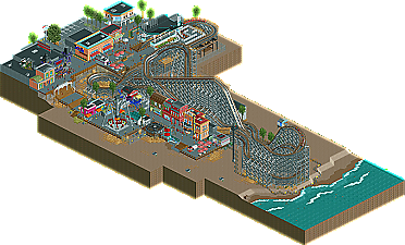
Park / Comet
-
 24-April 10
- Views 7,911
- Downloads 1,035
- Fans 4
- Comments 24
-

-
 79.23%(required: 65%) Design
Kumba 95% Steve 95% chapelz 90% CedarPoint6 85% 5dave 80% Sey 80% Six Frags 80% SSSammy 80% ][ntamin22 80% geewhzz 75% Liampie 75% posix 75% turbin3 70% inVersed 65% K0NG 65% 79.23% -
4 fans Fans of this park
-
Full-Size Map
-
Download Park
1,035
-
Objects
246
-
Tags
Similar Parks
-
Lenox Mall
-
Gangland
-
Nippon Professional Baseball Championship Weekend at Tokyo Dome City
-
[H2H8 R2] Feira do Flamengo
![park_4090 [H2H8 R2] Feira do Flamengo](https://www.nedesigns.com/uploads/parks/4090/aerialt3829.png)
-
Liseberg
-
Tivoli Utrecht
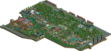
robbie92 has been on a roll. It started with Head-2-Head 5 last summer when he went 2-0 including a win in the championship. More recently he received his second design for Rangda, a wonderful Cambodian'ish B&M invert that proved he really does have the finishing power to give people hope that his screens will one day become releases. As of now he is hot off a couple of 2009 NE Awards wins for being the site's most promising parkmaker and he also won the best write-up award (ironically I am trying to do the same right now!) with his awesome review of Zippo's Wacky World of Wonders. Well now he's is back with another design and Comet shows that he just keeps getting better. | Read On...
Sandcastle = awesome. I loved this, but I do wish there was more.
Congrats Robbie.
Edited by Austin55, 24 April 2010 - 06:26 PM.
Robbie, awesome work. The signage, from the Coca-Cola billboard to the Comet sign was PRO, and the coaster itself was fun to watch. The surroundings were great. This is a picture perfect design, congratulations to you!
Great layout with the double out and back Great White type thing. It's a pretty stock design method, but the way you pulled it off makes it seem pretty fresh. What makes it for me is the surroundings mostly with the carnival type atmosphere on the pier and the stuff up top. It was the right mix of nice with concrete and makes me wish this was extended about 50 squares in either direction. It's too bad the water is so close, but I understand why you'd go that route. The sandcastle also rocks. So all in all, great design, one of my favorites of recent times, I think.
-Pacificoaster
I liked the ride itself, it was well paced and I could easily understand what you were designing for outside the limitations of RCT.
tdub96 Offline
@ Posix/Gee, can you both plan the winning submissions better next time? Now we have 3 releases in a few days, after that we probably have to wait a while again
Great job robbie, my score reflects how much I liked this.. What got it from a perfect score is that it felt kinda safe, like you built exactly what could get a design and not tried something new and innovative but did a "safe" boardwalk theme instead that has been done a million times already..
Oh, and I think now is the time to complete a full scale solo.. We know you can built great detailed small scale stuff, but are curious what you can do with a full scale park.
SF
I really was not a fan of how the detail and colors clashed so much that the coaster seemed like merely a backdrop to boardwalk itself, I'm in the minority with the opinion that such details and side-attractions bring down rather than accentuate a layout, but that seems to be what a lot of the RCT2 designs seem to veer towards lately. You put so much hard work into the boardwalk, I genuinely wish the coaster could have lived up to it. All-in-all, I enjoyed viewing this park but I know I've seen far superior coasters from you robbie. Keep em' coming!
It was also one of the first times in a while that I really felt like an out and back coaster layout was fun and interesting to watch; largely because the support work was so well done. The surroundings were also very pleasant. Not over or under-detailed, very tactful and stylish. The signs guiding the guests to the station were brilliant. Haunted Castle was decent and both custom flats were very nicely done. Nothing really worth complaining about at all. Congratulations on your unanimous win: it's truly deserved.
Ride6
James
Austin: Glad you liked it! About the amount of stuff, I know that it's a pretty small size, but as long as you look into it more deeply, there's more content than most designs, just in a smaller package. This wasn't made to make a large, show-stopping design, just something that showed how much "little things" can bring a design to the next level.
Luketh: Thanks! I'm happy you enjoyed it.
Zburns: Your comment was one of my favorite, as you seemed to understand my goal for this. I'm also glad that you, specifically, liked this, as I know that you've considered my work overdetailed and messy, and Comet was made to try to fix that, making amounts of details look clean
CP6: Thanks! Without you, this design would be next to impossible. Your feedback was insanely helpful to me.
Pacificoaster: Thanks!
Phatage: I completely understand your comment. The design obviously started with a Jersey influence, but as a Californian, the characteristics of CA boardwalks stepped in. The buildings are oddly placed, as I now realize, but I was attempting something like Santa Monica, which has it's buildings on a pier. However, your comment is completely right, and I need to take things more into focus next time I do a design.
Prodigy: Thanks!!!
JoeZia: Thanks, although beaches tend to be fairly empty at times. As far as more stuff, look more closely at everything that's there. I put a lot of time into each building, and I'm sure it's evident.
Tdub: Thanks!
Cena: Thanks!
Six Frags: Thanks, and I do know a boardwalk is pretty safe. However, I wanted this design to showcase execution rather than overall innovation. My later stuff is more unique, but I wanted something less "out-there" and more" well-done."
Kumba: Thanks!
Ozone: Wow, thank you!
Cornshot: Yeah, those details are what made the design so fun for me. Thanks!
Vert: I'm sorry you didn't find it to be work that was my best effort, as I did. However, this design, again, wasn't meant to be innovative. Instead, I wanted to see how well I could execute a common theme, layout included. For me, the surroundings only benefit design, but the layout was still really important to me.
Ride6: Wow, thanks! Much appreciated!
RCTNW: Once you get a look, tell me what you think, as you have some of the more perceptive opinions on this site.
Steve: Thnaks for all the help and testing! I hope SFSF will be there soon as well!
Thanks everyone, and comments are always appreciated.